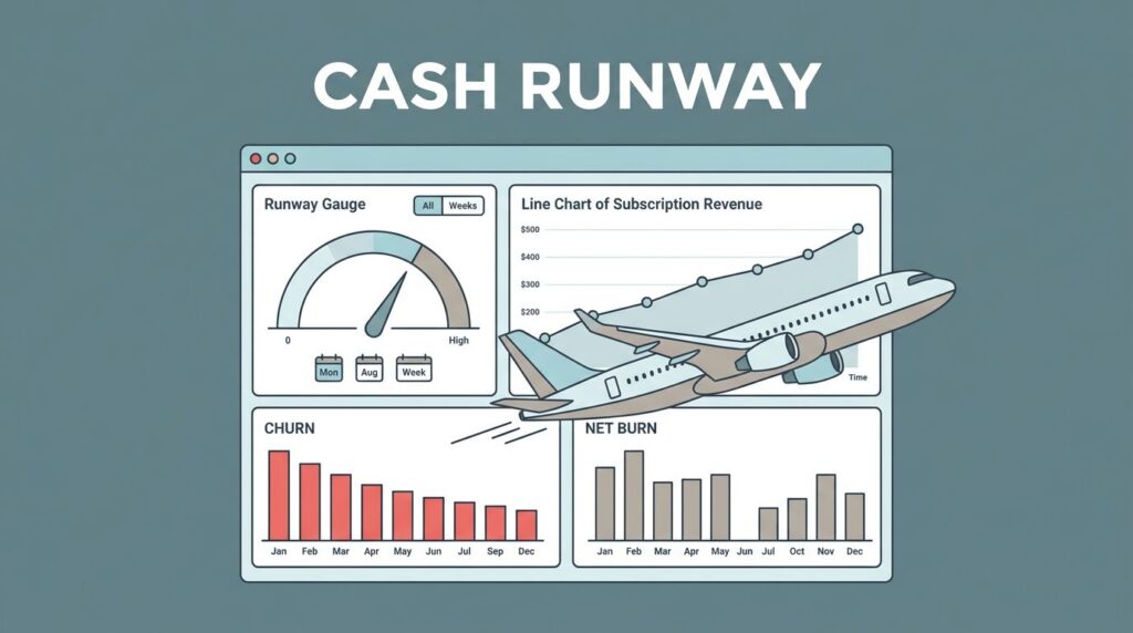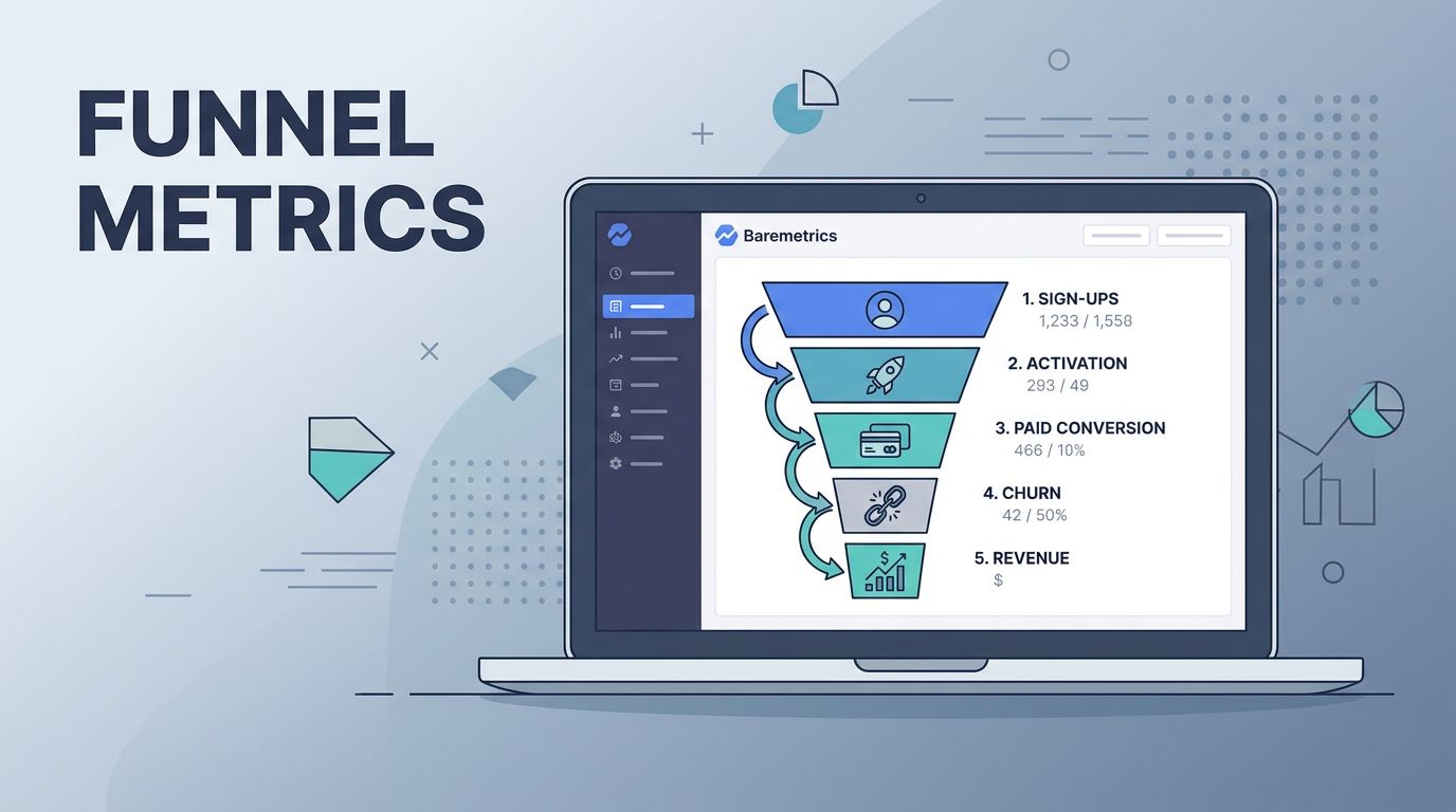
A SaaS funnel can look healthy while money slips out the side. When I open Baremetrics, I want to see where signups stall, where paid conversion weakens, and which cohorts turn into revenue instead of churn.
That means I treat Baremetrics funnel metrics as a diagnostic tool, not a scoreboard. I use them to connect behavior, revenue, and retention, then decide what to fix next. The fastest path is usually the clearest one.
What I put on the dashboard first
I start with one simple rule, I don’t want a pile of numbers spread across five tabs. I want a view that ties the funnel to revenue, so I can read the business in one glance. That is why I keep a Baremetrics dashboard view open alongside the funnel data.
In practice, I watch the same few signals together. Trial starts mean little if activation is weak. Paid conversions mean less if churn eats the new revenue a month later. Even a strong top of funnel can hide a bad middle.
I also avoid reading only the latest week. A single spike can fool me. Instead, I compare the current period with the prior one, then with the same period last month or last quarter. That gives me a cleaner view of movement.
A funnel number is useful only when I can point to the stage that changed and the revenue it touched.
When I set up funnel analysis, I like to pair it with a wider framework. If I need a broader map of marketing stages and revenue flow, I use full-funnel analytics for B2B SaaS as a reference point. It helps me stay honest about where the funnel begins and where it actually pays off.
Spotting drop-offs before they turn into churn
The first thing I look for is the place where the funnel narrows. A wide top and a thin middle is a warning sign. It usually means I am buying interest faster than I can convert it.

If trial starts rise but activation stays flat, I don’t celebrate. I look for friction in onboarding, poor qualification, or a weak first-value moment. If activation rises but paid conversion stays flat, I dig into pricing, trial length, or sales follow-up. The stage tells me where the story broke.
I also watch for hidden leaks. A funnel can look fine at the average level, yet one segment may be collapsing. For example, monthly customers may convert well but churn fast, while annual customers may convert slower and stay longer. The average hides that split.
A useful habit is to compare each step against the next one, not just against the final purchase. That keeps me focused on the real bottleneck. The big win often comes from fixing the middle, not adding more top-of-funnel traffic.
I also like using a concrete checklist for the weak step. If I want a practical sequence for conversion, velocity, and efficiency, I borrow ideas from this SaaS funnel optimization guide. It helps me move from observation to action fast.
Reading cohorts and segments with more context
A funnel metric changes meaning once I split it by cohort. Without that split, I can chase the wrong problem. With it, I can tell whether the issue is product, traffic, or mix.
I compare the same funnel step across plan type, billing interval, acquisition source, country, and customer size. I also compare cohorts by sign-up month. That helps me see whether a change improved the funnel or only changed who entered it.
For example, if paid conversion rose after a new campaign started, I ask one question immediately. Did conversion improve, or did the campaign bring in better-fit users? The answer matters because those are two very different fixes.
Here is the pattern I look for most often:
- Better-fit traffic: Conversion improves, churn stays stable, and early MRR grows with less strain.
- Weak qualification: Trial volume rises, but activation and paid conversion sag.
- Pricing mismatch: Conversion is uneven by plan, and one tier carries a heavy drop-off.
- Retention gap: Conversion looks healthy, but churn wipes out the gain after the first billing cycle.
This is where I rely on tracking key SaaS metrics for growth inside the same review. Funnel data alone can make me overfocus on signups. Revenue data tells me whether those signups turn into a business.
I also compare one cohort against another, not just one month against the next. A March cohort may convert at a different rate than a May cohort because onboarding changed. If I only watch the monthly total, I can miss that story entirely.
Tying funnel movement to MRR, LTV, CAC payback, and churn
Baremetrics gets most useful when I connect funnel movement to the numbers investors and operators care about. Conversion is the bridge. MRR, LTV, CAC payback, and churn are the outcomes on the other side.
The table below is how I translate funnel signals into action.
| Funnel read | What I think it means | What I do next |
|---|---|---|
| Trial starts rise, paid conversion stays flat | Interest is growing, but activation is weak | Inspect onboarding, first-value steps, and sales follow-up |
| Paid conversion holds, churn rises | The sale is getting through, but retention is weak | Review plan fit, usage depth, and support pain points |
| Annual plans stay strong, monthly plans churn fast | Commitment is uneven across billing terms | Rework monthly nurture, pricing, or upgrade path |
| LTV climbs, CAC payback stretches | Growth is getting more expensive | Tighten channel mix and reduce low-quality acquisition |
That lens keeps me from celebrating the wrong win. A higher trial count means little if the extra users never become durable revenue. A rising MRR chart can also hide a weak funnel if expansion masks churn.
LTV needs the same care. I treat it as a forecast, not a promise. If a customer base is churning early, LTV can look fine on paper and still mislead me. The number only helps when it reflects real retention.
CAC payback is where the funnel becomes cash pressure. If payback stretches out, the business feels it fast. I may still like the traffic, but I don’t like the math. In that case, I look for lower-quality channels, a weak qualification step, or a trial flow that attracts the wrong buyers.
Churn closes the loop. It tells me whether the funnel is filling a bucket with a hole in the bottom. If churn rises while acquisition improves, the business is not really growing cleanly. It is just moving faster toward the same leak.
The weekly review I actually use
I keep my funnel review simple, because complicated reviews get skipped. My goal is to find one weak stage, one weak segment, and one revenue consequence.
- I start with the largest conversion drop in the funnel.
- I split that step by cohort and acquisition source.
- I check whether the issue shows up in MRR, churn, or expansion.
- I pick one change to test, then I assign it to the right owner.
That rhythm keeps me honest. I do not need ten experiments. I need one clear fix that changes the next stage of the funnel.
I also write down the story in plain words. “Paid conversion fell in the monthly cohort, churn rose in week two, and CAC payback is now longer than last month.” That sentence tells me more than three separate charts.
The best part is how fast the pattern shows up once I repeat the review. One weak step becomes obvious. One strong segment becomes a model for the rest. Then I can spend less time guessing and more time deciding.
Conclusion
When I open Baremetrics, I want to catch the leak before it spreads. That means I read funnel movement with revenue beside it, not in a separate box.
The clearest analysis connects stage drop-offs to MRR, LTV, CAC payback, and churn. Once I can see that chain, I know whether I have a traffic problem, a product problem, or a retention problem.
That is the real value of Baremetrics funnel metrics. They turn scattered activity into a story I can act on, and that story is what keeps growth from feeling random.