A paid newsletter works best when the path is obvious. I want a reader to land on a page, understand the offer, pay once, and get access without confusion.
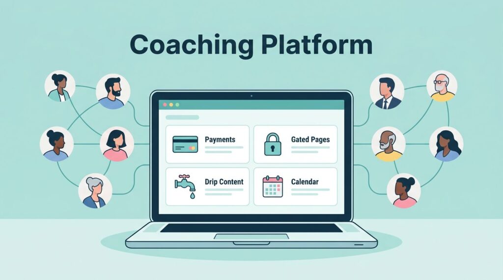
That is why I like MemberSpace for this job. It lets me gate content on my own site, connect recurring payments through Stripe, and keep the newsletter archive where I can control it. If I build the right structure first, the rest feels less like a launch and more like opening a clean front door.
Start with the content home, not the payment button
Before I touch pricing, I decide where the newsletter lives. MemberSpace does not host the content for me, so I publish the pages on my own website first, then lock the right URLs behind the membership.
That matters more than it sounds. A newsletter with no clear home gets messy fast. I usually set up three pieces:
- A public sales page that explains what subscribers get.
- A private newsletter hub with past issues, bonus posts, or resource pages.
- A simple thank-you page or welcome page for new members.
I also keep the content model simple. One landing page, one paid offer, one archive. That is enough for a first launch.
If I am using Squarespace, I usually keep protecting Squarespace content with MemberSpace nearby while I build. For examples of how MemberSpace structures newsletter content, I also check MemberSpace’s Squarespace newsletter guide and its newsletter archive.
MemberSpace gates content, but it does not replace the content itself. I always publish the page first, then protect it.

Set up MemberSpace around the site structure
Once the site is ready, I install the MemberSpace snippet. The setup is quick, and that is one reason I like it for small teams and solo creators. It works with tools like Squarespace, WordPress, Notion, and Wix, so I do not need to rebuild the whole site just to sell access.
In the dashboard, I create a product and choose the Newsletter type. I give it a name that matches the offer, like “Premium Newsletter” or “Member Briefing.” Then I point it at the URL that should be locked.
For a single page, that can be one newsletter post. For a whole archive, I use a wildcard path like yourwebsite.com/newsletter/* so every nested page stays protected. That saves time and keeps me from locking pages one by one.
The way I think about it is simple. The public site is the shop window. The private newsletter hub is the back room. MemberSpace is the lock between them.
If my site design is already in place, I do not want the membership layer to fight it. I want it to sit on top quietly and do its job.
Price the newsletter like a real recurring offer
Pricing is where many launches wobble. I keep it practical and choose a model that fits the publishing rhythm. For a paid newsletter, recurring billing is the right default because the value arrives over time.
Here is the pricing logic I use most often.
| Pricing model | Best fit | How I use it |
|---|---|---|
| Monthly plan | Ongoing issues and steady publishing | I start here when I want low friction and easy sign-ups |
| Annual plan | Readers who already trust the brand | I use a lower monthly equivalent to reward commitment |
| Founding member tier | Early supporters and first-launch cash flow | I set a higher price and limit the spots |
| Single paid tier | Small teams and solo creators | I keep one offer so the decision stays simple |
I keep my pricing structure tight, because too many choices slow people down. If you want a deeper look at the numbers, I use my MemberSpace pricing guide before I choose a tier.
For most launches, I start with one monthly plan and one annual plan. That gives me a clear path without turning the sales page into a menu.
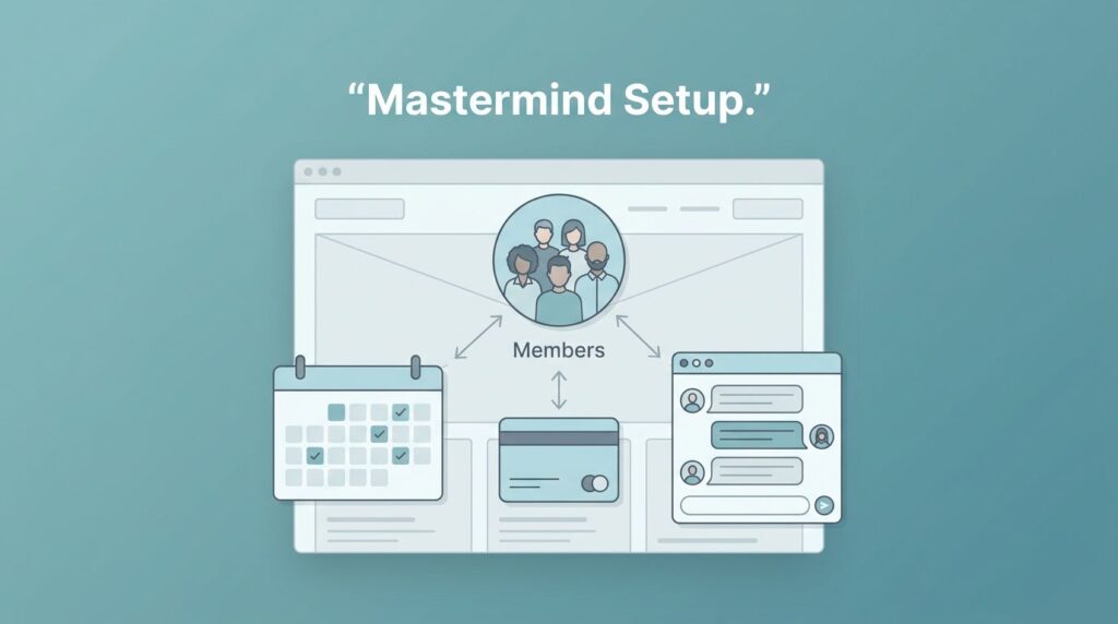
Connect Stripe and shape the member flow
MemberSpace uses Stripe for payments, so I connect that next. I start in the MemberSpace dashboard under payments, link the Stripe account, and test the checkout path before I announce anything. I keep my Stripe and MemberSpace integration guide open while I do it, because a rushed payment setup creates avoidable headaches.
After that, I map the customer journey. I want it to feel like a straight hallway, not a maze.
- A visitor lands on the public newsletter page.
- They click the sign-up link for the plan I created.
- Stripe handles the payment.
- MemberSpace grants access to the gated page or archive.
- The welcome message tells them where to go next.
I like that flow because it is easy to test. I can use a second browser, buy my own plan, and confirm the access rules in a few minutes. If something breaks, I know exactly where to look.
I also check the sign-up link itself. MemberSpace gives each plan a unique link, and I add that link to buttons, site banners, and launch emails. One clear button works better than five scattered ones.
Run the site archive and email side together
A paid newsletter needs both a home and a habit. The site archive gives people something they can revisit. The email side keeps the offer alive between visits.
I use the website for the content library, then use email to bring people back into it. MemberSpace’s Member Messages feature is useful when I want to send updates to subscribers without leaving the membership system. If I want a broader email workflow, I connect outside tools like Mailchimp or ConvertKit through automation.

That split gives me a clean rhythm. The archive holds the value. Email delivers the nudge.
For example, I might publish the full issue on a locked page, then send a short subscriber note that points to it. Or I might use email for a quick paid-only announcement and save the full write-up on the site. Either way, the reader knows where to find the content later.
I also like to keep old issues easy to scan. A simple member homepage with links to previous newsletters makes the product feel larger than one weekly send. It turns the subscription into a small library, not a one-off email.
Launch with a small list and a short checklist
I never launch a paid newsletter with a complicated stack. I launch with a short list, a tested paywall, and one clear offer.
My final checklist looks like this:
- The public sales page explains the promise in plain language.
- The private newsletter URL is locked.
- Stripe is connected and the test payment works.
- The sign-up link goes to the right plan.
- The welcome message points members to the archive.
- The first issue is already written or scheduled.
I also test the access flow on mobile. A lot of readers will sign up on a phone, and a cramped checkout page can kill momentum. If the page reads well on a small screen, I know I am close.
One more thing helps. I keep the first launch small on purpose. A paid newsletter does not need a massive audience on day one. It needs a clear reason to pay and a reliable way to receive the content.
Conclusion
A paid newsletter is easier to launch when the site, payment flow, and email plan all fit together. MemberSpace works well because it lets me gate the content I already own, charge through Stripe, and build a subscriber path that stays simple.
I get the best results when I start with one offer, one archive, and one checkout path. That is enough to turn a newsletter from a loose idea into something people can pay for and return to every month.