A search chart can fool me if I read it too fast. On Exploding Topics, I treat search volume history and search volume trends like a tide chart, not a scoreboard.
It shows me when interest rises, when it stalls, and when it starts to fade. That matters because marketers need timing, founders need proof of motion in historical search volume, and content teams need a clean signal before they spend weeks on the wrong idea.
I don’t trust one spike, and I don’t trust one tool by itself. I use the graph to spot direction first, then I test the meaning.
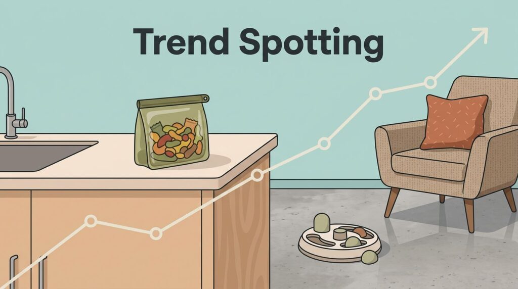
Key Takeaways
- I read search volume history like a tide chart, focusing on the shape—rising lines, repeated climbs, and a solid base—over single spikes or final numbers.
- I keep data honest by checking for seasonality (compare to last year), related terms, broad vs. narrow growth, and assuming a small data lag.
- Exploding Topics shines for breakout growth and long-term movement with absolute volumes; I use Google Trends for quick comparisons and relative pulses.
- I turn clean signals into action: time content around peaks, build keyword clusters on steady rises, and spot product demand in buying-language trends.
- I pair charts with market scans and never treat one tool as ground truth—repeated movement beats noise every time.
What I look for in a search volume history chart
When I open a topic page, I ask three things. Is the line rising, is the rise repeated, and is the base big enough to matter?
A slow climb over months often tells me more than a huge monthly search volume at the end. The shape matters because shape shows behavior. What matters more, the final number or the shape of the line? For me, the shape usually wins.
As of April 2026, Exploding Topics makes this easier with topic graphs, growth percentages, and category lists. That helps me move from a vague hunch to a real pattern in the search volume data.
Search volume history and historical metrics become useful when I read it like a story. A flat line says the topic may be stuck. A smooth slope says demand is building. A saw-tooth pattern often points to seasonal keywords, which means the topic may return each year instead of disappearing.
I also watch for breakout growth. That’s usually a small term that moves fast from a low base. On Exploding Topics, the Exploding label is my cue to slow down, not speed up. I want to know why the curve changed.
If I want a broader business angle, I cross-check with how I spot trending business ideas. That keeps me from mistaking curiosity for demand.

How I keep the data honest
I treat every trend chart as search demand trends. It points me somewhere, but it doesn’t hand me a final answer. Search data can lag, estimates can shift in tools like Google Keyword Planner, and a topic can look bigger or smaller depending on how sources like Google Ads data group terms.
A single spike can be noise. Repeated movement is what I trust.
I check three things before I act. First, I compare the line against the same period last year. If the curve repeats, I mark it seasonal. Second, I look at related terms, because people rarely use the same phrase in the same way. Third, I ask whether the rise is broad or narrow. Broad growth usually feels more durable.
I also assume a small data lag between real-world buzz and the chart. That’s normal. It means brand-new topics need extra caution, while older trends supported by historical data can be read with more confidence.
For a wider sanity check, I compare the chart with How to track trends and a quick scan of search results, forums, and buyer comments. I don’t treat one chart as perfect ground truth. I treat it as one strong signal in a larger pattern.
When I use Exploding Topics instead of Google Trends
Sometimes I want absolute growth history as a time series chart. Other times I want a fast relative pulse. The difference matters more than people think.
Here’s the shortcut I use.
| What I need to know | Exploding Topics search volume history | Google Trends |
|---|---|---|
| How much interest changed | Shows average monthly search volume history and growth over time | Shows relative interest on a 0 to 100 scale |
| What it’s best for | Breakout growth, long-term movement, rough size | Quick comparisons and short-term interest |
| How it helps with seasonality | Repeated peaks are easy to spot in one topic | Great for pattern checks, but normalized |
| My usual use case | Topic vetting, product ideas, and content timing | Fast validation and cross-checks |
I use both, but I let each answer a different question.
When I want to compare two or three terms quickly, Google Trends is handy. When I want the longer story behind one topic, Exploding Topics, a keyword research tool, gives me more context. If I want a plain-English refresher on relative interest, I keep Google Trends search volume explained open in another tab.

What I do with the signal
Once the line looks real, I turn it into work as part of my larger SEO strategy.
For keyword research, I start with a seed keyword and use history to judge whether a topic can support a page cluster of long tail keywords or just a one-off post. I check keyword difficulty and competitor keyword research to decide if it is worth pursuing. A steady rise means I can build around it with more confidence to capture organic traffic, and I often pair that with finding early low-comp keywords so the page has room to rank.
For content planning, search volume history helps me time the calendar. If a topic peaks every fall, I publish before the rush, not during it. That gives search engines time to index the page and gives readers something useful before everyone else piles in. The calendar works best when I match it to a real curve, not a guess.

For product research, I look for terms that move from curiosity into buying language. Words like pricing, tool, review, or alternative often signal action. That is where I compare the trend with tracking new ecommerce niches, because founders care less about buzz and more about whether people will pay.
I also use history for trend spotting. If the curve keeps climbing, related terms branch out, and the use case gets clearer, I pay attention. That can point to a new workflow, a new category, or a new service line. It can also tell me to wait. Waiting is a strategy when the data still looks thin.
Frequently Asked Questions
What should I look for in a search volume history chart?
I check three things: Is the line rising? Is the rise repeated? Is the base big enough? Shape matters more than the final monthly volume—a slow climb or smooth slope signals building demand, while saw-tooth patterns hint at seasonality.
How does Exploding Topics differ from Google Trends for search volume?
Exploding Topics shows average monthly search volume history and growth for breakout trends and long-term stories. Google Trends gives relative interest (0-100 scale) for quick comparisons and short-term checks. I use both: Exploding Topics for topic vetting, Google Trends for validation.
How do I avoid being fooled by search volume spikes?
A single spike is often noise; I trust repeated movement. I cross-check against last year for seasonality, scan related terms, and assess if growth is broad or narrow. Always assume data lag and pair with market scans like forums or buyer comments.
When should I act on a search volume trend?
Once the curve looks real—steady rise, breakout from low base, or seasonal repeat—I move. For content, publish before peaks; for keywords, build around steady climbers; for products, watch buying terms like ‘review’ or ‘pricing’. Wait if data feels thin.
Why focus on historical search volume shape over absolute numbers?
Shape tells the story: flat means stuck, slope means building, repeats mean seasonal. It helps time decisions for marketers, founders, and content teams. Absolute numbers can shift with data sources, but patterns reveal real behavior.
The pattern I trust most
I don’t use search volume data to predict the future with perfect accuracy. I use it to see motion early and to understand how that motion behaves. Direction, seasonality, breakout growth, and lag all matter.
When I pair Exploding Topics with a second check, usually Google Trends or a quick market scan, I get a cleaner view of traffic trends. That keeps me from chasing noise and helps me move while the signal is still young.