If I already have a website, I don’t want to rebuild it just to sell access. I want a membership platform that fits the site I have, protects the content I care about, and keeps the buying path short.
That is why MemberSpace keeps landing on my shortlist. It adds memberships to an existing site instead of forcing a full migration, which matters when I already have pages, design work, and search traffic in place. The real decision is whether that model fits my business, or whether I need something more closed and community-driven.
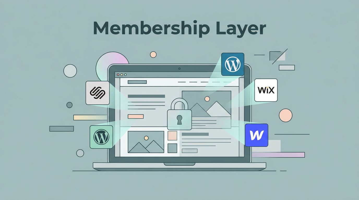
Why I start with the website I already have
MemberSpace works as a layer over my current site, not as the place where my content lives. I connect it to Squarespace, WordPress, Wix, Webflow, or another site, then choose which pages, posts, files, or sections stay behind a login. The public site stays mine, and the member side feels like part of the same brand.

That matters because I keep control of the design, navigation, and SEO structure I already built. I also avoid the awkward handoff that happens when members are sent to a separate campus just to sign in. MemberSpace even lets me rename the floating button, so “Students” or “Members” fits the offer better than a generic login label.
On Squarespace, I can pair that setup with adding a paywall to Squarespace, and I do not have to abandon the site I’ve already built. I still need the right Squarespace plan for code injection, but that is a smaller move than a full rebuild. Stripe handles the payment side, so the checkout flow stays familiar if I already use it.
Where MemberSpace fits best
I reach for MemberSpace when the offer lives inside my current website. Courses are an obvious fit, but so are paid newsletters, private resource libraries, client portals, member directories, and podcast content that should sit behind a login. I have also seen it work well when a business wants recurring billing for a small knowledge product without turning the whole brand into a classroom.
The access model is flexible enough for different offers. I can use free or paid memberships, set trials, accept Apple Pay or Google Pay, and let people sign in with Google Login. I can also drip content over time, which helps when I want a paced onboarding path instead of a giant pile of files on day one. For paid communities, I like that members can comment, bookmark, and search inside the protected area, because those small details keep the space usable.
If the offer needs a clear path, I map the structure first and then connect each plan. I keep a guide open for planning your membership pricing ladder so I do not create a messy bundle of overlapping plans. A simple ladder is easier for me to sell and easier for members to understand.
How I build a pricing ladder that members understand
Before I worry about design, I look at the math. On the current base plan, MemberSpace starts at $25 per month plus a 4% transaction fee on membership sales. That works for higher-value memberships, coaching programs, premium libraries, and courses where each member is worth enough to absorb the fee. It feels heavier if I want a very low-priced offer with thin margins.
I also decide whether my pricing needs to stay monthly, move annual, or include a free tier. The platform can handle more than one access level, but I still need to make the ladder easy to explain. If I cannot describe the difference between tiers in one breath, I have probably added too much complexity.
I never divide refunds by all payment attempts. Failed cards, retries, and duplicates blur the picture.
That rule keeps my reports honest. I use successful payments in the denominator, because that is the cleanest way to see how often I actually gave revenue back. Then I watch refunds two ways. The count-based refund rate shows how often people ask for money back. The amount-based refund rate shows how much revenue left my account.
A $10 partial refund and a $500 annual refund both count as one event, but they do not hurt the business the same way. I log refunds by the month they were issued, not the original sale month, so my report matches cash movement. If the count rises, I look for confusion, bugs, or a promise that did not match the product. If the amount rises, I know a few expensive refunds are doing the damage.
The tradeoffs I compare before I commit
If I know the offer needs more community energy than site control, I compare it with launching a successful membership on Skool. That keeps me honest about what I actually need. A platform decision is easier when I stop asking which tool has more features and start asking where members will spend their time.
| Platform | Best fit | Main tradeoff |
|---|---|---|
| MemberSpace | I want to keep my existing site and add gated content, subscriptions, or client portals | I pay an extra transaction fee and still rely on Stripe |
| Squarespace Member Areas | I want a native membership tool inside Squarespace | I stay inside one ecosystem, so flexibility is narrower |
| Skool | I want a community-first classroom with posts, events, and daily interaction | I give up some website control and move the member experience elsewhere |
That table usually tells me enough. I choose MemberSpace when I care most about brand control and keeping my current site intact. I choose Squarespace Member Areas when I want the simplest native path inside Squarespace. I choose Skool when the offer is really a community with lessons attached.
For video-heavy offers, I also pay attention to how the content will be priced and delivered. If the format is a course, a podcast archive, or a resource vault, the platform has to match that shape. A bad fit shows up fast when members cannot find what they bought.
What I watch after launch
Once the first members join, I stop judging the platform by the sales page alone. I watch the billing flow, the login flow, and the habits that show up after week one. A membership platform can look polished and still leak money through failed cards or messy access rules.
I keep an eye on successful payments, refund count, refunded amount, and failed charges. Failed payments matter because they can quietly eat into monthly recurring revenue and create involuntary churn. That problem often looks small on a dashboard before it becomes expensive. If a platform hides billing noise, I notice that problem quickly.
A gated site also needs basic protections. I compare my setup with tips to secure a membership site and keep the boring controls in place, like stronger passwords, tighter login rules, and better access hygiene. If members can open PDFs, lesson pages, or client files, I do not treat security as an afterthought.
For growth, I pay attention to onboarding and member habits as much as the sale itself. Membership growth strategies for associations is a useful reminder that retention starts long before renewal day. A clear welcome flow, a first quick win, and a simple content path do more for retention than a crowded dashboard ever will.
Conclusion
When I choose a membership platform, I start with the site I already have. MemberSpace stays attractive because it lets me add gated access without turning my business into a migration project.
It fits best when I want control, a clean checkout path, and flexible content types. The tradeoff is clear too: I pay for that flexibility, I still depend on Stripe, and I need to decide whether a native Squarespace tool or a community-first platform like Skool fits the offer better.
If I want a membership that feels like an extension of my brand rather than a detour, MemberSpace is usually the first platform I test.