A SaaS dashboard can look healthy while the engine underneath starts to cough. I’ve learned that ARPU is one of the fastest ways to catch that drift.
When I track baremetrics arpu, I’m not chasing a vanity number. I’m checking whether each paying customer is worth more over time, or whether growth is getting thinner with every new signup. That’s where Baremetrics earns its place.
What Baremetrics ARPU tells me, and what it doesn’t
I think of ARPU as the average weight each customer adds to the revenue bridge. If the bridge grows stronger, pricing, packaging, and expansion are likely working. If it gets lighter, I know to look closer.
In plain language, ARPU means average revenue per user. In Baremetrics, it’s calculated as:
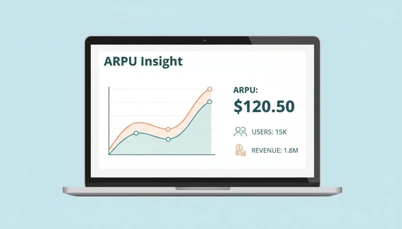
ARPU = MRR / active customers
That lines up with Baremetrics’ ARPU explanation and its ARPU Help Center article.
For example, if I have $30,000 in monthly recurring revenue and 1,000 active customers, ARPU is $30. That number sounds simple, because it is. Still, simple numbers can hide messy stories.

Here’s the quick way I separate ARPU from nearby metrics:
| Metric | What it shows | Why I use it |
|---|---|---|
| ARPU | Average revenue per paying user | Tracks monetization quality |
| ARPA | Average revenue per account | Better for multi-seat or team billing |
| MRR | Total recurring revenue each month | Shows overall subscription scale |
| LTV | Revenue expected over a customer’s lifetime | Helps judge acquisition spend |
The takeaway is simple. MRR tells me the size of the pie. ARPU tells me the average slice. LTV tells me how long the meal lasts.
This also means ARPU is not a stand-alone truth serum. If I only watch one company-wide average, I can miss discount-heavy cohorts, plan mix changes, or churn among larger accounts. That’s why I never stop at the top-line number.
How I set up ARPU tracking in Baremetrics
Baremetrics makes ARPU useful because it updates from live billing data instead of a tired spreadsheet. As of March 2026, it still supports automated dashboards, segmentation, Control Center views, Forecast+, Benchmarks, and integrations with tools like Stripe and Shopify.
My setup is usually short:
- Connect the billing source so MRR and customer counts flow in automatically.
- Check customer definitions so I’m looking at active paying customers, not free users.
- Open the dashboard trend view and compare ARPU against MRR and customer growth.
- Create segments by plan, region, source, or signup date.
That last step matters most. A blended ARPU can feel calm while one segment sinks like a stone.

I also like pairing ARPU with trend dashboards. The Baremetrics dashboard examples show why visual context helps. A flat ARPU line beside rising customer count tells a different story than the same ARPU beside falling upgrades.
For finance teams, I use ARPU in monthly reporting packs. For operators, I use it to test pricing changes and plan migrations. For founders, I use it as a smell test. If customer count jumps but ARPU slides, growth may be cheap, noisy, or hard to keep.
Control Center can also help explain sudden movement by showing transaction impacts. So if ARPU shifts after refunds, failed payments, or billing changes, I can trace the wobble back to something real.
How I analyze baremetrics arpu without fooling myself
Once tracking is live, the real work starts. I don’t ask, “Is ARPU up?” I ask, “Why did it move, and who moved it?”
The strongest ARPU analysis usually comes from segments. In Baremetrics, I can break results by geography, pricing tier, region, acquisition source, or signup date. That’s where patterns stop whispering and start speaking.

Here’s a common trap. ARPU can rise while the business gets weaker. If lower-paying customers churn first, the average may go up, even though total revenue health gets worse.
A higher ARPU is good only when it comes from better monetization, not from losing the bottom of your customer base.
I watch ARPU alongside churn, expansion, and customer count for that reason. Baremetrics also offers Forecast+ for cohort-based and driver-based planning, so I can model how ARPU changes might shape future revenue. Benchmarks add outside context when I want to see whether my pricing power looks strong or ordinary.
One more pitfall catches teams all the time. They confuse ARPU with ARPA. If one account carries many seats, ARPA may tell the sales story better, while ARPU explains user-level economics. I keep both in view when enterprise plans enter the mix.
I also build a short monthly review around one question: which segment improved ARPU, and was it healthy? If the answer is “annual prepay discounting brought in smaller customers,” I don’t celebrate too fast. If the answer is “core plans expanded and churn held steady,” then I lean in.
For a broader metrics frame, I also revisit Baremetrics’ SaaS reporting metrics. ARPU gets sharper when it sits beside the rest of the revenue picture.
A single number won’t run a SaaS company. Still, the right number can point a flashlight at the dark corner.
That’s why I keep baremetrics arpu near the top of my dashboard. If I want cleaner pricing calls, better reporting, and fewer spreadsheet surprises, I start there.
Pull your last 12 months, segment one customer group, and read the story under the average. That’s usually where the money is hiding.