When I look at SaaS revenue, I do not start with signups. I start with the people who pay, stay, expand, or leave. Baremetrics customer analysis helps me see whether those customers are healthy or quietly slipping away.
That matters because raw volume can lie. A busy top of funnel can hide weak retention, while a smaller base can build a stronger business. The useful answer sits inside the payment pattern, not around it.
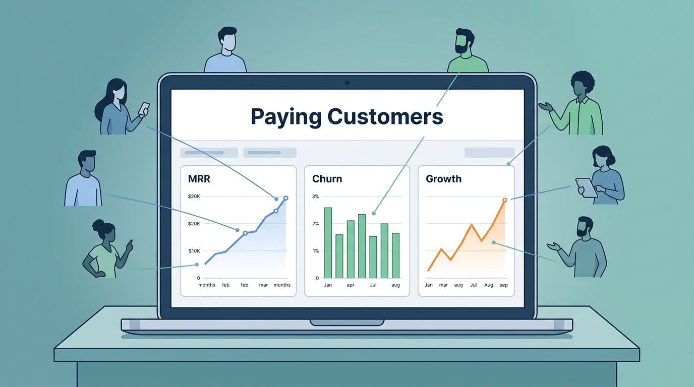
Start with the signals that change revenue
I keep my first view tight. If I spread attention across too many charts, I lose the thread fast.
At the top of my Baremetrics setup, I want the numbers that answer simple questions. Is revenue rising? Are existing customers growing? Are I losing accounts faster than I can replace them? Those are the figures that shape decisions.
I usually start with MRR, net new MRR, customer churn, and active customers. MRR tells me the current pace. Net new MRR shows whether growth beats contraction. Customer churn shows how many accounts I lose. Active customers tell me whether the base is widening or thinning out.
That is why I like having a clean layout before I look for patterns. I built a sharper view around how I organize my SaaS dashboard, because a messy screen makes good data harder to use.
One more thing matters here. I do not treat every metric as equal. Signups, page views, and trial starts can be useful, but they are not the same as paying customer behavior. Revenue gives me the truth. Everything else needs context.
Read customer quality, not just customer count
A growing customer list can still hide a weak business. A shrinking list can still support healthy revenue if the right accounts expand. That is why I keep customer quality in view.
Here is the kind of comparison I use when I want the numbers to tell a cleaner story.
| Metric | What I learn from it | Why I care |
|---|---|---|
| Signups | Top-of-funnel volume | It can rise while revenue stalls |
| Active customers | Current paying base | It shows real customer size |
| Customer churn | Accounts lost in a period | It reveals retention pain |
| Revenue churn | Dollars lost from cancels and downgrades | It shows how serious the loss is |
| Expansion MRR | Revenue gained from current customers | It shows product pull |
| ARPU | Average revenue per account | It shows pricing and mix shifts |
The table makes one thing clear. I do not want a dashboard that flatters me. I want one that tells me where money is growing, leaking, or concentrating.
That is also where critical SaaS performance indicators matter more than vanity numbers. When I compare revenue movement with customer counts, I can tell whether growth is broad or fragile.
Baremetrics helps here because the real-time view pulls these signals into one place. I can see when a new push lifts MRR, but also whether the lift came from a few large accounts or a wider base. That difference changes the next move.

Segment paying customers until the pattern becomes useful
Once I know the base story, I slice it by segment. That is where the details sharpen.
I look at plan tier, signup cohort, location, acquisition channel, and sometimes industry. Each cut can expose a different kind of customer behavior. A channel that brings in lots of accounts may still create weak retention. A higher-priced plan may churn less, but only if the product matches the use case.
This is where Baremetrics feels most useful for operators and finance teams. I can compare cohorts and see whether certain customer groups pay longer, upgrade faster, or drop off early. Then I can connect those patterns to product changes or campaign changes.
If I want a broader frame for this work, I also compare my questions with user behavior analytics best practices for SaaS. The main lesson is simple: the value comes from asking better questions, not from piling up more charts.
I also like to treat segment analysis as a test bench. For example, if customers from a paid search campaign cancel faster than referral customers, I do not blame the channel right away. I check onboarding fit, pricing, and activation path first. That keeps me from chasing the wrong cause.
Segment data is useful only when it changes a decision. If it does not point to a pricing, product, or retention move, it is decoration.
When I need to turn those segment patterns into a next step, I compare them with advanced user behavior analysis for SaaS. The idea is practical, not theoretical. I want segment data to lead to a test, a fix, or a sharper target market.
Turn cancellations into evidence
Cancellation reports are one of the best parts of Baremetrics, because they turn loss into something I can study.
I never accept churn at face value. A customer may say the price is too high, but the real issue could be weak onboarding, missing features, or slow support. Another account may cancel because the product no longer fits the team size. That is a different problem.
Baremetrics helps me collect cancellation reasons and pair them with account details. I can look at payment history, usage patterns, support history, and the revenue impact behind each exit. That gives me more than a list of goodbye messages. It gives me evidence.
The strongest use case is simple. If a small number of large accounts drive most revenue loss, I focus there first. If many small accounts leave for the same reason, I look for a product or messaging gap. That split matters because the fix is often different.
I also like to compare cancellation reasons with broader customer behavior studies, like tracking SaaS customer behavior to drive growth. It reinforces a point I see often. Retention work gets better when it starts with the actual behavior of paying customers, not broad guesses.
The goal is not to stop every churn event. The goal is to learn which kind of churn is expensive, which kind is normal, and which kind points to a fix I can ship.
Use alerts and forecasts to make the analysis operational
A good analysis means little if I only check it once a month. I want the data to pull me forward.
Baremetrics alerts help with that. If churn jumps, failed payments spike, or expansion drops, I want to know quickly. A short alert can save me from finding out too late, after the revenue dip has already spread across the month.
Forecasting matters for the same reason. Baremetrics Forecast+ uses recent history to project future revenue, and that helps me plan around more than hope. I can think through best case, base case, and worst case paths before I commit spending or hiring.
I use forecasts to test my own assumptions. If revenue growth depends too much on a few accounts, I know the runway is shakier than it looks. If expansion revenue keeps climbing, I can be more confident in next quarter planning. The forecast does not replace judgment. It gives me a cleaner starting point.
Annotations also help more than most teams expect. When I mark a pricing change, campaign launch, or product release, I can later see whether the revenue shift lines up with that event. Without those notes, I end up guessing at cause and effect.
I keep the analysis tied to the operating rhythm by revisiting the same view often, then checking whether the story changed. That is how customer analysis stops being a report and starts acting like a control panel.
Conclusion
When I analyze paying customers with Baremetrics, I stop chasing surface numbers and start reading the health of the business. The real story sits in churn, expansion, segment behavior, and cancellation reasons.
That shift matters because revenue quality is easier to manage than revenue noise. If I know which customers stay, which ones grow, and which ones leave for a real reason, I can make better calls on pricing, product, and retention.
Baremetrics works best when I use it as a lens, not a scoreboard. The more I focus on paying customer behavior, the faster the data turns into action.