I don’t want a financial dashboard that looks busy and says nothing. When I open a Baremetrics dashboard, I want the first screen to answer whether revenue is growing, whether churn is creeping up, and whether collections need attention.
For a SaaS business, those answers have to be visible in seconds. If I need to hunt through tabs, I lose the thread and the meeting.
This is how I shape the layout, choose the numbers, and use the view to make faster decisions.
What I want the dashboard to answer
I start with the questions that affect cash and growth. That means I want to know if MRR is moving in the right direction, if expansion is offsetting losses, and if failed payments are creating hidden drag.
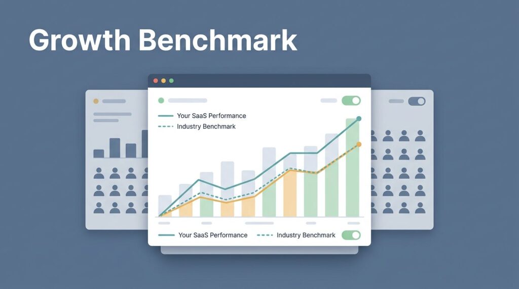
Baremetrics is one of the tools I use because it keeps subscription data in one place. The Baremetrics subscription analytics platform is built around the metrics SaaS teams watch most often, so I don’t have to stitch together a dozen spreadsheet tabs before I can see the shape of the business.
If I’m still setting up the foundation, I use how I set up Baremetrics dashboards as my starting point. I want the layout and metric names to match the way my team already talks.
If a metric can’t change a decision, I keep it off the first screen.
That rule keeps the dashboard lean. It also keeps meetings shorter, because the page points us toward action instead of trivia.
The layout I use in Baremetrics
I keep the layout simple. The top row holds the numbers I check first, the middle row shows the trend lines, and the bottom row gives me the context behind the change.
That structure works because it follows how I read the business. I scan the headline number, then I ask why it moved, then I look for the segment behind the change. I don’t want to solve the puzzle in reverse.
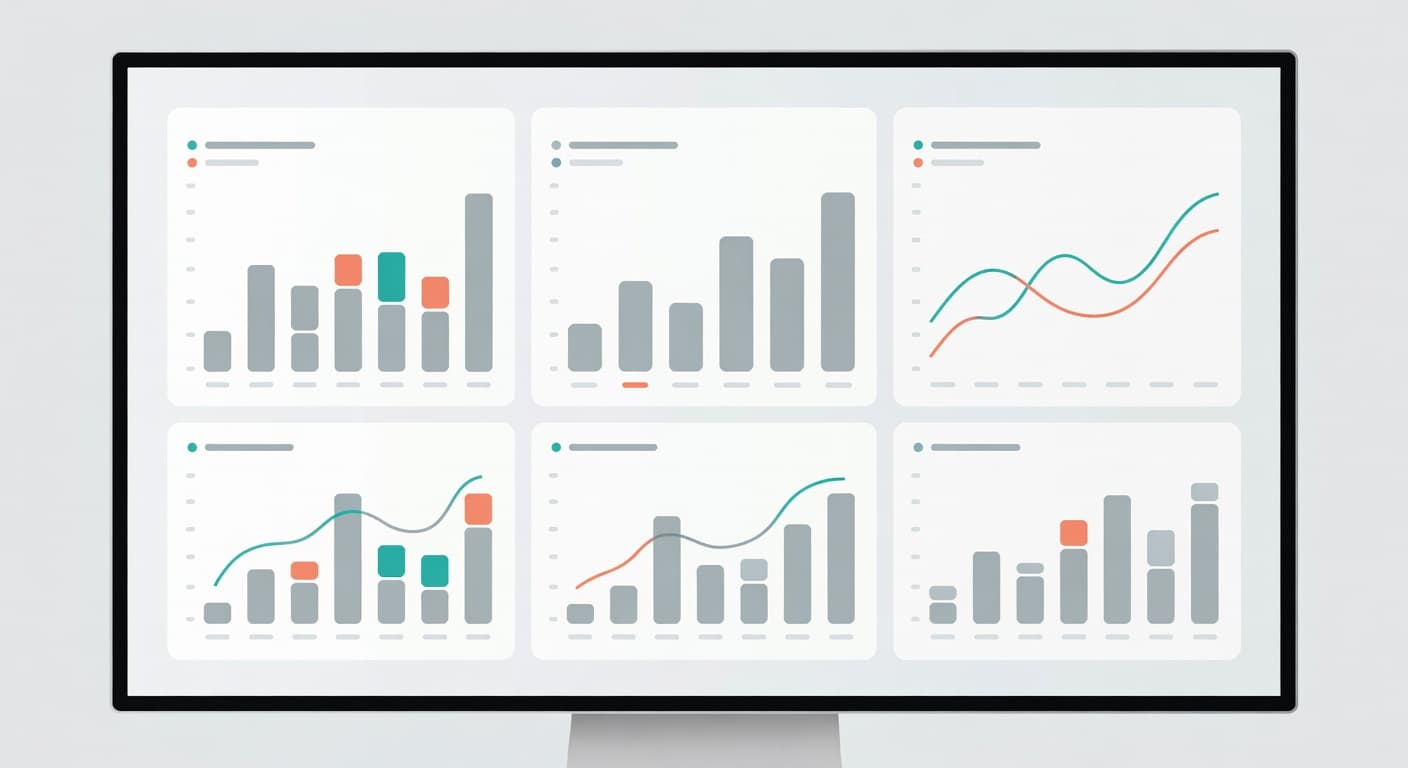
A good layout also protects the eye. I keep the chart style consistent, use the same time frame across panels, and avoid crowding the page with every possible metric. If a chart needs a long explanation, it belongs lower on the page.
Baremetrics’s SaaS dashboard examples follow that same idea. The best views don’t try to impress me with density. They give me a clean read on revenue health.
I also keep the time window consistent. A 7-day view is useful for billing issues and sudden drops. A 30-day view is better for board prep and monthly reporting. When I compare those views side by side, I can tell the difference between a blip and a real shift.
The metrics I put on the first screen
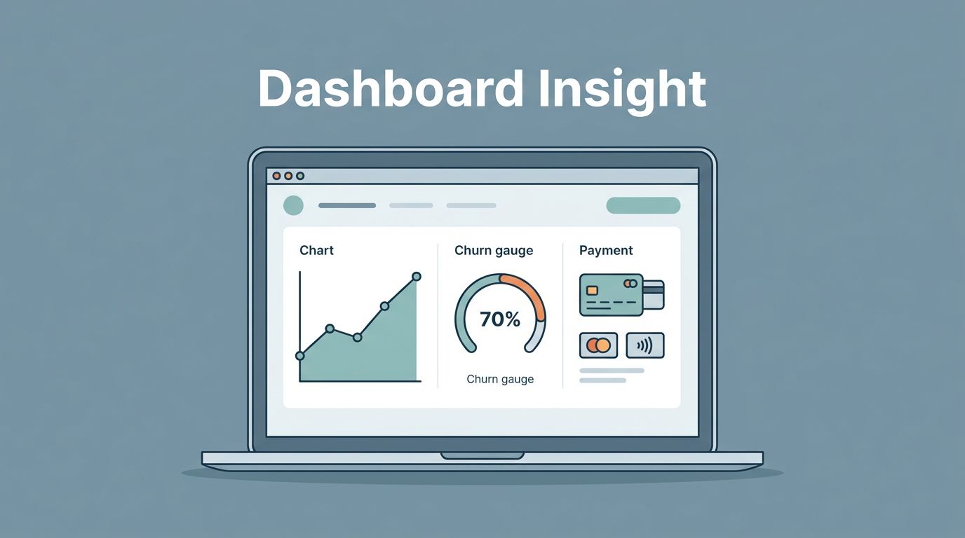
The first screen should feel like a cockpit, not a warehouse. I want a small set of metrics that explain the business without making me dig.
Here is the mix I use most often.
| Metric | How I display it | What I read from it | Usual next move |
|---|---|---|---|
| MRR | Current total with a 30-day trend line | Overall revenue direction | Check whether growth is steady or slipping |
| Net new MRR | Gains and losses under the total | Whether growth is real | Inspect upgrades, downgrades, and cancellations |
| Revenue churn | Monthly rate with a rolling line | How much recurring money is leaving | Break it down by plan and customer size |
| Expansion MRR | Upgrades by plan and cohort | Whether existing customers are growing with us | Review pricing, packaging, and upsell paths |
| ARPU | By plan and segment | Whether discounts are pulling revenue down | Tighten offer rules and discount policy |
| Failed payments | Count, amount, and recovery rate | Whether collections are slipping | Adjust dunning and follow-up timing |
That mix works because it covers both growth and leakage. A rising MRR line can hide churn if I don’t inspect the pieces under it. A strong expansion number can also hide weak new sales if I only watch the total.
When I want to go deeper on churn, I lean on the metrics I track to reduce churn. I care most about the split between revenue churn and logo churn. If one segment looks fine while another is bleeding, I want to see that difference fast.
A useful detail is to display churn next to expansion, not far away from it. That side-by-side view tells me whether growth is coming from new money or from existing customers buying more. It also tells me where to focus the next call with sales, success, or finance.
The weekly review I run
I use the dashboard the same way every week, because a repeatable process keeps me honest. If I change the order of the review too often, I miss patterns.
- I check MRR and net new MRR first. If the line changes, I want the reason before I look anywhere else.
- I compare churn with expansion. When churn outpaces upgrades, I know the business is leaking even if top-line growth looks fine.
- I split the view by plan, billing interval, and customer group. Annual and monthly customers often behave differently, so I don’t lump them together.
- I add notes for launches, outages, price changes, and payment issues. Without context, a chart can lie by omission.
- I assign one owner and one next step. If no one owns the issue, the dashboard becomes a wall of facts with no movement behind it.
That review flow works for founders and finance leaders in different ways. As a founder, I care most about growth quality and retention. As a finance lead, I pay closer attention to failed payments, collections risk, and whether the forecast still matches reality. Operators usually care about segment changes, because those hints show which customer groups need attention first.
Mistakes that make the numbers hard to trust
The biggest mistake I see is trying to fit too much onto one screen. If every metric gets equal space, nothing feels important. I want the eye to land on the numbers that can change the next decision.
Another mistake is mixing different churn measures without labels. Revenue churn and logo churn are not the same thing. One tells me how much money left, while the other tells me how many customers left. If I blur them together, I blur the problem.
I also watch for weak context. A spike in failed payments means one thing if it follows a renewal day and something else if it follows a product issue. The dashboard should leave room for notes, so I can connect the change to a real event.
Finally, I don’t let the page drift away from the billing source. If the numbers in the dashboard don’t match what the team sees in Stripe, Recurly, or the billing system, trust drops fast. A financial dashboard is only useful when people believe it.
Conclusion
A strong SaaS financial dashboard doesn’t try to show everything. It shows the few numbers that tell me whether the business is healthy, leaking, or gaining ground.
When I use Baremetrics this way, the dashboard feels less like a report and more like a working tool. The clearest view is the one that helps me act before the month closes.