A plan change can hide in plain sight. One customer upgrades, another downgrades, and a third moves to a different tier, yet the real story is buried unless I watch it closely.
That story matters because plan migrations shape expansion revenue, contraction, and churn risk. They also show whether pricing, packaging, and usage limits are doing their job or creating friction.
When I monitor Baremetrics plan migrations, I am not looking for busy charts. I am looking for signals I can act on before revenue slips away. The fastest way to read those signals is to pair migration data with the rest of the revenue picture.
Why plan migrations tell me more than a simple plan count
A raw count of plan changes tells me almost nothing. Ten upgrades in one month can be great, or they can hide a wave of downgrades that cancels them out.
I care about the direction of movement and the reason behind it. If customers move up because they hit usage limits, that points to healthy expansion revenue. If they move down after a price increase or a feature change, that points to contraction pressure. If they leave after a downgrade, I treat that as a churn warning.
I also connect plan movement to other SaaS metrics. I keep an eye on MRR, ARPU, churn, and NRR because a migration is only useful when I can place it inside a wider pattern. For that broader view, I use key SaaS metrics to track for churn reduction.
A downgrade is often a warning, but not always a loss. I treat it as a signal to inspect usage, timing, and price fit.
That mindset changes how I read the numbers. A downgrade from a high-touch plan to a lighter one may preserve the account. On the other hand, a downgrade followed by a cancellation often means the customer already decided the product no longer fits.
Plan migrations also help me separate product problems from pricing problems. If users upgrade after they adopt one feature, the feature may deserve more visibility. If they downgrade after they hit billing friction, the issue may be the offer, not the product.
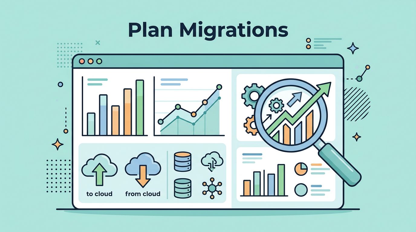
The Baremetrics features I rely on
Baremetrics already gives me the tools I need to track upgrades, downgrades, and plan switches without building a custom reporting layer. In 2026, the features I use most are segmentation, plan filters inside Cancellation Insights, usage revenue views, plan nicknames, customer profiles, and Forecast+.
I start with segmentation because it lets me compare plans side by side. That matters when one tier behaves well and another leaks revenue. I can look at churn, upgrades, and downgrades by plan, then spot the outlier fast. Plan nicknames also help because internal team language is often clearer than raw product labels.
Baremetrics Cancellation Insights is useful when I want to know why people leave by plan. If one plan has a high cancellation rate, I want to know whether the cause is price, missing features, or a mismatch with how the customer uses the product. Usage Revenue adds another layer, because it shows metered or usage-based revenue and lets me segment by plan. That helps me see whether heavy usage is creating natural upgrade pressure.
I also keep my dashboard simple. A cluttered view slows me down, so I focus on the numbers that reveal movement first. I use the same structure across reports, then I compare the story with my Baremetrics dashboard setup. When I need to tighten the layout, I use how I track MRR and retention in Baremetrics as a reference point.
Customer profiles and history matter too. A plan change makes more sense when I can see the timeline around it. A support ticket, a feature launch, or a payment issue can explain the movement better than the migration itself.
My weekly review process for plan changes
I check plan migrations on a schedule, not when I feel like it. That keeps me from reacting to noise.
- I start with the biggest movement first. I look at upgrades, downgrades, and switches for the week or month, then compare them with MRR movement.
- I split the data by plan. This helps me see which tier is healthy and which tier is under strain.
- I open customer history for the outliers. A single large account can distort the picture, so I check the account timeline before I make a call.
- I compare the movement with revenue impact. If upgrades rise but contraction also rises, I want to know whether the product is growing or simply reshuffling spend.
This process keeps me focused on business decisions instead of vanity counts. It also helps me spot when a trend needs action from finance, product, or support.
For example, if downgrades cluster right after renewal, I look at pricing communication and value delivery. If upgrades cluster after a feature rollout, I look at onboarding and in-app prompts. If switches happen often between two plans with similar pricing, I ask whether the packaging is too confusing.
How I read common migration patterns
The same movement can mean different things depending on context. A clean way to read it is to tie each pattern to the likely business effect.
| Migration pattern | What I usually see | The decision it informs |
|---|---|---|
| Upgrade to a higher tier | More usage, better fit, or stronger feature demand | Expand the tier, reinforce the upgrade path |
| Downgrade to a lower tier | Price sensitivity, lower usage, or a missing feature value | Rework packaging, add guardrails, test pricing |
| Switch between monthly and annual billing | Cash flow preference or commitment change | Review discount depth and annual offer framing |
| Downgrade followed by cancellation | Weak adoption, budget pressure, or a poor fit | Improve rescue flows, look at churn risk by plan |
The table makes one thing clear. I do not read every plan change the same way. I read the sequence, the account value, and the timing.
If I want a second lens on the same pattern, I compare my results with subscription change analysis and this guide to upgrade and downgrade rates. Those references help me sanity-check the migration logic before I change a pricing page or announce a packaging update.
Baremetrics makes that review faster because I can move from the summary view to the customer record without stitching together spreadsheets. That saves time, but more importantly, it keeps me honest. I can see whether a plan move is a one-off event or part of a real pattern.
Turning migration data into better pricing decisions
Plan migration data is useful only when it changes what I do next. If I keep seeing upgrades on one tier, I ask why that tier works. If I keep seeing downgrades on another, I ask what the product is saying back to me.
Sometimes the answer is pricing. A tier may be too expensive for the value it delivers. Sometimes the answer is packaging. A plan may bundle features that do not belong together. Sometimes the answer is usage design. If customers upgrade right after they cross a usage threshold, that threshold may be doing its job.
I pay close attention to three decision points:
- Expansion revenue, because rising upgrades can show where customers are willing to pay more.
- Contraction, because downgrades can reveal value gaps or price pressure before churn starts.
- Churn risk, because repeated movement down the plan ladder often means the account is cooling off.
Forecast+ helps here because it lets me project what current migration trends may do to future MRR. I use that forecast as a check, not a promise. If upgrades are strong today but downgrades are accelerating, I do not want to mistake short-term growth for durable revenue.
The best pricing work I do starts with patterns like these. A plan that attracts upgrades may need a better annual option. A plan that draws downgrades may need a smaller entry point. A plan that loses customers after a billing jump may need a smoother transition or better education.
Conclusion
When I watch plan migrations closely, I learn how customers feel about the product without asking them twice. That is the value of Baremetrics plan migrations for me. It turns hidden movement into a clear read on expansion revenue, contraction, and churn risk.
The biggest lesson is simple. A plan change is not just a billing event. It is a message about fit, price, and timing. If I read those messages well, I can make better pricing choices and spot trouble before it turns into lost revenue.