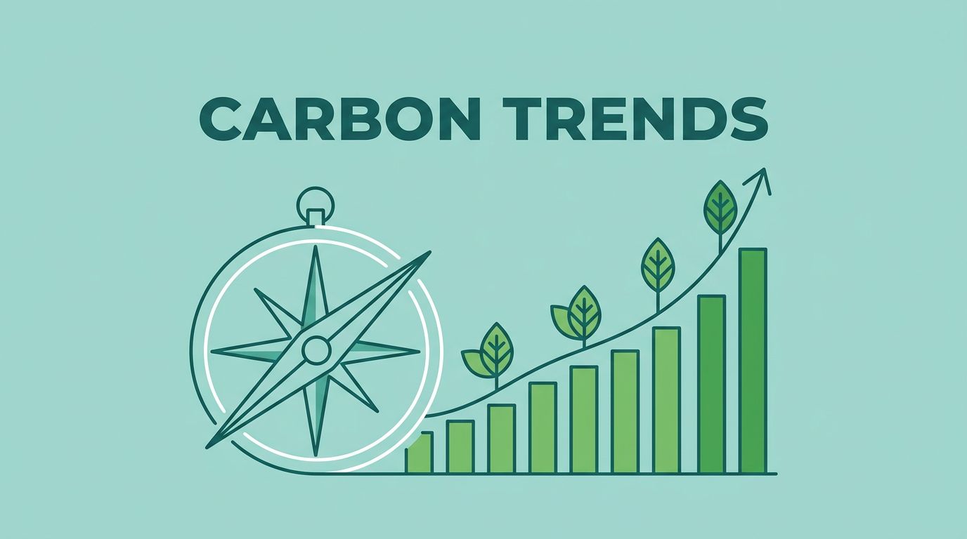
A rising chart can make a carbon offset program look safer than it is. I treat trend tools as a compass, not a stamp of approval. That matters in 2026, because carbon offset programs are getting more attention, and a popular project can still be weak on quality, transparency, or pricing.
When I want to find programs worth a closer look, I start with How I Use Exploding Topics Data to Spot Real Demand in 2026 and then test the story behind the curve. That keeps me from buying buzz instead of substance. It also helps me move faster, because I can skip weak ideas before I spend time on them.
I use trend signals as a filter, not a verdict
I begin with my Exploding Topics trend discovery process because I want early motion, not polished claims. A steady rise matters more than a noisy spike. If the curve climbs for months, I pay attention. If it jumps for a week and fades, I slow down.
I also compare nearby terms. One program can be a fluke, but a cluster tells a bigger story. If reforestation, peatland restoration, biochar, and direct air capture all start moving, I know buyers are circling a broader category. That matters because carbon offset programs are sold as a promise, but the market still behaves like a market.
I also watch the words around the trend. Search terms like pricing, retirement, registry, and verification tell me people may be close to buying. Curiosity words tell me the topic is still being watched from a distance. That difference saves me from mistaking attention for demand.

The screen may point me toward interest. The real work starts when I ask why that interest exists. Is it compliance pressure, brand pressure, or a genuine need for durable removals? I want the answer before I trust the headline.
What looks hot in carbon offset programs right now
Current 2026 coverage points to peatland restoration, reforestation, biochar, methane capture, and direct air capture. I see those themes in Mast Reforestation’s sold-out MT1 Biomass Burial Credits and in Carbon Credits’ report on Microsoft’s North Star deal. Those stories matter because they show where attention and budget are moving.
One example that caught my eye is Mast Reforestation’s MT1 Biomass Burial Credits, which sold out after issuance under Puro.earth. That does not make every biomass project strong, but it does show demand for durable removal stories. I also notice TIST Community Reforestation in Kenya and Climeworks Mammoth in Iceland because they sit at very different ends of the market, yet both draw serious buyer interest. A separate roundup like the 5 best carbon offset projects of 2026 shows the same split between nature-based and tech-based programs.
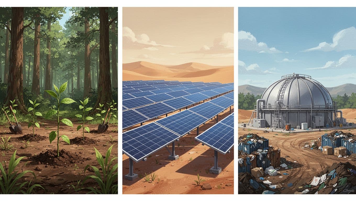
I don’t treat those categories the same. Nature-based projects often look familiar and easier to explain. Tech-based removals often look more durable on paper, but they can cost more and need tighter proof. Either way, I still check the same basics. Popularity can open the door, but it doesn’t prove quality.
What I check on a registry page
A project page can sound polished and still leave out the facts I need. So I open the registry record, not just the seller’s landing page. I want the project name, methodology, issuance date, vintage, and retirement status. If the record is hard to find, I slow down. If it isn’t public, I usually walk away.
I also look for a clean chain of custody. Who issued the credit? Who retired it? Was it sold once, or bundled and resold through a middle layer? Those details matter because carbon offset programs can look tidy on the surface while the paper trail gets messy underneath.
That registry check does one important job. It tells me whether the program can be traced after the marketing fades. If I can’t trace it, I can’t trust it.
My checklist for judging a program
Before I trust a carbon offset program, I put it through a simple filter.
| Criterion | What I want to see | What makes me pause |
|---|---|---|
| Verification standards | A named standard, like Verra, Gold Standard, Puro.earth, or Isometric | Vague claims about being “verified” |
| Project type | Clear method and clear use case | Broad climate language with no details |
| Additionality | Credit revenue helps the project happen | The project would likely happen anyway |
| Permanence | Long-term storage or a strong reversal plan | Short-lived storage with no backup |
| Leakage risk | The project addresses displaced emissions | Harm moves somewhere else |
| Registry transparency | Public serial numbers, issuance, and retirement records | Hidden records or incomplete docs |
| Pricing transparency | Price per ton, fees, and vintage are visible | Bundle pricing with no breakdown |
| Corporate credibility | Named buyers, audits, and specific claims | Big logos with thin evidence |
I read that table like a buyer, not a fan. If the project cannot answer those questions, I move on. I want a program that can explain itself without a sales gloss.
Trend interest tells me where attention is moving. It does not tell me whether a credit is durable, verified, or fairly priced.
The details behind the label
Additionality matters because I want to know whether the credit changed the outcome. Permanence matters because carbon storage should last, not fade with the next fire, storm, or policy shift. Leakage risk matters because emissions can move, even when a project looks clean on paper.
Registry transparency is where I often separate good marketing from real proof. I want to see the registry name, the project ID, vintage, and retirement status. Pricing transparency matters too, because a buyer should know whether the listed price includes fees, overhead, or a markup.
Corporate credibility closes the loop. A company with a clear method, named partners, and public documentation feels safer than a brand that only says “eco-friendly” and leaves the rest fuzzy. That is why I look for plain language and verifiable records, not just polished pages.
These are the warning signs I move past fast:
- No project ID or registry link.
- “Verified” with no named standard.
- Price shown without fees or vintage.
- Corporate pages full of logos, thin on proof.
What stays on my shortlist after the noise
After I run a program through Exploding Topics and my own checklist, I usually end up with fewer options, not more. That is a good thing. The loudest program is often the easiest to find, but the best one is the easiest to verify.
When I use carbon offset programs as a search topic, I want real signals, real documents, and real pricing. A rising chart is only useful when it leads me to a program that can stand up to scrutiny. The rest is just noise.