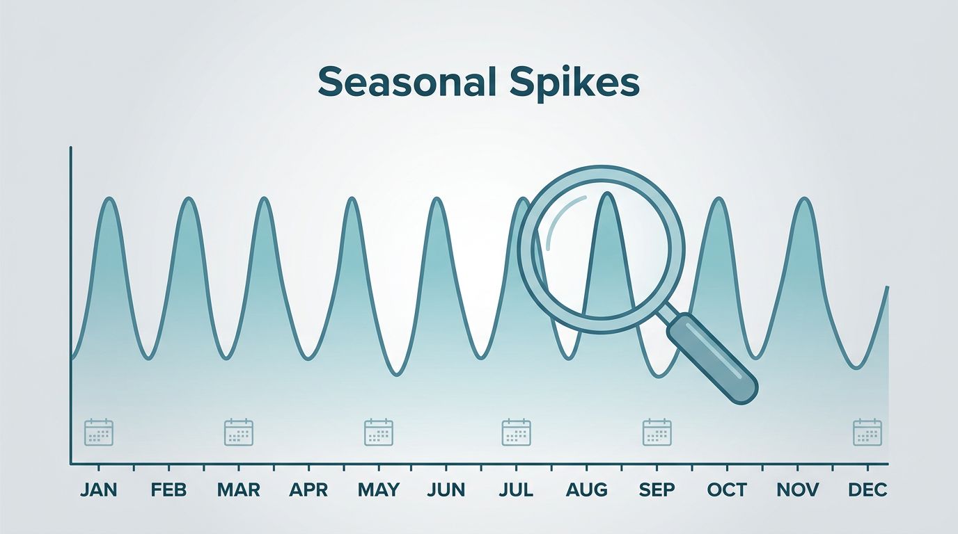
Seasonal demand hides in plain sight. A line chart can show it, if I read the curve instead of staring at the peak.
When I track Google Trends seasonal demand, I look for repeating patterns that come back year after year. That helps me time content, products, ads, and forecasts with more confidence.
The hard part is separating a true seasonal wave from a one-time flash. I watch the shape, the filters, and the context before I trust the signal.
How I read a Google Trends chart without fooling myself
Google Trends does not show raw search volume. It shows relative interest on a scale from 0 to 100, so the highest point in the range gets the top score.
That means I read the chart like a tide map. I care about when the water rises, how long it stays high, and whether the same shore floods every year.
A recurring spike in the same month is usually seasonal. For example, travel searches often build before summer, retail searches climb before holiday shopping, and home service searches rise when weather or budgets change. Google’s own Seasonal Search Trends by Industry summary shows how these patterns repeat across categories.
A one-off surge looks different. It rises fast, peaks hard, then drops without returning in the same season next year. That kind of jump often comes from news, a viral post, or a short event.
I trust a chart more when the same shape appears in multiple years, not when one week looks exciting.
The filters I change first
I start with four filters, because they change the story fast.
Location matters most when demand varies by climate or region. Air conditioner repair rises earlier in hot states. Snow gear spikes later in colder places. A national chart can hide that difference.
Category matters next. It helps me avoid mixed meanings, like a term that could be a product, a brand, or a broad topic. If I want home services, I narrow the category so the chart reflects buyers, not general curiosity.
Search type changes the signal too. Web search shows broad intent. YouTube search can show how-to interest. Shopping search is closer to purchase behavior. I use the type that matches the decision I care about.
Date range is the last piece. I check five years first, because it shows repeat patterns. Then I zoom into 12 months or 90 days to see if the curve is warming up right now.
I often pair that with my own validating trends before they peak process, because one spike can lie. Repeated interest usually tells the truth.
What seasonal spikes look like in real industries


The cleanest way to spot seasonal demand is to compare industries side by side. I use the same method every time, then I watch how the curve behaves.
| Industry | What the spike usually looks like | What I do with it |
|---|---|---|
| Retail | Holiday shopping builds in late summer and peaks in Q4 | I plan product pages and promos early |
| Travel | Searches rise before school breaks and summer trips | I publish landing pages before booking season |
| Home services | HVAC, roofing, and lawn care rise with weather shifts | I schedule service content before the rush |
| B2B | Budget cycles, compliance, and quarter-end planning create bumps | I time demos, case studies, and nurture emails |
Retail is the easiest place to see the pattern. When holiday demand starts climbing, I use that early rise as a signal to stock content and inventory first. Shopify’s Google Trends products guide is a useful reminder that buying interest often shows up before the actual sale window.
Travel works the same way, only faster. I see interest move before flights and hotels fill up. Google’s travel trends page is a good example of how travel searches can heat up before the season arrives.
Home services are tied to weather and money flow. Air conditioning repair rises with heat. Interior projects often get a boost after tax refunds. I watch for those bumps because they can support service pages, local ads, and seasonal offers.
B2B demand looks softer, but it still has seasons. Budget planning, renewals, audits, and compliance deadlines can push search interest in clear waves. When I see that pattern, I plan content and sales outreach around business calendars, not the weather.
I also keep this section connected to my using trend data for launch calendars process, because timing matters more than size.
How I turn the pattern into a content, product, and ad plan
Once I trust the trend, I move from observation to action.
For content, I publish before the peak. If holiday searches rise in September, I want pages live by late summer. If travel interest builds in March, I want trip guides and landing pages ready before people book.
For product planning, I use the curve to decide what to stock, bundle, or delay. A seasonal retail item needs a longer runway. A service offer can move faster, but it still needs a landing page before the rush starts.
For ads, I avoid waiting until the peak. By then, costs often rise and attention gets crowded. I prefer to start as the curve turns up, then increase spend when the signal stays stable.
For forecasting, I compare the search curve with traffic, leads, and sales. If Google Trends rises first and my numbers follow, I know I picked up a real pattern. If the trend rises but my business data stays flat, I dig deeper.
When I need keyword ideas for that next step, I pull from low competition keywords from trends and build around the season, not just the head term.
That approach keeps my plan simple. I stop guessing and start working backward from the moment buyers are most ready.
Where Google Trends can mislead me
I never treat Google Trends as a forecast on its own. It is a map, not the trip.
Low-volume terms can look messy or flat, even when the business case is real. Short-term spikes can also fool me, especially when news or a viral post bends the chart for a few days. That is why I prefer repeatable patterns over dramatic jumps.
Location can skew the result too. A weather event in one region can make a term look national when it is really local. Category choice can do the same thing if the term has more than one meaning.
I check the trend against sales data, search console data, ad results, or CRM notes before I act on it. If the curve and the business numbers point in the same direction, I trust the signal more.
The pattern I trust most
I keep coming back to the same rule. A seasonal spike matters when it repeats, fits a real buying cycle, and shows up in the right filters.
That is how I spot demand before it feels obvious. The chart gives me the shape, but the business plan comes from the shape plus timing.
When the same rise shows up every year, I do not call it noise. I plan around it.