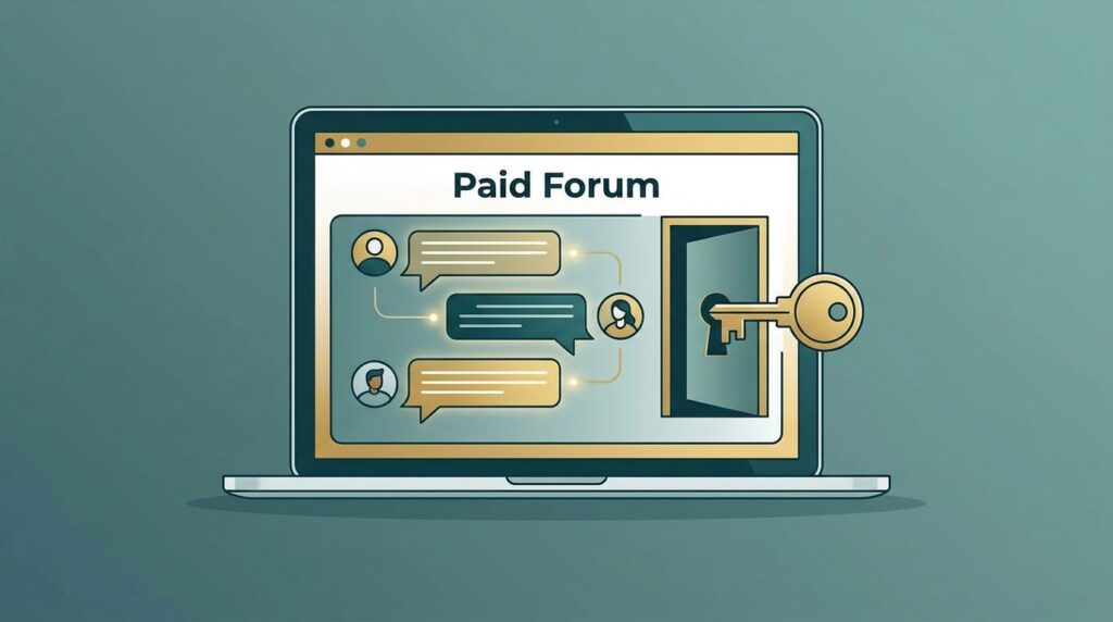
I build a membership marketing funnel in MemberSpace by treating it like the lock on a door, not the whole house. The pages outside the platform do the convincing, and MemberSpace opens access after the sale.
That separation matters because MemberSpace works on top of an existing website. I can sell subscriptions, trials, bundles, or group access, then unlock the right content the moment payment clears.
Once I accept that structure, the funnel gets much easier to plan.
Start With One Offer and One Audience
I start with one person, one promise, and one payment path. If I cannot explain the offer in one sentence, I am not ready to build pages yet.
The same planning mindset shows up in MemberSpace’s membership marketing plan, and I use that logic before I touch design. I want to know who I am speaking to, what problem they are trying to solve, and why a membership beats a one-off product.
If I need more than one tier, I map that structure first. My own guide to building membership levels fits that step, because tiered plans need a clean ladder before they need copy.
For a solo creator, that might mean one monthly plan and one annual plan. For a B2B membership, it might mean a company-paid plan with employee access behind it. In either case, I keep the offer simple enough that a stranger can understand it in a few seconds.
MemberSpace helps most when I decide where each piece belongs. I might put courses in one Space, community in another, and a newsletter archive in a third. That way, the funnel points to a real destination instead of a vague promise.
I only build one clean path first. If that path converts, I add the next step.
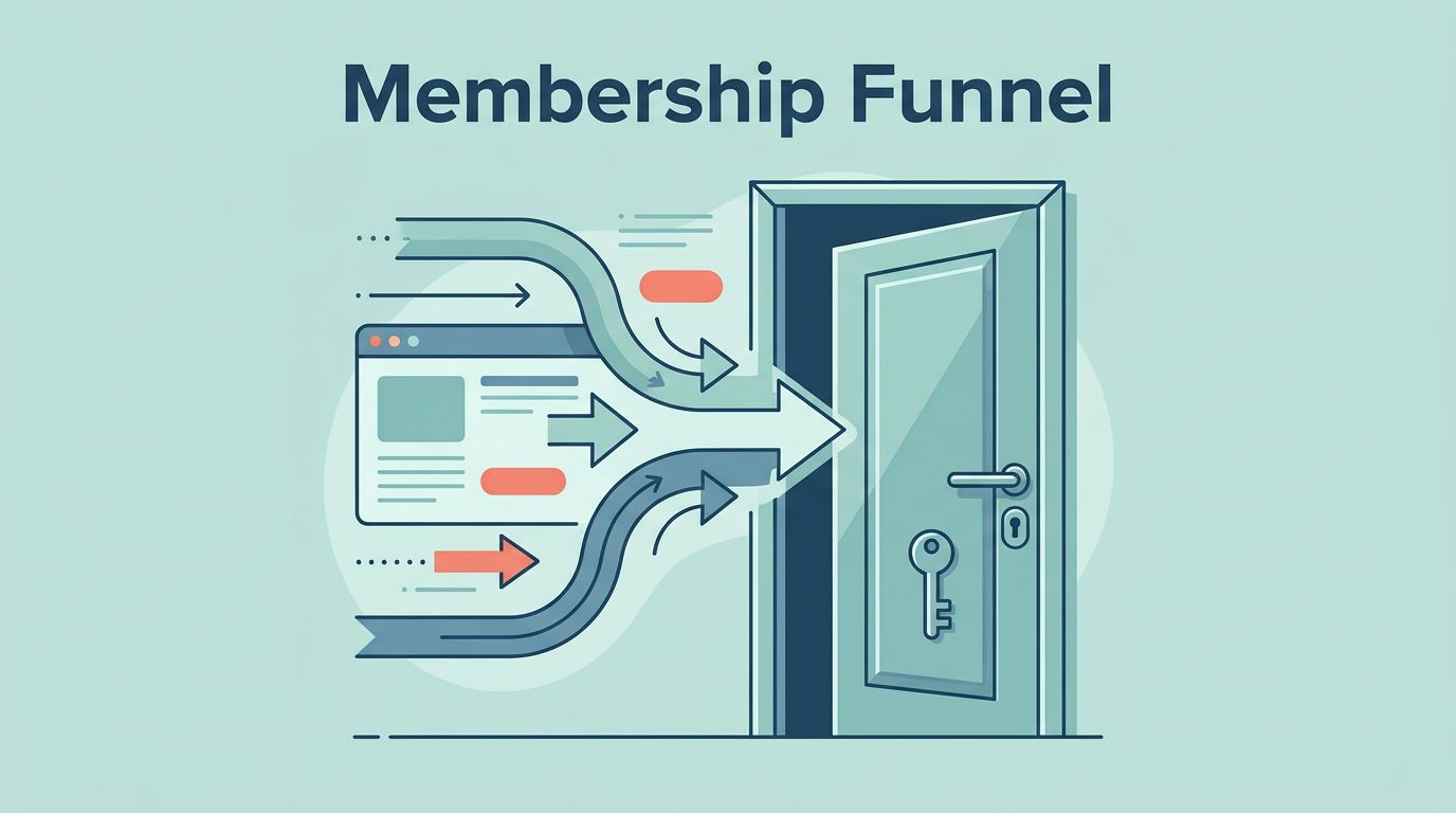
Map the Funnel Before I Build Pages
I like to sketch the full journey before I open a page builder. The standard flow is simple: traffic comes in, a lead magnet captures attention, emails build trust, the sales page makes the case, checkout closes the sale, and MemberSpace grants access.
That sequence matches the usual membership funnel logic in Raklet’s funnel guide, and it keeps me from skipping steps. If I jump straight to checkout, I usually pay for it later with weak conversions.
Here is the layout I use when I plan the funnel.
| Stage | What I build | What I watch |
|---|---|---|
| Traffic | Search posts, social clips, partner mentions | Click-through rate |
| Lead capture | Opt-in page with one promise and one form | Opt-in rate |
| Nurture | Email sequence with proof and examples | Open and reply rates |
| Sales | Sales page and pricing page | Scroll depth and sales clicks |
| Checkout | Payment flow tied to the right plan | Completion rate |
| Access and onboarding | Thank-you page, login, first task | Activation rate |
That table keeps me honest. If any stage feels vague, I fix it before I spend more time on design or ads.

I treat that map like a contract with myself. If the reader gets confused at one step, the funnel leaks there first.
Turn Traffic Into Leads With Opt-In and Sales Pages
My opt-in page does one job. It offers a small, clear reason to hand over an email address. I do not ask it to sell the full membership, because that usually turns the page into a cluttered mess.
For lead magnets, I keep things close to the paid offer. If the membership teaches business writing, I might offer a checklist or a sample template. If it teaches community building, I might offer a short planning sheet or a mini training.
The sales page needs more depth, but it still needs focus. I answer five questions there: who the membership is for, what is inside, what changes after joining, why I trust my own method, and what the price looks like.
A pricing page works best when it stays plain. I show the monthly and annual options side by side, then I make the value difference obvious. If I run a trial, I keep the trial terms right where people can see them.
The front end is also where I decide how much I want MemberSpace to do. If I need free members, email campaigns, or a preview tier, I plan for that early because the plan level matters. If I stay on a lighter setup, I send nurture emails through a separate tool and keep MemberSpace focused on access.
Connect Checkout to MemberSpace Access
This is where the funnel stops feeling theoretical. I connect payments first, then I connect access rules.
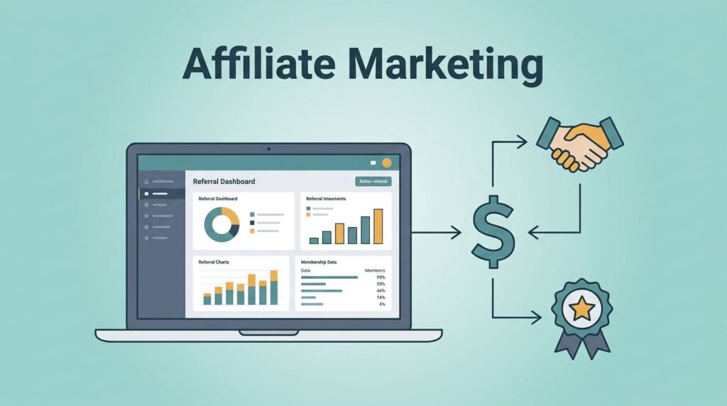
When I configure billing, I usually start with configuring Stripe recurring billing in MemberSpace. Stripe handles the money side, and MemberSpace links the purchase to the right plan or Space. That handoff needs to feel boring in the best way.
I also keep checkout friction low. On mobile, Apple Pay and Google Pay help a lot because they cut down on typing. A short checkout form usually beats a long one, especially when someone is already interested.
If I run a trial offer, I use MemberSpace free trials that auto-charge so the billing path matches the promise on the sales page. The trial should feel like a real start, not a vague maybe.
The thank-you page matters more than most people think. I use it to confirm the purchase, show the login link, explain what happens next, and point the new member to one first action. That page should calm the buyer, not make them guess.
Build Onboarding That Gets Members Moving
The first 24 hours decide a lot. If a new member lands in a quiet, empty space, they drift. If they land in a guided path, they start using what they bought.

I keep the welcome email short. It confirms access, tells the member where to start, and gives one clear next step. If I send too many links at once, the first login feels like a maze.
A good onboarding flow usually includes a welcome page, a quick-start lesson, and a first win within a few minutes. For a course, that might be module one. For a community, that might be an introduction prompt. For a resource library, that might be the most useful template.
If I use MemberSpace’s native email campaigns on the Professional plan, I keep the first messages simple. If I stay on a different setup, I send the same messages through Mailchimp, ActiveCampaign, or another tool I already trust. The format matters less than the timing and clarity.
I also watch for one thing after signup, activation. A paid member who never logs in is a warning sign. A member who completes the first task is much more likely to stay.
Keep Engagement Alive After Week One
Retention starts after the first excitement fades. That is where I focus on small, repeatable moments that pull people back in.
MemberSpace gives me a few useful tools here, including announcements, notifications, comments, and reactions. I use them to keep the membership alive without flooding people with noise. A weekly update, a short prompt, and one live touchpoint can do more than a pile of content uploads.
For B2B memberships, I keep the structure even cleaner. One company pays, employees get private access, and I give each team a simple path to join. If the company has an admin contact, I keep that person in the loop with updates and renewals.
I do not try to win retention with more content alone. I win it with rhythm. Members stay when they see the same faces, answer the same prompts, and get useful feedback on a steady schedule.
That is also where I pay attention to posting and response rates, not just signups. A smaller group that talks often is healthier than a larger group that never shows up.
Measure, Test, and Tighten the Weak Spots
I track the funnel in stages, because one big number hides too much. Opt-in rate tells me if the lead magnet works. Checkout completion tells me if the offer and pricing feel right. Activation tells me if onboarding has any real pull. Renewal tells me if the membership is worth keeping.
When one number drops, I fix the closest stage first. If opt-ins are strong but sales are weak, I sharpen the sales page. If sales are fine but members vanish after week one, I rebuild the welcome path.
I test one change at a time. A new headline, a tighter trial offer, or a shorter onboarding email can move the numbers more than a full redesign. Small changes are easier to read, too. I can see what worked and what did not.
I also check the journey on a real phone. If the page feels crowded on mobile, I cut it back. If the login link is hard to find, I move it up. If the first action takes too long, I shorten it.
A membership marketing funnel works best when the path stays clear from first click to first win. That is the part I return to every time.
Conclusion
I build MemberSpace funnels by keeping each stage honest. Traffic, lead capture, checkout, access, onboarding, and retention all need their own job.
When I make the path simple, the business feels calmer and the members move faster. The real win is not a bigger stack of pages, it is a cleaner path from interest to participation.
If I were starting today, I would build the opt-in page, the sales page, and the checkout handoff first, then layer on onboarding and retention once the path is working.