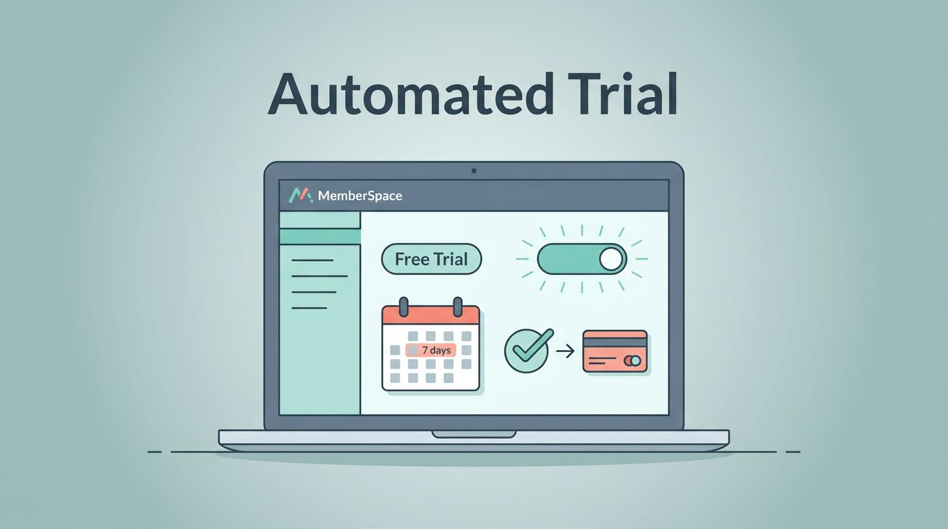
A free trial should feel like a door that opens by itself and closes on time. When I set up a MemberSpace free trial, I want the signup, access control, reminder emails, and upgrade step to run without me chasing each person by hand.
As of June 2026, MemberSpace’s own help docs show that I can set the trial length inside a plan and let the system charge the member when the trial ends. That gives me a clean base to work from, as long as I set the flow up with care.
What MemberSpace Automates for Me
MemberSpace already handles the parts I care about most. I can set a trial period, open access right away, and let the paid charge begin when the trial ends. The MemberSpace free trial docs make that setup clear, so I treat them as my starting point.
I also like that MemberSpace sends automatic emails for the start and end of the trial. That saves me from building a separate reminder system on day one. If I am still shaping the offer, I compare the member journey with my Skool vs Kajabi platform comparison, because it keeps me honest about whether I need a simple trial or a bigger course-style setup.
The Setup Sequence I Use Before Launch
I split the work into required steps and optional touches. I finish the required steps first, because they control whether the trial works at all.
- I create the Member Plan and name it after the offer, not the billing detail.
- I set the trial length to match the real value of the product. Shorter trials work when the win is quick. Longer trials work when the result takes more time.
- I set the paid price that starts after the trial ends.
- I decide exactly what the trial member can see. Guests should see enough to want in, but not enough to skip payment.
- I write one welcome email and one upgrade message. I keep each message focused on one action.
- I run a test signup before I publish. If the charge, access change, or email timing feels off, I fix it before launch.
Once I map the flow, I keep a simple mental picture of the trial path.
After the required steps, I add only the touches that make the trial easier to understand. A teaser page helps visitors see what they get. A short FAQ cuts down support questions. A clean member dashboard makes the experience feel deliberate instead of improvised.
How I Handle Access, Reminders, and Expiration
The middle of the trial flow matters most. That is where trust is built or broken.
MemberSpace’s current setup also gives me automatic emails around the trial start and end. The docs say I can extend a trial from Stripe when a real exception comes up, so I keep Stripe in the loop for edge cases and support issues. I do not use that as a routine fix for a weak setup. I use it when a real customer problem needs a real answer.
I keep the flow straight with a simple checklist.
| Flow piece | I set it now | I can add later |
|---|---|---|
| Trial start email | Yes | Extra onboarding tips |
| Access control | Yes | Teaser pages or previews |
| Trial end reminder | Yes | A second reminder or SMS |
| Paid conversion | Yes | Annual upgrade offer |
| Stripe extension | Yes, for edge cases | Manual support notes |
That table keeps me honest. If a step affects the trial’s shape or the charge, I treat it as required. If it only improves comfort or conversion, I save it for later.
I don’t rely on memory. I set the access rules once, then I test the charge and the cutoff.
I also keep the upgrade path painfully clear. One button works better than three choices. If the member wants to stay, I want the payment step to feel obvious and calm.
My Pre-Launch Test Before I Let the Trial Go Live
I treat the first run like a rehearsal. I sign up with a fresh email, open the member area, and wait for the trial start message. Then I check whether the content opens exactly where I want it to.
I look at three failure points every time. First, I check whether the trial end date matches the plan. Second, I confirm that access closes or converts when the trial ends. Third, I verify that the paid charge appears where I expect it, usually in Stripe. If any of those pieces are messy, the trial feels sloppy.
When my site runs on Webflow, I keep the MemberSpace Webflow integration notes open while I style the pages. Small layout mistakes can hide the signup button or bury the upgrade path, and those mistakes show up fast in a live trial.
Before I publish, I want these points to be true:
- A new member can sign up without confusion.
- The trial start email lands quickly.
- The paid switch is clear on the last day.
- The member can reach help without digging through the site.
If any of those checks fail, I fix them before I invite real traffic.
Optional Automations I Add After Launch
Once the core flow works, I add the extras that save time. I tag trial members in my email tool so I can send a day-two nudge and a last-day reminder without rebuilding the whole stack. I also keep one upgrade page ready for annual plans, because a clean option often converts better than a long menu.
If I need more control, I connect MemberSpace to the rest of my stack with simple automations. That can mean a CRM tag, a support note, or a task for my team when someone upgrades. Zapier or Make can help here, but I keep those add-ons small. Too many moving parts turn a trial into a maintenance job.
If I run a community or a course, I care even more about the member’s first week. A free trial is not only about billing. It is also about whether the person sees value fast enough to stay. That is why I keep the first login simple, the welcome email short, and the expiration note direct.
I also use one rule when I review the copy. The trial should explain itself. If a member has to ask when billing starts, I have not written enough clarity into the signup page, the welcome email, or the expiration note.
Conclusion
A MemberSpace free trial works best when I treat it like a system, not a promo. The trial length, access rules, automatic emails, and paid handoff all need to fit together.
Once those pieces are in place, the setup feels calm. New members get in fast, reminders arrive on time, and the upgrade path is obvious. That is the kind of automation I trust, because it runs cleanly even when I’m not watching it.