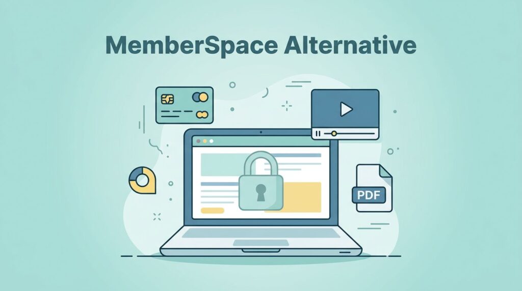
I want my paid content to live on my site, under my brand, with my rules. That is why I reach for MemberSpace when I need a Substack alternative that feels owned instead of rented.
Substack makes publishing easy, but ease can come with tradeoffs. I lose some control over design, pricing, and the path a reader takes from free visitor to paying member.
With MemberSpace, I can keep the website I already built, then add gates, memberships, and checkout on top. I get a cleaner brand, a clearer offer, and a member experience that feels like mine.
Why I choose MemberSpace over a hosted newsletter platform
I use MemberSpace when I want the website to be the product, not just the place where the product lives. It works with common site builders, so I do not need to rebuild my whole stack to get started.
That matters when I already have a site in WordPress, Squarespace, Wix, or Webflow. I can keep the homepage, the blog, and the sales pages where they are, then lock specific content behind a login or payment wall.
I also like the way MemberSpace separates the public front door from the paid back room. My free content can still attract search traffic. My paid content can sit behind a clear offer. The reader sees one brand, one domain, and one path.
If I want a reality check before I choose a platform, I compare notes with other creators too. I found why one team skipped Substack helpful when I was weighing control against convenience, and I like MemberSpace pricing guide when I want to budget the setup before I commit.
Build the pages members actually use


I start by mapping the pages people will touch most often. That keeps the site simple and keeps me from overbuilding.
Here is the structure I use most often:
| Page | What I put there | Who sees it |
|---|---|---|
| Homepage | A clear pitch, proof, and sign-up path | Everyone |
| Free article or sample lesson | A preview of my style and value | Everyone |
| Pricing page | Membership plans and benefits | Everyone |
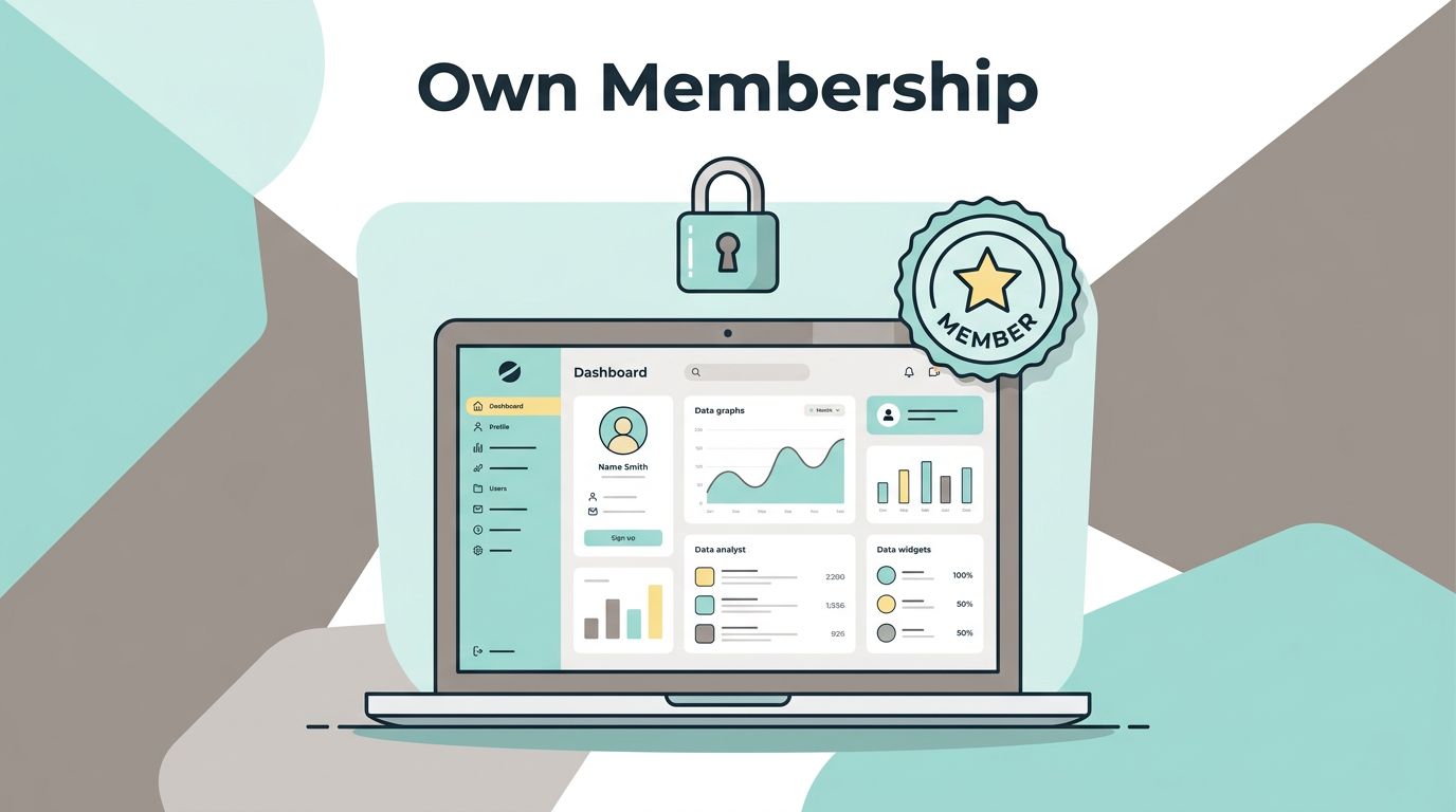
| Member dashboard | Links to locked content and account tools | Members |
| Locked article, video, or file | The premium material itself | Members |
| Account page | Billing, upgrades, and login details | Members |
The table sounds basic, but that is the point. I want a visitor to understand the offer in seconds.
A strong home page does three jobs. It says what I publish, who it helps, and why membership is worth paying for. A good pricing page does one job. It tells the reader what they get and what it costs.
I also like to show one public sample that feels generous. That sample acts like a taste test. If it works, readers are more willing to join.
Set the paywall around real reader behavior
I do not gate content just because I can. I gate it because the content has a clear role in the business.
I build the paywall around the first action I want, not around every edge case.
That usually means I choose between a few simple patterns. I can lock a single page, a group of posts, a file library, or a video archive. I can also mix public and private content on the same site.
A few setups work especially well for me:
- A free weekly article, plus a paid archive for deep dives.
- A public lesson page, plus private downloads and templates.
- A free podcast page, plus a members-only audio feed or bonus episodes.
- A public case study, plus a gated resource library with checklists and swipe files.
The member journey matters as much as the gate itself. I like to design it in this order: visit, preview, signup, pay, unlock, return. That way the reader never wonders what happens next.
If I am selling recurring access, I use how to create a recurring membership plan as my setup reference, and I keep how to connect Stripe to MemberSpace close while I test checkout.
I also want the preview to feel fair. If the teaser is too thin, trust drops. If it gives away too much, the membership has no pull. The sweet spot is a sample that proves the quality without giving away the whole vault.
Price the membership without confusing buyers
I keep pricing simple at first. Too many tiers make a small offer feel heavy, and readers back away before they compare the value.
When I build a Substack alternative, I usually start with one of four models:
| Pricing model | Best for | My read on it |
|---|---|---|
| Monthly membership | Ongoing content and community | Easy to test and easy to explain |
| Annual membership | Stable revenue and committed members | Good after the offer proves itself |
| One-time payment | Resource packs, templates, or courses | Clean for evergreen assets |
| Free tier | Audience growth and email capture | Useful if I want a larger top of funnel |
For most creator businesses, monthly is the easiest first step. It lowers friction, and it gives me room to improve the offer over time. Annual can come later, once members already trust the content.
I use recurring billing when the content keeps arriving. I use one-time access when the value is a fixed library or bundle. That split keeps the offer honest.
I also like to avoid hiding the cost behind vague wording. The reader should know whether they are buying a newsletter, a library, or a community. If I confuse the format, I slow down the sale.
When I want a broader view of how creators package content across different homes, I look at Creating a Content Web. It reminds me that the best setup is usually a clear hub with a few strong paths, not a maze of disconnected offers.
Make the member experience feel branded
I do not want the paid experience to feel like a bolt-on. I want it to feel like the rest of my site.
That means I match the fonts, colors, and tone of voice. I keep the login and checkout pages clean. I also make sure the thank-you page points to the next step, not a dead end.
Email matters here too. I can keep MemberSpace handling access while I use a flexible email tool for welcome messages and updates. I have used simple systems with tools like MailerLite, ConvertKit, Buttondown, and Beehiiv, because I want the email stack to fit the business, not the other way around.
My welcome flow usually looks like this:
- A confirmation email that says the signup worked.
- A short welcome note that explains what members get.
- A link to the dashboard, library, or first lesson.
- A follow-up email that suggests the next best piece of content.
That sequence keeps the new member moving. It also cuts down on support questions, because people know where to go.
I also think about the first 10 minutes after checkout. That is when trust feels fresh. If the member lands on a clear dashboard with useful links, the experience feels strong. If they land in a blank corner of the site, the excitement drops.
The same thinking applies to upgrades. I keep the upgrade path visible, but I do not shove it in the reader’s face. A simple prompt inside the dashboard usually works better than a noisy sales banner.
Start with one clear offer and one clean launch path
I have seen too many creators try to launch with six tiers, four gated sections, and a dozen bonus files. That usually slows everything down.
I get better results when I launch with one tight offer. A public site, one premium library, one clear membership, and one reason to join is enough to start.
My first launch often looks like this:
- I publish a public page that explains the value in plain language.
- I add one free sample that shows the quality of the paid content.
- I gate the premium pages with MemberSpace and test the full flow.
- I buy the membership myself on a phone, then fix anything that feels clumsy.
- I send the first welcome email and make sure the dashboard links work.
That is usually enough to spot weak points fast. If the payment page feels confusing, I simplify it. If the dashboard feels empty, I add shortcuts. If the pricing page asks for too much reading, I cut it down.
For a small business, that first launch is not about perfection. It is about proving that readers will pay for content on your site, inside your brand, with a checkout you control.
Conclusion
I build a Substack alternative with MemberSpace when I want ownership, not just publishing convenience. The best setup is usually simple: a clear public site, a focused paywall, and a member journey that feels natural from the first click to the first renewal.
Once the pages, pricing, and checkout all point in the same direction, the whole business feels steadier. I get a branded home for my content, and my members get a clean path to what they paid for.