Execute Responsive Design Testing Using Mida.so
Responsive design testing is the difference between a high-converting mobile experience and a broken, frustrating layout. Most teams struggle to verify how specific elements shift across breakpoints without relying on time-consuming develop...

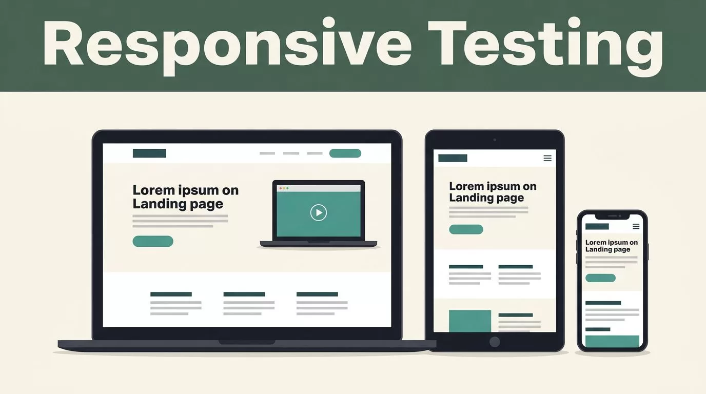
Responsive design testing is the difference between a high-converting mobile experience and a broken, frustrating layout. Most teams struggle to verify how specific elements shift across breakpoints without relying on time-consuming developer handoffs. Mida.so changes this workflow by allowing you to inject, edit, and experiment with design changes directly on your site without bloating your page speed.
By isolating your testing to specific device classes, you gain precision. You no longer have to guess if a layout change ruins the experience on a tablet while improving it on a phone. Instead, you deploy changes that only fire for the target audience. This is how you optimize without the typical performance overhead.
Key Takeaways
- Use Mida.so device targeting to isolate layout experiments to mobile, tablet, or desktop classes.
- Leverage the visual editor to make CSS adjustments, like button sizing or element hiding, specifically for mobile breakpoints.
- Verify rendering in real-time by opening your live site with the Mida.so Chrome extension on actual mobile hardware.
- Keep experimentation lightweight; Mida.so injects a compressed 15KB script to prevent the site slowdowns common with legacy tools.
- Automate variant generation using MidaGX to instantly convert design prompts or screenshots into mobile-optimized layouts.
Isolate Tests by Device Class
Testing across breakpoints shouldn’t be a global experiment. If you apply a style change to an entire page, you risk breaking the layout on desktop. Mida.so lets you restrict experiments by device category. You select whether a test runs on mobile, tablet, or desktop from the targeting menu.
This separation is vital for testing responsive design effectively. If your goal is to boost mobile conversion rates, you don’t want desktop traffic seeing your tests. By setting a device trigger, your experiment only activates when the platform matches your criteria. This keeps your data clean and your user experience consistent.
Live Editing for Responsive Layouts
Once you isolate the device, you need to adjust elements. The Mida.so visual editor enables you to select specific components and modify their properties for that viewport. You can hide desktop-heavy navigation bars or increase the font size of call-to-action buttons for thumb-friendly mobile interaction.
Because the tool supports custom CSS, you aren’t limited to basic point-and-click changes. You can write specific media queries or target IDs to force layout changes that trigger only on smaller screens. This approach treats mobile experimentation as an iterative process rather than a complete site rebuild. For deeper insights on managing these workflows, check out tips for testing responsive web apps to refine your approach.
The Responsive Testing Checklist
Before pushing any experiment live, run your variants through this checklist to catch common layout errors. These issues often go unnoticed if you only test on a wide desktop screen.
- Touch Targets: Ensure all buttons have at least 44×44 pixels of tappable space.
- Text Scaling: Confirm that base font sizes don’t cause horizontal scrolling.
- Image Clipping: Verify that hero images don’t hide critical text content on smaller widths.
- Fixed Elements: Check that persistent headers or footers don’t cover more than 20% of the visible viewport.
- Navigation: Test that fly-out menus are fully accessible and don’t get stuck behind other page elements.
If you find a broken element, use the Mida.so Chrome extension to inspect the live site. You can toggle your variant on and off instantly to see exactly where the CSS collision happens. This is the most convenient way to check responsiveness while you are in the middle of a design iteration.
Scaling Experiments with AI
Manual layout adjustments take time. MidaGX speeds up this process by using generative AI to handle the heavy lifting. You provide a prompt or a design file, and the engine generates the CSS or HTML variant for your test. This is useful for scaling mobile experiments across different collection pages or product categories.
You can tell the AI to “increase mobile button size by 15% and center the text” or “remove the sidebar on mobile views.” The AI translates these instructions into production-ready code that you can preview and launch. It removes the bottleneck of waiting for a developer to hand-code every minor responsive tweak.
Maintain Site Speed
Performance is a component of responsive design. If your testing tool is heavy, your mobile site will feel sluggish regardless of how optimized your layout looks. Mida.so is designed to be lean. With a 15KB compressed script size, it avoids the render-blocking issues that plague legacy A/B testing platforms.
You get the ability to experiment without sacrificing your Core Web Vitals. Because the variant injection targets sub-200ms loading times, the change appears instantaneous to the user. You aren’t forcing your visitors to download a bloated library just to see a different button color or a shifted layout.
Conclusion
Responsive design testing requires a disciplined approach to targeting and performance. By isolating experiments to specific device classes and using tools that don’t block your page render, you create a sustainable testing cycle. Use the Mida.so visual editor to make precise CSS changes, and rely on the platform’s lightweight script to keep your site speed high.
You now have the technical means to experiment on mobile without developer reliance. Start by testing one high-impact component, such as your primary CTA, on mobile devices only. Once you confirm the layout stability, move toward more complex page-level redesigns using MidaGX. Effective optimization is about small, consistent improvements that respect the constraints of every device.

