How Baremetrics Classifies Plan Changes, and What They Hide
When a customer changes plans, revenue can shift before anyone notices. A move that looks small in the product UI can change MRR, churn, and next month’s forecast in one step. I care about SaaS plan migrations because they tell me whe...

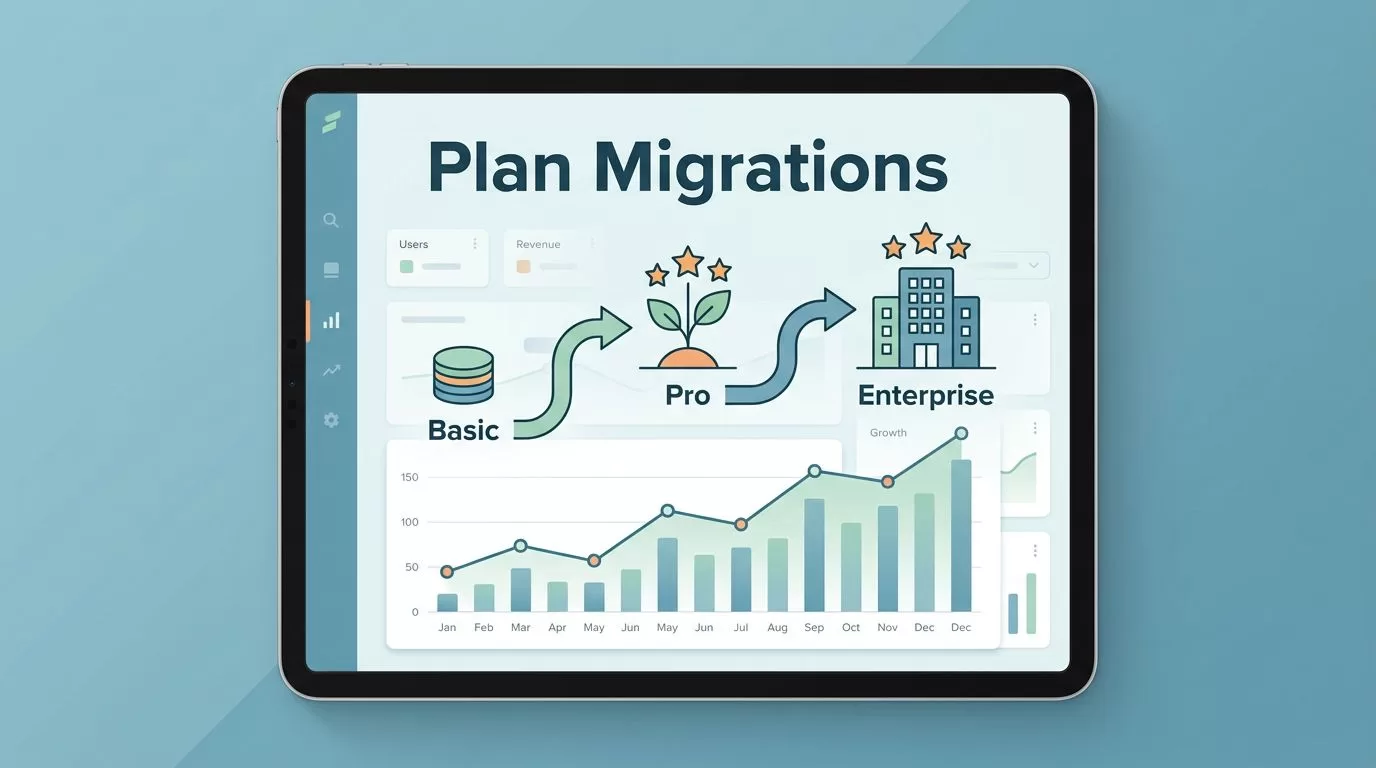
When a customer changes plans, revenue can shift before anyone notices. A move that looks small in the product UI can change MRR, churn, and next month’s forecast in one step.
I care about SaaS plan migrations because they tell me where customers are finding value, where pricing is under pressure, and where discounts are doing the heavy lifting. Baremetrics gives me a clear way to follow those moves, so I can stop guessing and start reading the pattern.
When my billing data is clean, I can separate healthy growth from quiet erosion. That matters more than a busy dashboard full of pretty charts. Here’s how I use Baremetrics to watch the movement.
Why plan migrations change the revenue picture
Plan migrations look small on paper. In practice, they can reshape monthly revenue, retention, and forecast confidence. One upgrade can lift expansion MRR. One downgrade can hide inside a larger renewal count. A legacy plan move can create a false sense of growth if I only watch logo counts.
Discounts make the story even messier. A customer who moves onto a promo rate can look healthy until the discount ends. Then the same account can drop back to its real price, and the dip may look like churn if I do not track the history.
Baremetrics has a useful primer on subscription analytics reporting for startups, and that framing fits this problem well. I am not trying to admire a chart. I want to know where revenue is building, where it is slipping, and whether the change came from product value or pricing mechanics.
That is why I treat migrations as their own signal. They are not a side note. They are the trail marks that show how customers move through the product.
How Baremetrics classifies plan changes
Baremetrics watches subscription events, then compares the old and new plan values. If the monthly value rises, I read it as an upgrade. If the monthly value falls, I read it as a downgrade. When a customer switches plans, the system cares about monthly value, not the label on the package.
Before I trust those labels, I make sure my billing source is clean by following how to connect Stripe to Baremetrics. A bad sync or a messy plan map turns the whole picture blurry, and then every report starts to feel suspect.


The annual-plan edge case matters here. If a customer pays more upfront but the average monthly amount drops, Baremetrics may count that as a downgrade. That is useful because I care about recurring value, not only cash collected today. It helps me avoid confusing prepaid revenue with durable growth.
Baremetrics also records events like new subscriptions, upgrades, downgrades, cancellations, and reactivations. Once those events are in the system, it updates MRR, expansion MRR, revenue churn, and churned subscriptions. That turns a raw billing event into something I can use in a forecast meeting.
My weekly workflow for spotting movement
My weekly check starts with raw movement. I open the change events, then I scan for upgrades, downgrades, cancellations, and reactivations. I also cross-check the sync with verifying Stripe data in Baremetrics so a broken mapping does not look like a revenue problem.

My review usually follows a simple order:
- I look at the biggest MRR changes first, because the loudest moves shape the month.
- I group plan changes by source, such as self-serve signups, sales-assisted deals, or support-led saves.
- I compare plan movement with discount codes, because promos can inflate upgrade rates.
- I check whether a move was one account or many. A bulk migration can mean pricing cleanup, not organic demand.
Once that pass is done, I sort the rest by cohort and segment. A downgrade in a small customer plan says one thing. The same downgrade across enterprise accounts says something else. The pattern matters more than the raw count.
I also check timing. A wave of upgrades at month-end often reflects sales pressure. A wave of downgrades after renewal may point to weak adoption. When I see both in the same week, I know I need to look at the billing logic before I trust the story.
This rhythm keeps me out of spreadsheet traps. I see the motion first, then I ask why it happened.
What migration data tells me about forecasting and retention
I map each movement to a revenue effect, because the label alone does not tell me enough. A quick map helps me separate the common cases:
| Change type | What Baremetrics shows | How I use it |
|---|---|---|
| Upgrade | Expansion MRR rises | I check whether the larger plan is sticking |
| Downgrade | Revenue churn rises | I flag the account for save work or pricing review |
| Legacy plan move | Old plan value drops out | I compare the grandfathered rate with the current catalog |
| Discount-related migration | Temporary lift or later drop | I separate promo math from product value |
| Seasonal shift | Changes cluster in one period | I compare the month with the same period last year |
That table keeps me honest. A clean upgrade rate can hide promo-heavy deals. A downgrade can be a seasonal cutback instead of product regret.
A migration only helps me when I can explain the MRR change behind it.
I also watch expansion MRR, revenue churn, and churned subscriptions together. If expansion rises while churn stays flat, I know the pricing path is probably working. If revenue churn climbs, I want to know whether the cause is product fit, pricing pressure, or a plan sunset.
When I need a broader view of forecasting, Baremetrics’s ChartMogul vs. Baremetrics overview is useful because it explains how Forecast Plus connects to actual financial data. That matters when I want migration trends to meet real cash planning, not just dashboard math.
Patterns that can hide behind clean numbers
Some plan moves look clean until I zoom in.
Legacy plan migrations often create the biggest blind spot. I may retire a grandfathered plan and see a neat bump in average revenue per account. That is useful, but only if I separate price cleanup from true product expansion. If I do not, I can mistake a pricing reset for customer enthusiasm.
Discount-related migrations need the same care. A customer who moves onto a lower-priced promo plan can look like a downgrade, yet the move may be a sales save or a seasonal incentive. I track those cases by date and by code, so I can see what happens when the discount ends. If the customer upgrades later, the original move was part of the path, not the end of the story.
Seasonal shifts can be the noisiest pattern. Teams buy more in one quarter, trim in another, and move between tiers as workloads change. I have seen a January downgrade wave that had more to do with budget resets than product value. I have also seen summer upgrades tied to project launches, then a fall slowdown that looked scary until I compared it with the prior year.
The best read comes when I line up plan changes with retention, expansion, and support notes. Then the story is clearer. I am not guessing whether the customer moved because of value, price, or timing. I can see the reason in the numbers.
Conclusion
Plan migrations are easy to miss when I only watch top-line revenue. Baremetrics helps me turn each move into a readable signal, so upgrades, downgrades, and legacy plan changes stop blending together.
That gives me cleaner forecasts and a better view of retention. Once I know whether a move came from pricing, discounts, or seasonality, I can act with more confidence.
The real win is context. When the revenue graph shifts, I know where to look first.

