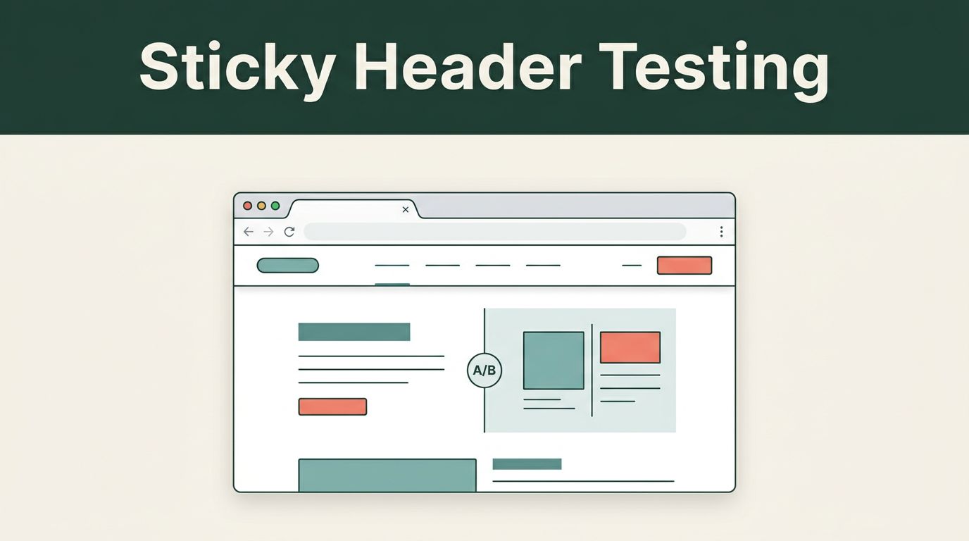
A sticky header can keep key navigation and calls to action visible as visitors move down a page. It can also cover content, reduce mobile screen space, and create accidental taps. Sticky header testing helps you measure which effect happens on your website instead of trusting design preference.
Mida.so gives growth teams a practical way to compare a static header with one or more sticky versions. The reliable process starts before launch: establish a baseline, write one clear hypothesis, control traffic allocation, and define the decision rules before the first visitor enters the test.
Key Takeaways
- Test one header change against a stable control.
- Use a primary conversion goal and several experience guardrails.
- Keep targeting and traffic allocation unchanged during the campaign.
- Review raw visitor and conversion counts before percentage lifts.
- Segment results by device, traffic source, and visitor type before rollout.
Why Sticky Headers Need a Controlled Test
A sticky header stays visible while a visitor scrolls. It can keep the main navigation available on long pricing pages, product pages, documentation, and comparison pages. A persistent “Request demo” or “Start free trial” action may also reduce the effort required to convert.
The same layout can create friction. A fixed header takes up part of the viewport, which matters more on mobile screens. It may hide a form heading, cover a promotional banner, or push the first useful content below the fold. A header that changes height while the page loads can also create layout shifts.
The right question is not, “Do sticky headers convert better?” The right question is, “Does this header help this audience complete the next important action without adding friction?”
Start with the current experience as your control. Then test one defined variation. Possible changes include:
- A static header versus a header that remains visible during scroll.
- A full-height sticky header versus a smaller version after the visitor scrolls.
- A sticky header with navigation only versus one with a conversion CTA.
- A sticky header for mobile traffic only.
- A header that hides while scrolling down and returns when the visitor scrolls up.
Don’t combine all five ideas in one variant. If the result changes, you won’t know which decision caused it. Established conversion rate optimization test examples can help your team build a stronger test backlog, but your hypothesis still needs to match the page and audience you plan to change.


Build a Clear Sticky Header Testing Hypothesis
A useful hypothesis connects an observed problem to a measurable outcome. Avoid statements such as, “A sticky header will improve the experience.” That claim is too broad to test.
Use a structure that names the audience, change, mechanism, and expected result:
If mobile visitors keep access to the primary CTA while scrolling, then completed demo requests will increase because they won’t need to return to the top of the page.
You can write a different hypothesis for navigation:
If the navigation remains available on long product pages, then visitors will view more relevant pages and reach the pricing page more often.
These hypotheses produce different primary metrics. The first focuses on completed forms. The second focuses on qualified navigation behavior and may require a later conversion event.
Choose one primary conversion goal before you open the Mida.so report. For a SaaS landing page, use a completed signup, demo request, or qualified form submission. For ecommerce, use checkout completion or revenue per visitor. A header click can be a secondary metric, but it shouldn’t replace the action that creates business value.
Track supporting metrics to identify trade-offs:
- Conversion rate and total conversions.
- CTA clicks and navigation menu interactions.
- Bounce rate, scroll depth, and engagement time.
- Form starts, form completions, and error rates.
- Revenue per visitor or qualified lead rate.
- Largest Contentful Paint, Interaction to Next Paint, and Cumulative Layout Shift.
A sticky header may increase CTA clicks while reducing completed forms. It may also increase page navigation while lowering lead quality. Connect the test to your CRM or billing data when possible. A higher click-through rate isn’t enough if the added submissions don’t become qualified opportunities.
Tools used for conversion research and experimentation often combine behavioral evidence with testing data. The CRO tools overview from Wisepops provides useful context for the wider workflow, but Mida.so should remain the source for the experiment decision when it owns visitor assignment and reporting.
Configure the Campaign in Mida.so
Before creating the variant, document the current page. Record conversion rate, bounce rate, traffic volume, and the split between mobile and desktop visitors. Include the main traffic sources, such as paid search, organic search, email, and referral traffic.
A noisy baseline weakens the test. If traffic changes sharply during the campaign, the result may reflect an audience shift rather than the header.
Use this setup sequence:
- Open the relevant Mida.so project and select the page or URL pattern for the campaign.
- Create the existing page as the control experience.
- Build the sticky variation in the visual editor or with custom code.
- Select one primary conversion event.
- Set a balanced traffic split, usually 50/50.
- Apply precise audience rules and exclusions.
- Preview the experience across supported devices.
- Confirm that conversion events fire once per action.
- Launch only after the tracking and performance checks pass.
Target the smallest audience that can answer the question. If the issue affects mobile navigation, restrict the test to mobile visitors. If paid search visitors have a different intent, use campaign or URL parameters to separate that audience.
Exclude internal employees, QA traffic, automated bots, existing customers when they aren’t part of the hypothesis, and visitors enrolled in a conflicting experiment. Keep those rules unchanged after launch. Changing the audience, page logic, traffic split, or conversion goal creates a new test condition.
Test the header on real viewport sizes. Check iPhone-sized screens, Android devices, tablets, and desktop browsers. Inspect the first screen after load and the header after several scroll actions. Look for covered content, broken anchor links, menu overlap, and touch targets that sit too close together.
Open browser developer tools and confirm that the conversion event fires once after a successful action. Duplicate events can make a weak variation look successful. Also monitor the page performance scorecard. Google defines Core Web Vitals guidance around loading, interaction, and visual stability. A conversion lift paired with a large layout shift isn’t a clean win.
Read Mida.so Results Without Chasing Noise
Mida.so’s reporting view can show visitor allocation, conversions, conversion rate, uplift, and statistical confidence as data arrives. Live visibility helps you find broken tracking early. It doesn’t justify stopping the campaign after a few hours.
Read the report in a fixed order.
First, check the traffic split. A planned 50/50 campaign should produce reasonably close visitor counts over time. Small differences are normal. A large gap points to targeting rules, device restrictions, exclusions, or an implementation issue.
Next, review total visitors and conversions. Keep the raw counts visible. A variation with three conversions from twelve visitors has a 25% conversion rate, but that result has little decision value.
Then compare the primary conversion rate for the control and variant. Review the trend across several days and include a complete business cycle when traffic changes by weekday. A spike may come from a campaign launch, an outage, a tracking adjustment, or a temporary audience mix.
Use Mida.so’s confidence indicator as one part of the decision. It doesn’t replace sample size, test duration, or business context. Define the minimum sample and confidence threshold before launch. Don’t check the dashboard every hour and stop when the variant briefly leads. Repeated stopping raises the chance that random movement becomes a permanent decision.
The conversion rate optimization tools guide from Glassbox covers the broader measurement stack. For your Mida campaign, keep one reporting source responsible for the final result. Different analytics systems may use different session, attribution, and conversion rules.
Segment the Results Before You Roll Out
An overall winner can hide a losing audience. Review segments that match the original hypothesis instead of searching through every available dimension.
For a responsive header test, compare mobile and desktop. For a paid campaign, compare traffic sources and campaign groups. For a navigation test, compare new and returning visitors. If your business serves different buyer types, review relevant account or landing page segments.
Ask direct questions:
- Did mobile conversion improve while desktop conversion declined?
- Did paid search visitors respond differently from organic visitors?
- Did new visitors use the header more than returning visitors?
- Did the header increase navigation but reduce form completion?
- Did the result hold for the traffic source that produces the most revenue?
Don’t select one favorable segment and ignore the rest. Segment analysis is for diagnosis. A mobile-only win may justify a mobile rollout, not a site-wide change. A paid-search win may require a separate experience for organic visitors.
Review the business metric behind the conversion. If the header increases demo submissions, check lead qualification and downstream sales activity. If it increases ecommerce orders, check revenue per visitor, refunds, and average order value. If it reduces bounce rate but lowers completed forms, the lower bounce rate isn’t a success by itself.
Avoid Common Sticky Header Testing Mistakes
The most expensive errors happen before the result appears.
Running overlapping experiments on the same header can contaminate the comparison. Schedule related tests or use a planned multivariate design only when traffic can support it. Never change the control during an active campaign.
Testing too many header elements at once creates an attribution problem. Keep the change narrow. A compact sticky state is one test. A new navigation structure, CTA, color system, and content hierarchy are several tests.
Ignoring speed creates another problem. Audit every script and code injection used by the campaign. Limit the experiment to the pages and audiences that need it. Remove old test code after the campaign ends.
Document the final status as won, lost, inconclusive, or technically invalid. Store the hypothesis, launch date, audience rules, primary metric, sample size, result, and rollout recommendation. If the test wins, define the permanent implementation. If it loses, record the design assumption it ruled out.
Conclusion
Sticky headers can improve access to navigation and conversion actions, but they can also reduce usable space and add visual friction. Sticky header testing gives you a controlled way to measure that trade-off with Mida.so.
Start with a clean baseline and one narrow hypothesis. Keep traffic rules stable, inspect raw counts, review device and channel segments, and protect page performance. The winning header is the one that improves the primary business metric without creating a worse experience for the visitors who matter most.