Messy show notes can make a polished episode feel unfinished. I want mine to read cleanly on Transistor, on my podcast site, and inside podcast apps without rewriting the same copy three times.
That means I keep the structure simple and the formatting predictable. I also check the latest Transistor help docs before I change my workflow, because the interface and display rules can shift over time. From there, the job gets easier: write for scanners first, then let the player and feed do the rest.
Start with a reusable template in Transistor
I begin with a template because it saves time and keeps every episode in the same shape. Transistor now supports pre-filled show notes templates, so I don’t have to rebuild the same intro, links, and CTA for every publish day. The official template update is explained in Transistor’s show notes template changelog, and I still check the current help docs as of April 2026 in case the UI labels move.
If I host on Transistor Podcast Hosting, I treat the show notes as part of the episode page, not an afterthought. That means I write them with the page, the embedded player, and the RSS feed in mind at the same time.
My base template usually includes:
- A one-sentence episode summary
- A timestamp block for key moments
- Guest name and role
- Links to tools, resources, or sources
- One clear call to action
- A short closing line that points to the next episode or newsletter

The point is consistency. When I publish often, a template keeps me from staring at a blank field and wondering where to start.
Use a fixed order for the details that matter
I like my notes to feel like a quick map. The listener should know where they are, who is speaking, and what to click next.
Here’s the order I use most often:
- A short summary that tells the story of the episode.
- Timestamps for the parts people will want to jump back to.
- Guest info with a name, role, and one useful detail.
- Resource links for books, tools, articles, or downloads.
- A CTA for the next step, such as subscribing or joining my list.
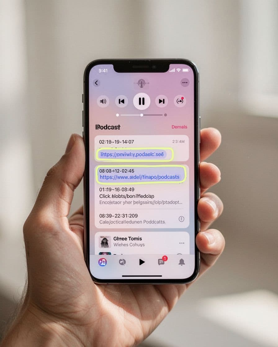
When I add timestamps, I follow Transistor’s timestamp guide. If I already have chapters in my MP3, I can also use that chapter data inside the notes. That makes the episode feel easier to scan, and it gives listeners a clear path through longer conversations.
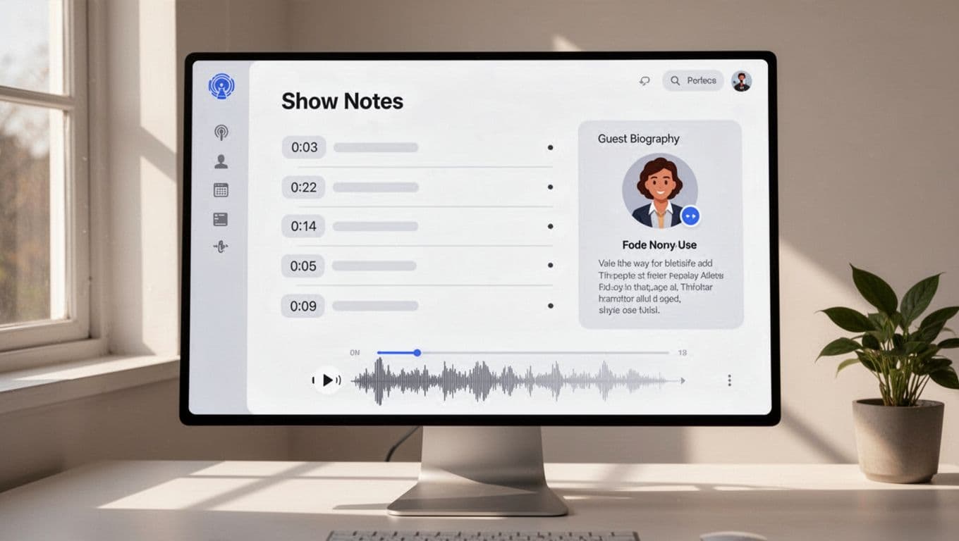
A simple example looks like this:
00:00 Intro and what changed this week
04:12 Guest background
11:35 Main lesson
19:40 Tools and next steps
Guest: Maya Chen, operations lead at North Peak
Resources: newsletter, transcript, and guest website
I keep the tone plain. I don’t pack in extra copy just to fill space. A good note block should feel like a clean desk, not a drawer stuffed with cables.
Write for the page, the player, and the app
This is where Transistor show notes need a little discipline. The same text can appear in three places, and each one behaves differently.
On the Transistor-hosted website, the notes can sit beside the player and look polished with basic formatting. In an embedded player, the same notes may appear under the audio controls on my own site. Inside podcast apps, the feed text gets rendered in its own way, which is why the display can vary from app to app.
I rely on a few safe habits:
| Place | What I want | What I avoid |
|---|---|---|
| Hosted episode page | Clean reading with easy links | Dense blocks of text |
| Embedded player | Short notes under the audio | Fancy layouts that may break |
| Podcast apps | Simple text that still makes sense | Anything that depends on exact spacing |
Transistor’s own rendering guide for show notes explains why the same HTML can look different across apps. That’s why I keep formatting light. Bold text, links, bullets, and line breaks are usually enough. I skip tables, images, and anything that depends on a perfect layout inside the feed.
Keep podcast app display in mind
Podcast apps are where many listeners meet the episode first. That means I can’t assume they’ll see the notes exactly as I wrote them.

So I check the notes with a simple question in mind: does this still make sense if the app trims the formatting?
My rules are plain:
- I keep paragraphs short.
- I use direct link text for the main resources.
- I don’t depend on fancy spacing.
- I test the episode in the apps my listeners use most.
- I rewrite any line that only works on one screen.
That approach matters because podcast apps don’t all treat the feed the same way. A note block that looks perfect on the Transistor page can show up a little differently in Apple Podcasts, Spotify, Overcast, or another app. I’d rather write for the lowest common denominator and have the notes hold up everywhere.
My quick pre-publish check
Before I hit publish, I read the notes once on the hosted page and once in the player preview. Then I scan the timestamps, guest details, and links one more time.
I also check that my CTA is clear and that the episode still reads well without any fancy formatting. If a line feels crowded, I split it. If a link looks buried, I move it higher.
That last pass usually takes less than two minutes, and it saves me from a sloppy first impression.
Conclusion
Clear notes don’t need a lot of decoration. They need order, clean timing, and formatting that survives the trip from Transistor to the listener’s app.
When I build my notes this way, the episode page feels easier to read and the feed stays trustworthy. That’s the real goal, a clean show notes structure that works where people actually listen.