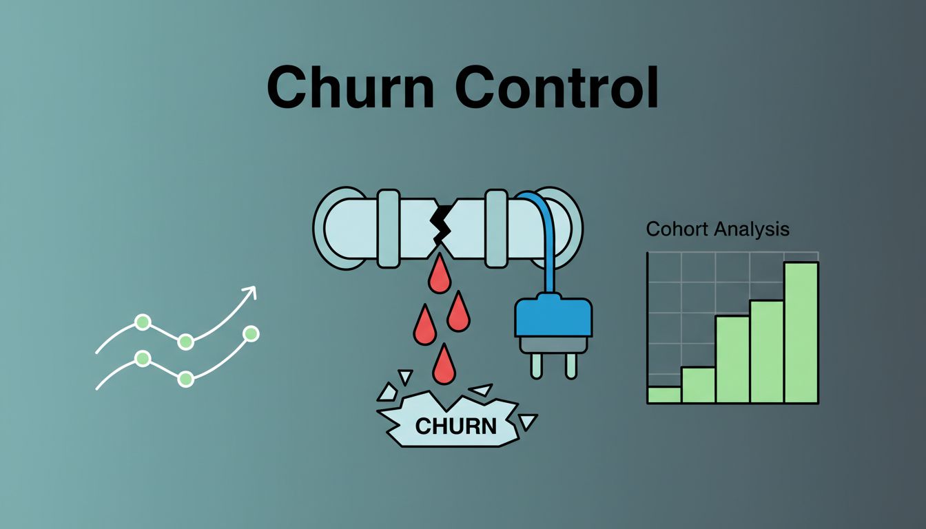
Voluntary churn rarely sounds an alarm. It slips out like air from a tire, one cancellation at a time.
When I talk with SaaS founders and growth leads, the pain is often the same. Customers are leaving by choice, yet the team can’t see the pattern fast enough. To reduce voluntary churn, I need a system that shows where value breaks down.
Baremetrics helps me build that system around revenue, cohorts, and customer segments. Once the leak is visible, the work gets sharper.
Start by separating voluntary churn from billing churn
I never mix voluntary and involuntary churn. They look similar on a chart, but they come from different problems.
Voluntary churn is a value problem. Involuntary churn is a billing problem.
Involuntary churn comes from failed payments, expired cards, or bank issues. Voluntary churn happens when a customer decides the product no longer earns its place. If I lump them together, I send the wrong team after the wrong fix.
I also split customer churn from MRR churn. Losing 10 tiny accounts hurts less than losing one large account with expansion room. Then I add LTV to see how much future revenue disappears with each loss. After that, I check cohort retention so I know when customers start to drift.
This is where teams get fooled. Customer churn can stay flat while MRR churn worsens, because larger accounts are leaving. The reverse can happen too, which is why I never trust one number alone.
That structure matters because one top-line churn rate can hide several stories. This guide to churn analysis makes that point well. I use the same logic in Baremetrics: separate the type of churn, measure the revenue impact, then find the stage where customers break away.
Spot churn signals early with Baremetrics
Once the basics are clean, I watch for early signals instead of waiting for a cancellation email. Baremetrics pulls billing data into dashboards that make churn easier to inspect by segment. I can compare MRR churn, growth, LTV, new signups, and retention trends without bouncing between spreadsheets.
I keep one weekly view for first-month retention, one for plan-level churn, and one for revenue lost by segment. That way, I can tell if the pain sits in onboarding, pricing, or product fit.
Some warning signs show up again and again:
- Weak first-month retention: new cohorts fall off before they form a habit.
- Low product engagement: usage fades, then support goes quiet.
- Price friction: small accounts leave soon after a plan change.
- Support tone shifts: tickets move from setup help to refund or downgrade talk.
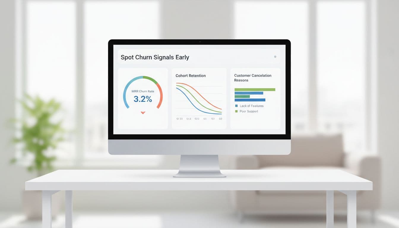
I pay close attention to new cohorts. If a cohort that signed up after an onboarding change drops faster than the last one, I don’t need a long debate. I need a fix. Baremetrics has long pushed this idea in its advice on identifying customers at risk of churn, and the logic still holds. Early signals beat post-mortems every time.
Segment customers before you try to save everyone
A good churn program doesn’t chase every canceling customer the same way. I segment first, because churn rarely hits all accounts evenly.
In Baremetrics, I can group customers by plan, signup date, tenure, MRR size, country, payment method, and custom data. That lets me compare monthly self-serve users under $100 MRR against annual teams with high lifetime value. Customer profiles help too. I can review plan data, payment history, location, and LTV in one place, which makes outreach less blind.

I usually start with a few practical slices:
- New customers who haven’t reached first value in 7 to 14 days
- High-LTV accounts with falling usage or stalled expansion
- Low-MRR monthly users who churn soon after month one
- Customers citing the same exit reason, such as price, missing features, or slow setup
If monthly self-serve users in one market churn after day 21, I focus there first. A broad save campaign would waste time and hide the real cause.
That last point matters. Baremetrics gives me the revenue and segment view, while my cancel flow gives me the stated reason. When I line those up, the picture sharpens. “Too expensive” means one thing for a $29 account, and something else for a $1,200 account that never adopted the core workflow. For deeper pattern work, Baremetrics’ piece on cohort analysis for retention is a solid companion.
Turn churn analysis into weekly retention experiments
Data without cadence turns into wallpaper. So I run a simple weekly loop.
First, I choose one segment with rising voluntary churn. Next, I write one hypothesis. Then, I launch one small intervention and watch the same metrics for two to four weeks. I keep the test small on purpose, because churn keeps moving while big projects crawl.

A few tests I like:
- For users who stall before activation, I shorten onboarding and add a human check-in.
- For price-sensitive monthly users, I test a downgrade path instead of a hard cancel.
- For high-LTV teams with falling usage, I offer a success call tied to one outcome, not a generic demo.
I judge each test the same way. Customer churn should fall in that segment. MRR churn should drop too. I also look for better cohort retention after month one and stable LTV. Then I compare results against the cancellation reasons from my exit form. If “missing integration” drops after a setup change, I know I fixed friction, not price.
If a test works, I document it and add it to the playbook. If it fails, I stop it fast. For more ideas, Baremetrics collected several practical ways to reduce SaaS churn. What matters most is the loop, not the one-off tactic.
Keep the leak visible
Voluntary churn feels personal, because every cancellation sounds like a verdict. I get better results when I treat it as a system. I split it from billing churn, track it by segment, study cohorts, and test one fix at a time.
Open your dashboard, pick one weak segment, and run one retention experiment this week. A slow leak becomes a flood only when nobody keeps checking the pipe.