Revenue alone can hide a lot. I have watched MRR climb while the product’s daily pull got weaker, and I have seen user activity spike while cash barely moved. When I watch the Baremetrics active users view beside revenue, I get a cleaner read on whether growth is real. That matters when I am setting price, reviewing retention, or planning the next quarter.
I want one view that tells me if people are using the product and paying for it. Baremetrics gives me the money side, and a usage line fills in the behavior side. Together, they show whether the business is getting stronger or just louder.
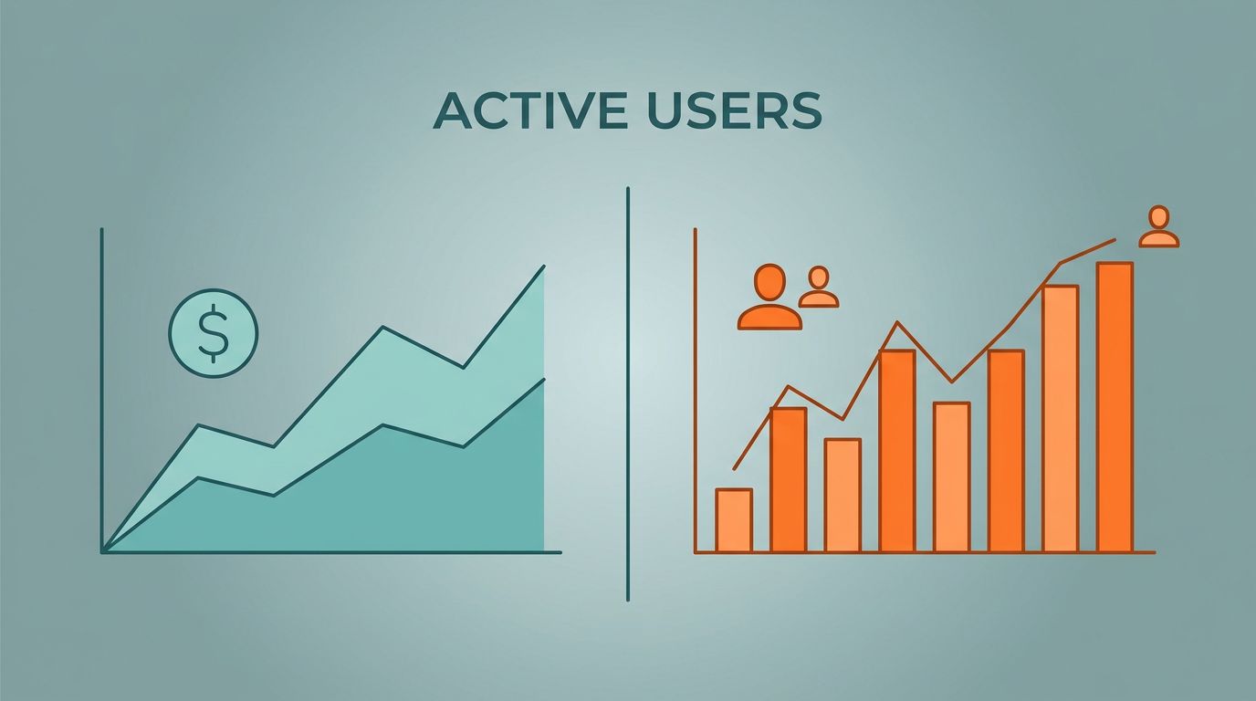
Why I pair active users with revenue
I start with revenue because it is hard to argue with cash. It tells me what came in, what churn took out, and what expansion added back. Still, revenue can flatter a weak product for a while. A contract renewal, annual prepay, or a short-lived price bump can keep the line up even while customers visit less often.
That is why I put active users next to the money line. Baremetrics’ own SaaS metrics guide treats the core numbers as a set, and that matches how I think about SaaS health. If usage falls while MRR holds, I look for a lagging churn problem. If usage rises while revenue stays flat, I look for a leak in pricing or conversion.
Paddle’s SaaS metrics by company stage makes a similar point. Early on, active users can look noisy. Even then, the trend still tells me if the product has a habit-forming core or just a burst of curiosity.
Once I add ARPU and NRR to the same review, the picture sharpens. A higher ARPU with falling active users often points to concentration risk. A steady NRR with weak usage can also hide tired accounts. I want the whole story, not a flattering slice.
A rising revenue line can hide a shrinking user base. I do not want to find that out after renewals start slipping.
How I build the Baremetrics view
I start by shaping the revenue view first, then I place usage beside it. In building a smarter SaaS metrics view, I keep the layout simple so the trend is easy to read at a glance.
- One cadence stays fixed. Monthly works well for board work, while weekly catches drift sooner.
- Matching active-user counts to the same dates I use for revenue keeps the chart honest. If the windows do not line up, the story drifts.
- Segments by plan, cohort, or channel help when the main line looks calm. A flat average can hide a rough split between self-serve, enterprise, and legacy accounts.
- Annotations for price changes, launches, campaigns, and outages belong on the chart. When a line bends, I want the reason beside it.
- One owner needs to keep the view consistent. Finance, product, and growth can all read it, but the story should not change every week.
After that, I review the same chart on a fixed schedule. That habit matters more than the tool. If the view lives in a quiet corner, I stop trusting it. If it sits inside my weekly operating rhythm, I catch small changes before they turn into quarterly problems.
What the lines tell me when they split
Once the chart is in place, the split tells me more than either line alone.

Before I read the chart, I define “active” in plain language. I want one definition for the whole team, whether that means logged-in, engaged, or completed a key action. Without that, I end up comparing different stories.
| Pattern | What I read | What I check next |
|---|---|---|
| Revenue rises, active users fall | Pricing or renewals may be hiding weak use | Cohort retention, plan mix, failed charges |
| Active users rise, revenue stays flat | Conversion or packaging may be too weak | Upgrade path, ARPU, pricing ladder |
| Both rise | Product use and monetization are moving together | Expansion MRR, new cohorts, seat growth |
| Both fall | Demand or value is slipping | Acquisition source, onboarding, churn reasons |
If revenue rises while users fall, I do not call that healthy growth. I call it a delay. If users rise while revenue stays flat, I look at pricing, packaging, and upgrade paths. When both move together, I get a cleaner signal that the product and the business model are pulling in the same direction.
When the lines drift apart, the reason is usually in pricing, retention, or packaging.
When churn, failed charges, and expansion start moving together, I pull a wider view from tracking SaaS subscription health. That helps me separate a product problem from a billing problem.
Decisions this chart pushes me to make
I use this chart to make real calls, not just to admire the trend.
- Pricing gets a second look when usage is strong but revenue lags. That often means the product has more value than the current plan mix admits.
- Onboarding needs work when signups look healthy but active users fade fast. Revenue can hide that leak for a while, but the base gets thinner each month.
- Expansion deserves attention when active users rise inside existing accounts. That is a sign that more seats, higher limits, or a better tier could fit.
- Spend gets cut when both lines soften. I would rather trim early than build around a weak demand curve.
I also use the view in product and finance meetings because it keeps everyone on the same page. Product sees engagement. Finance sees cash. Leadership sees the gap between the two, which is where many bad surprises start.
When I want to sanity-check the metric definitions, I compare my read with Stripe’s essential SaaS metrics guide. The goal is not to drown in dashboards. It is to move one level deeper each time the lines tell me something useful.
Mistakes that distort the picture
I avoid a few traps because they make the chart feel smarter than it is. The first is mismatched timing. A weekly usage line compared with monthly revenue can make me think there is a problem when there is only a calendar gap. The second is sloppy definition. A login count is not the same thing as meaningful use, and I do not want to confuse the two.
The third trap is reading a total without a segment. A healthy enterprise group can hide a weak self-serve channel, or the other way around. That is why I keep tracking SaaS subscription health close when churn, failed charges, and expansion start moving at the same time.
Baremetrics gives me the revenue spine. It does not need to act like a product-event warehouse. If I want feature-level behavior, I use another source for that. I come back to Baremetrics when I want to know whether the business is earning in a way that matches real use.
Conclusion
Revenue alone can fool me, and active users alone can do the same. When I put them side by side, I get a better answer to the question that matters most, whether customers are finding value and paying for it.
That is why I keep the Baremetrics active users view tied to revenue, segments, and annotations. It turns a pair of lines into a decision tool. In a SaaS business, that is where the useful signal lives.