You’ve built a feature customers love. But do they stick around longer because of it? I faced this question head-on with my SaaS tool. Low churn hid deeper issues until I linked feature use to retention data.
Baremetrics changed that for me. It pulls subscription metrics like MRR and LTV. Pair it with feature events, and patterns emerge. Users who hit a key dashboard weekly churn 40% less. That’s the insight you need.
I’ll walk you through my exact process. You’ll see how to connect data, run comparisons, and act fast.
Why Baremetrics Shines for Feature Usage Checks
I run a SaaS with 5,000 users. Features come and go. Some boost revenue; others drain it quietly. Baremetrics gives me the subscription backbone: MRR trends, churn splits, expansion revenue.
It doesn’t track in-app clicks natively. That’s fine. I feed it events from Amplitude or Intercom. Then People Insights builds profiles. One glance shows if low usage ties to cancels.
Think of it as a spotlight on your data room. Fixed lights hit billing. Portable ones reveal behavior. Together, they show why revenue dips. For example, Baremetrics People Insights merges logins with LTV. High-engagement users expand twice as fast.
This setup saved me $12K MRR last quarter. Churn dropped after I targeted laggards.
Setting Up Feature Usage Tracking
Start simple. Sign up for Baremetrics. Connect Stripe in seconds. MRR, churn, and LTV load right away.
Next, add behavior data. Go to Settings > Integrations. Link Amplitude for feature events or Intercom for logins. Data syncs in hours. No code needed.
I tag events like “dashboard_opened” or “export_clicked.” Baremetrics segments them against cohorts. Now profiles show usage heatmaps next to churn risk.


This dashboard view hits home. Bars spike for active users. Curves flatten churn. I spot gaps fast.
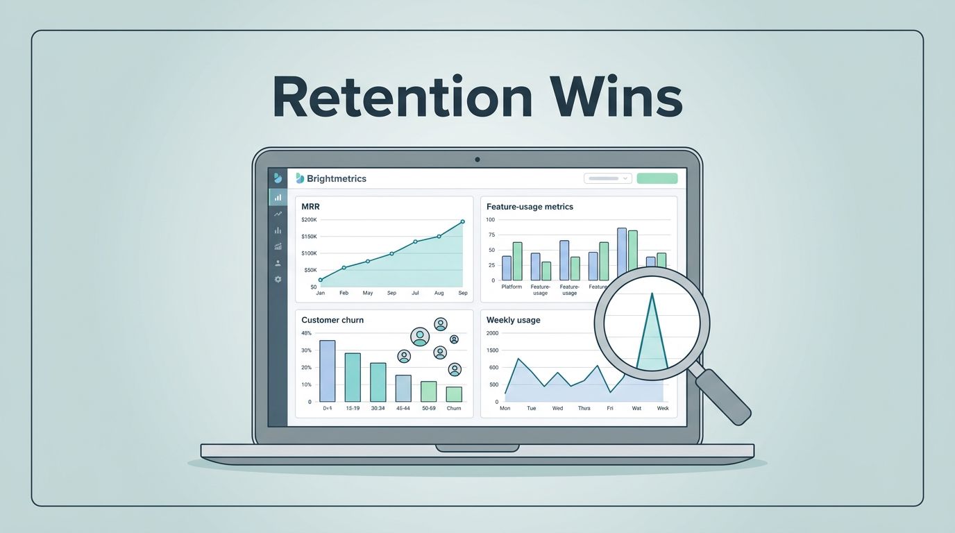
Check my Baremetrics dashboard for MRR and retention tracking setup. It pairs usage with revenue flows.
Step-by-Step Guide to Measure Correlations
Follow these steps. I run them monthly. Results guide my product roadmap.
- Open People tab. Filter by feature tag, say “power_user.”
- Compare cohorts. High usage group versus low. Pull LTV, retention rate.
- Add metrics. Drag MRR churn, expansion MRR. Charts overlay instantly.
- Segment deeper. By plan or signup date. Does free tier usage predict upgrades?
- Annotate spikes. Note “AI feature launch.” Link it to retention jumps.
- Set alerts. Slack pings if churn rises as usage falls.

This flow turns chaos into clarity. Events stream in. Metrics align. Decisions follow.
For Intercom sync details, see Baremetrics Intercom integration guide. It unlocks tags for precise cuts.
Metrics That Matter Most for Comparisons
Pick these five. They paint the full picture.
MRR breakdown first. Track new, expansion, churned. High feature users show 15% more expansion MRR.
LTV next. Calculate it as ARPU divided by churn rate. Power users hit $1,800. Laggards stop at $600.
Churn splits matter. Customer churn counts logos lost. Revenue churn hits dollars. Feature engagers lose half as much revenue.
Retention curves reveal stickiness. Month 3 drop-off halves for active groups.
NRR ties it together. Above 110% means growth from within. I watch it in net revenue retention tracking in Baremetrics.
| Metric | High Usage Benchmark | Low Usage Risk |
|---|---|---|
| LTV | $1,500+ | Under $800 |
| Churn | 4-6% monthly | 10%+ |
| NRR | 110%+ | Below 100% |
These numbers guide fixes. Low scorers get nudge emails.
Real-World Examples from My Dashboard
Take my export tool. 30% of users touch it monthly. Their LTV soars 25% over averages. Churn? Under 3%.
Contrast that with a buried report builder. Low adopters (10% usage) churn at 12%. Revenue contraction follows. I promoted it via in-app tips. Usage doubled. Churn fell.
Another win: AI beta. Early testers expanded MRR by 20%. Laggards stalled. Revenue cohorts in Baremetrics for retention leaks helped spot this. Cohorts glowed green for testers.
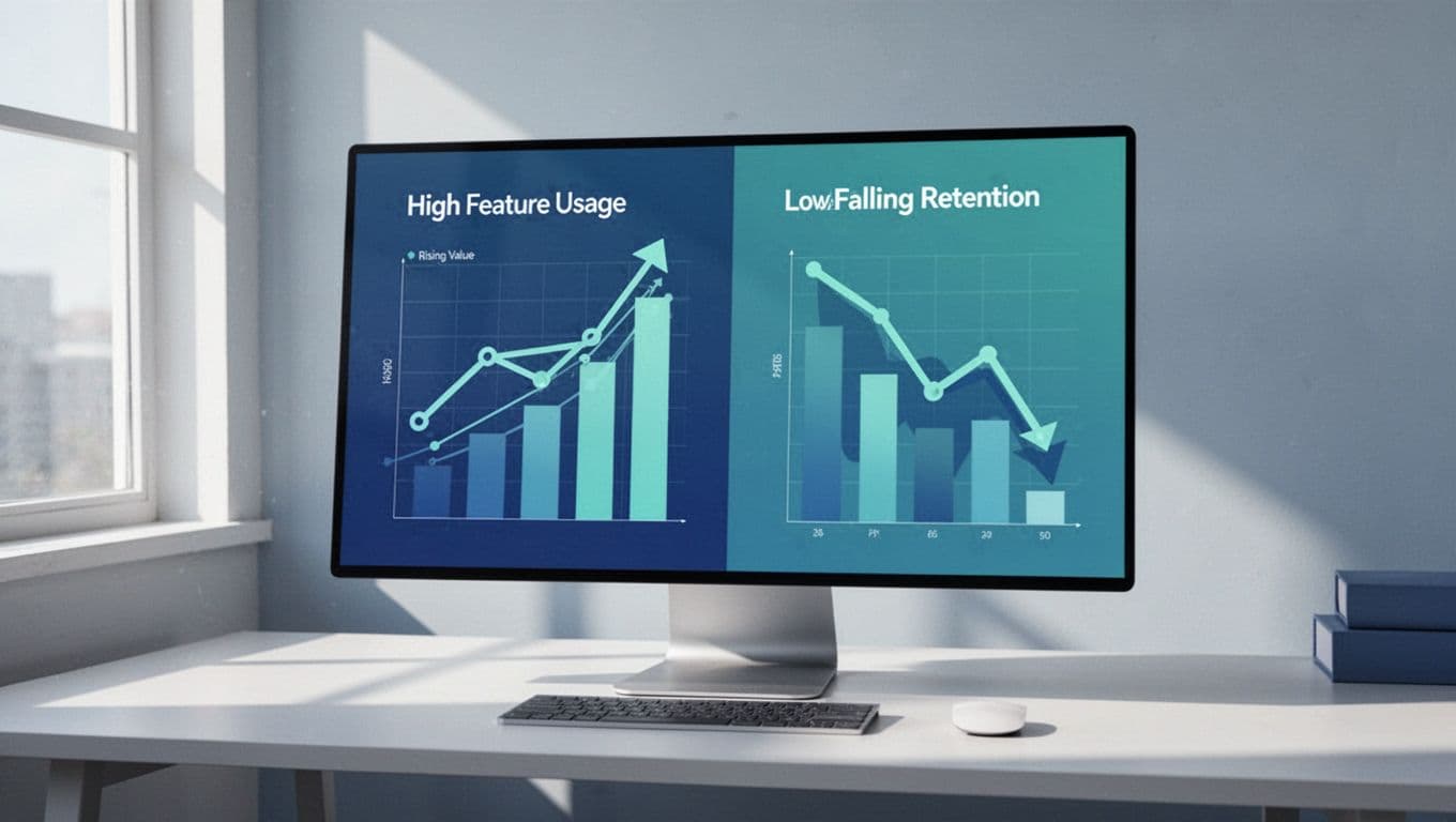
Charts like this confirm hunches. Left side thrives. Right side warns.
See key SaaS metrics like LTV and ARPU in Baremetrics for my full list.
Remember: Correlation Does Not Equal Causation
Patterns excite. But pause here. High usage links to low churn. Does it cause it?
Not always. Self-selectors grab features. They might retain anyway. Run A/B tests. Survey cancels. Cross-check with support tickets.
I use Cancellation Insights for this. It tags reasons against usage. “Too complex” hits low users hard. Fix onboarding, not the feature.
Benchmarks help too. Compare to peers via Baremetrics. If your link beats industry norms, dig deeper.
Conclusion
Baremetrics feature usage checks revealed my retention leaks. Integrations feed events. Metrics compare cohorts. Actions follow.
I cut churn 8 points last year. MRR grew steady. You can too. Start with People Insights today.
Your next upgrade waits in the data.