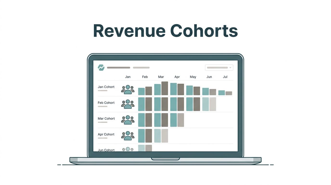
Blended MRR can look healthy while retention quietly slips. When I want the truth, I open revenue cohorts in Baremetrics. A cohort table shows me which signup groups stay, shrink, or grow over time.
That matters because SaaS revenue has a memory. A strong month of new sales can hide a weak month of retention. My goal is simple, read each cohort like a story, then act before the plot turns ugly.
Why cohorts tell me more than blended MRR
I think of a cohort as a graduating class. Everyone who started in January sits in one row. Everyone who started in February sits in the next. Instead of mixing all customers together, I compare groups that began at the same point.
As of March 2026, current public Baremetrics materials show cohort segmentation by signup date and other traits like plan, location, and acquisition source. That lines up with Baremetrics’ cohort analysis guide.
Topline MRR tells me what happened. Cohorts tell me when it started. If total revenue rises while newer cohorts fade fast, I know growth may be masking a leak. For founders and finance teams, that difference is the whole ballgame.
How I read the Baremetrics cohort table
I start with one row, not the whole screen. A cohort table can feel like a quilt of numbers, but it becomes simple once I read it left to right. When I need to explain the basics to a teammate, I often share this revenue cohort analysis guide before we review live data.

This is the revenue cohorts Baremetrics routine I use every time:
- Find the starting row: Each row is one signup cohort, usually by month. I treat that row like a single customer class.
- Read across the row: Each cell shows what that same cohort looks like later, often month 1, month 2, month 3, and so on. Depending on the selected view, I may be looking at dollars or retained revenue percentage.
- Compare the same age across rows: Month 2 versus month 2 is where the real signal lives. That keeps the comparison fair.
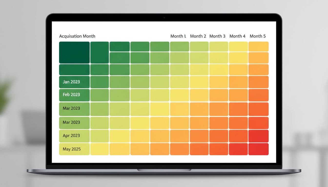
- Watch the color pattern first: I use the shading to spot shape, then I confirm with numbers. Good cohorts usually cool off slowly. Bad cohorts fall off a cliff early.
- Check segments before blaming the product: If one plan or source looks weak, I segment further. Sometimes the problem is traffic quality, not onboarding.
I never judge a cohort by one ugly cell. I look for repeated shape across several rows.
After that, I zoom out. If multiple recent rows improve after a pricing change, feature launch, or onboarding fix, I pay attention. If only one cohort improves, I treat it like weather, not climate.
What strong retention, weak retention, expansion, churn, and seasonality look like
Most patterns speak plainly once I stop staring at totals. This quick cheat sheet is the lens I use.
| Pattern | What I usually see | What I assume first |
|---|---|---|
| Strong retention | Small early drop, then flatter later cells | Users reach value fast |
| Weak retention | Sharp fall in months 1 to 2 | Onboarding or fit is weak |
| Expansion revenue | Later cells hold steady or rise | Upsells offset loss |
| Churn spike | One row or several rows fade hard | A product, pricing, or billing issue |
| Seasonality | Many cohorts dip in the same calendar period | Demand or buying cycles changed |
The strongest cohorts rarely look dramatic. They look calm. A little revenue slips at the start, then the row settles down. In plain English, customers stick, renew, and sometimes buy more.

Weak retention is louder. If a cohort loses a big chunk in the first one or two periods, I read that as a value problem close to signup. The promise was bright, but the room went dark too fast. At that point, I cross-check Tracking gross and net revenue churn so I can tell whether I lost accounts, dollars, or both.
Expansion revenue is the happy surprise. In revenue cohorts, it shows up when later cells stop shrinking or even climb. That often means upgrades, add-ons, seat growth, or stronger annual renewals. If a cohort expands after month 3, I ask what nudged customers deeper into the product. Then I compare that with Baremetrics pricing metrics for SaaS to see whether plan design helped or hurt.
Seasonality is the trickiest signal. If many cohorts dip at the same customer age, I look at onboarding or product value. If many cohorts dip in the same calendar month, I look for holidays, budget freezes, or renewal timing instead.
How I turn cohort signals into action
I don’t stop at reading the table. I use it to make smaller, safer decisions. If new cohorts retain better after a change, I push that change further. If cohorts convert well but decay fast, I fix activation before I spend more on acquisition.
I also pair cohort trends with Baremetrics’ MRR forecasting methods. Forecasts are only as good as the retention beneath them. A shiny growth line built on weak cohorts is like a house built on wet soil.
When I review revenue cohorts in Baremetrics, I’m not chasing a prettier dashboard. I’m looking for the shape of future revenue. Patterns beat averages, and one good row never earns my trust on its own.
Open one cohort table today and read across, not down. The leak, or the lift, usually shows up faster than you think.