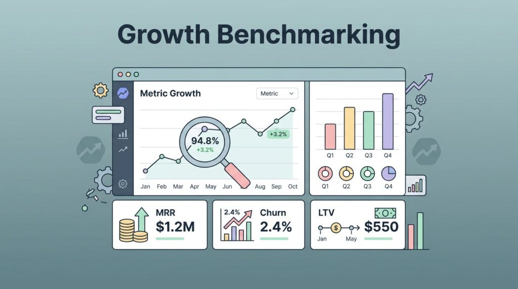
Plan upgrades can look like a clean rise in revenue, then vanish into a crowded chart. I don’t read them that casually. When I watch Baremetrics plan upgrades, I want to know whether the move came from real expansion, a billing change, or a coupon that ran out.
That difference matters for MRR, expansion revenue, and the story I bring to finance. A spike can hide weak account health, while a smaller climb can point to strong retention and honest upsell behavior. I start with a simple review flow before I trust the number.
Start with the upgrade number, then test the story
I begin in the subscription metrics dashboard, where Baremetrics shows upgrades, downgrades, and plan changes in one place. That view keeps me from reading MRR in a vacuum. A plan upgrade is useful only when I know what caused it.
I compare the upgrade count with total MRR movement and the downgrade side of the ledger. If upgrades rise while downgrades rise too, the chart is noisy. If upgrades rise and churn stays calm, I can read the signal with more confidence.
Baremetrics also counts a price increase after a coupon ends as an upgrade. That matters. A customer who outgrows a starter tier tells me something different than one whose discount expired. I want both in the same dashboard, but I do not want to confuse them.
For a broader metric frame, I keep the Baremetrics metrics I use for churn control close by. It helps me place upgrades beside ARR, churn, NRR, and ARPU instead of letting them float alone. Baremetrics’ own SaaS metrics guide is also a useful reference when I want the upgrade story to sit inside the bigger revenue picture.
A plan upgrade is not always a growth win. Sometimes it is a pricing correction with good timing.
Once I know the upgrade count is real, I ask a simpler question. Did the business move up because customers found more value, or because pricing rules changed the bill?
Read plan breakdowns beside customer history
I spend most of my second pass in plan breakdowns. Baremetrics shows how many active subscriptions sit on each plan, plus the monthly versus annual split. That matters because upgrade behavior often follows billing cadence. A monthly customer may move in small steps, while an annual customer may stay put until renewal.
The plan breakdown help page makes that structure easy to read, and I use it to spot drift. If one plan suddenly holds too much weight, I ask whether the entry tier is too narrow or the premium tier is too hard to reach.
If I want a broader layout, I borrow ideas from how I set up Baremetrics dashboards. A clean dashboard keeps the upgrade path visible. It also stops me from hunting through tabs when I need to answer a quick finance question.
The New Subscriptions tab matters too. I check what share of new customers choose each plan, because upgrade patterns usually start with first purchase behavior. If most people land on the lowest plan, I know I need a clearer path to expansion later.
Customer history gives me the raw evidence behind the trend. I can see payments, events, and changes for an account. That helps me tell the difference between a one-off move and a pattern. When a customer upgrades right after a usage spike, I read that as product pull. When the move follows a support touch or a renewal reminder, I treat it as a sales-assisted step.

Baremetrics gives me enough context to connect the event trail to the revenue shift. That is where the upgrade story starts to feel trustworthy. I can see whether the movement is tied to value, timing, or plain billing logic.
Use segmentation to separate real expansion from noise
I rarely trust a company-wide upgrade number until I split it by plan, billing interval, acquisition source, country, or customer type. Segmentation shows me where the lift comes from. It also shows me where I am telling myself a neat story.
A simple pattern table keeps me honest.
| Pattern I see | What it often means | What I check next |
|---|---|---|
| Upgrades cluster on one plan | The packaging may be working, or the next tier may be too easy to reach | I check usage, pricing, and support tickets |
| Annual customers upgrade less often than monthly customers | Renewal timing may hide expansion until later | I compare renewal dates and cohort age |
| Upgrade spikes follow a coupon ending | Revenue is rising, but the lift may come from price normalization | I separate promotion-driven changes from true expansion |
The biggest lesson is that expansion revenue is not the same as raw upgrade count. A small group of high-value accounts can move MRR more than dozens of low-value upgrades. Likewise, a wide wave of tiny upgrades can look healthy while net revenue retention stays flat.
I use key Baremetrics metrics for SaaS as the anchor here, because upgrades only matter when I can place them beside churn and ARPU. If ARPU is flat, I know the upgrades are not translating into deeper account value. If NRR improves, I know the revenue motion is sticking.
Baremetrics segmentation also helps me spot customer behavior that sales calls alone miss. If one channel brings in upgrade-ready customers and another brings in discount hunters, the plan mix shows it faster than anecdote does. I can then adjust onboarding, pricing, or follow-up work with a sharper view of where the friction starts.
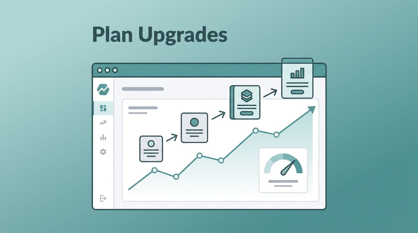
Turn plan upgrades into reports I can act on
Once I understand the pattern, I shape the reporting around decisions. Daily reports work well when I need a quick read on plan movement. Weekly reports help me see whether a spike was real or just a burst. Monthly reports are where I look for the shape of the business.
I share a different slice with each team. Finance wants the MRR effect and the split between new money and expansion. Growth wants the path that led to the upgrade. Customer success wants the accounts that may be ready for the next step. When I give each group the same chart, I get three different conversations. When I give each group the right chart, I get action.
Baremetrics’ automated reports make that rhythm easier to keep. I do not need to sit in the dashboard all day to know whether plan movement is healthy. I can set the pace to match the job, then spend my time on the parts that need judgment.
That is also where I think about the platform as more than a charting layer. I can keep upgrades in view, then pair them with annotations, benchmarks, or product context when I need the story behind the number. For a broader view of where the platform fits, I keep my Baremetrics analytics platform review close by. It helps me stay honest about what Baremetrics does well and where I still need other tools.
I also pay attention to customer success signals outside the revenue chart. Baremetrics’ own customer success tracking guide lines up with the way I read upgrade behavior, because healthier accounts tend to move cleanly through plans. If the upgrade pattern stalls, I look for friction in onboarding, usage, or support before I blame pricing.
A clean report answer is simple: who upgraded, when they moved, what plan they left, and what revenue changed because of it. That is enough for most teams. Anything more should have a purpose.
Conclusion
Plan upgrades are easy to admire and easy to misread. I get better answers when I read them beside plan breakdowns, customer history, and segmented views.
When I do that inside Baremetrics, the chart stops feeling like a scoreboard. It becomes a map of expansion revenue, customer intent, and pricing fit. That is the kind of signal I can use in a finance review or a growth meeting without second-guessing the data.
The cleanest upgrade story is the one I can explain in one sentence and trust in the numbers.