
Pricing problems rarely shout. They whisper through small drops in revenue, strange downgrade patterns, and discounts that look harmless until margins thin out.
When I analyze Baremetrics pricing metrics, I’m not hunting for textbook definitions. I’m trying to see whether my pricing model pulls customers forward or quietly sends them backward. That means reading metrics together, not one by one.
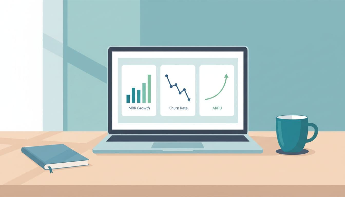
I start with MRR, ARPU, and plan mix
As of March 2026, Baremetrics tracks more than 28 subscription metrics. Still, I keep my first pass tight. I start with MRR, ARPU, and plan mix because those three tell me whether pricing is lifting the business or hiding weak spots.
MRR is the headline number, but I don’t trust it by itself. A rising MRR line can still hide a pricing issue. For example, if customer count climbs while ARPU stays flat, I may be adding too many low-value users. That often means the entry plan is cheap, the mid-tier is weak, or discounts are doing too much of the selling.
Plan mix gives MRR context. If growth comes mostly from lower tiers, I ask whether the product creates enough reason to upgrade later. Baremetrics Segmentation helps here, because I can compare plan performance by cohort, signup date, or customer group instead of staring at one blended average.
This quick table shows how I read the first layer:
| Metric | What I look for | Pricing decision it supports |
|---|---|---|
| MRR | Growth source, new vs expansion | Raise, re-bundle, or hold price |
| ARPU | Revenue quality per account | Fix discounting or move feature gates |
| Plan mix | Share of customers by tier | Simplify tiers or reposition plans |
If discounts are active, I read ARPU with extra care. A promo can fill the funnel and still weaken pricing power. Baremetrics’ own write-up on value-based pricing metrics supports that broader view, and their guide on how to do price analysis for SaaS lines up with the same idea: pricing only makes sense when tied to customer behavior.
Revenue churn and customer churn are not the same signal
This is where I see many teams blur the picture. Customer churn tells me how many accounts left. Revenue churn tells me how much money left. Those are cousins, not twins.
If ten small accounts cancel, customer churn may look ugly while revenue churn stays calm. If one large account downgrades, customer churn may look fine while revenue churn spikes. That difference matters because pricing decisions change depending on which one moved.

I also compare churn with upgrades, downgrades, and expansion revenue. If customer churn rises but Net Revenue Retention stays healthy, higher-value customers may still be expanding. In that case, I don’t rush into a full price cut. I look at who’s leaving. Maybe the lowest tier attracts poor-fit users. Maybe a free trial promise oversells the product.
Downgrades are especially telling. A downgrade wave often means customers still want the product, but not at the current price or feature boundary. That can point to a missing middle tier, bad packaging, or usage caps that feel punitive.
Failed payments complicate the picture. Baremetrics Recover helps separate a billing issue from a true pricing issue. If revenue dips because cards fail, I treat that differently from voluntary churn. Otherwise, I might blame pricing for a collections problem.
When customer churn and revenue churn move in opposite directions, I stop looking at totals and start looking at plan-level behavior.
Cancellation Insights adds another layer. If users cite budget, weak value, or missing features, I can tie those reasons back to specific plans and price points instead of guessing.
My Baremetrics pricing analysis workflow
I follow the same sequence each time because pricing analysis gets messy fast.
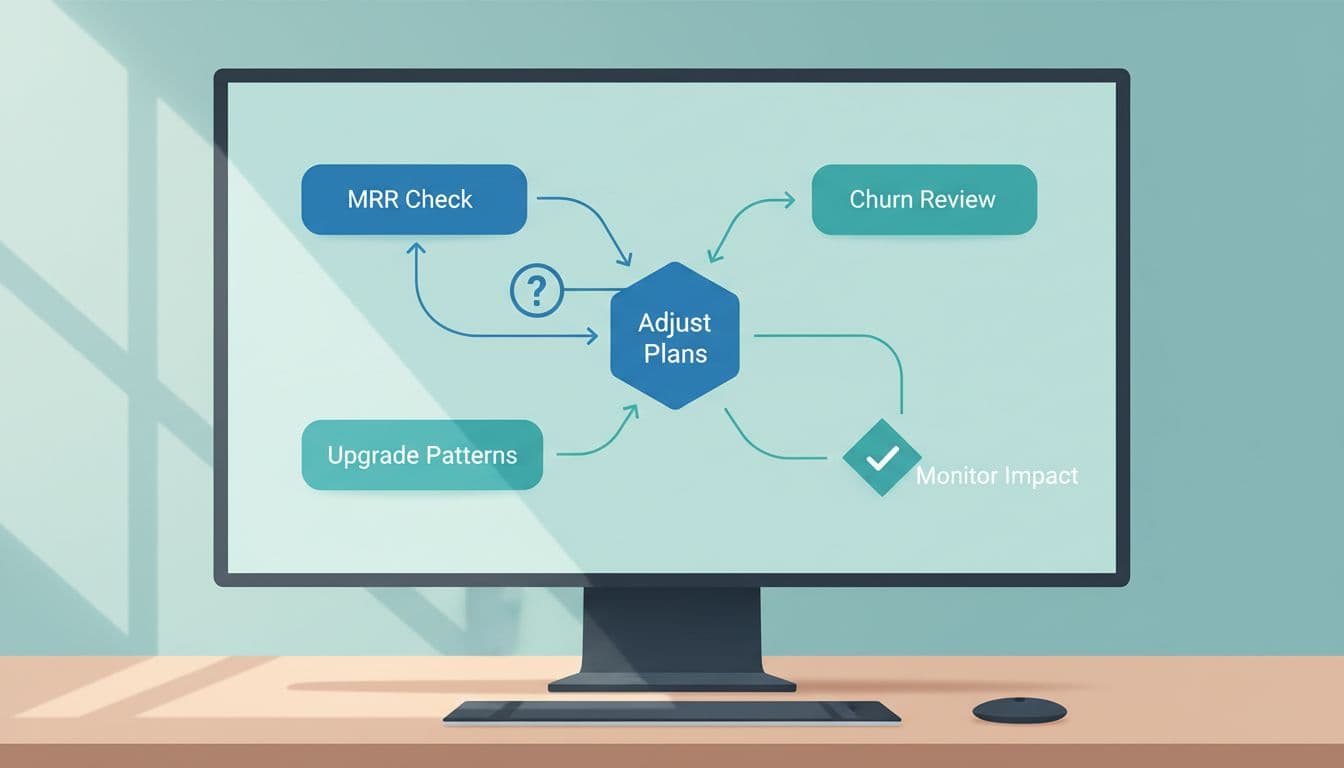
- Check MRR quality first. I look at total MRR, then compare new revenue, expansion revenue, and contraction. If expansion does the heavy lifting, pricing may work well for existing customers but not for new ones.
- Segment by plan and cohort. I compare customers who joined before and after pricing changes. If a newer cohort has lower ARPU and higher churn, the new packaging may have weakened perceived value.
- Compare churn types with downgrade patterns. I review customer churn, revenue churn, and downgrades together. If downgrades rise before churn rises, customers are waving a warning flag before they leave.
- Separate payment friction from price resistance. Failed payments belong in one bucket. Voluntary cancellations belong in another. Recover and Cancellation Insights help me keep those stories apart.
After that, I use Forecast+ and cohort trends to test the likely impact of a pricing change. I’m not looking for perfect certainty. I’m looking for the least risky next move.
For example, if a discounted annual plan shows strong retention but weak ARPU, I may reduce the discount rather than raise the base price. If mid-tier customers upgrade often and churn stays low, I may raise the entry tier and sharpen the mid-tier message. The broader logic also matches Baremetrics’ article on price optimization in SaaS, which treats pricing as an ongoing feedback loop, not a one-time guess.
The patterns that usually change my decision
Some patterns keep showing up, and each one points to a different move.
If upgrades are strong and downgrades stay low, I usually see room to tighten entry pricing or shift more value into the middle plan. On the other hand, if customer churn stays flat while revenue churn worsens, I look for larger downgrades, discount-heavy renewals, or enterprise accounts shrinking seats.
Plan mix can also fool me. A low churn rate sounds healthy until I notice most customers sit on the cheapest plan with weak expansion. That’s not pricing strength. That’s a crowded waiting room.
LTV helps settle hard calls. If higher-priced cohorts keep better retention and stronger expansion, the price may be filtering for better-fit buyers. Baremetrics’ piece on predictive analytics for SaaS lifetime value is useful here because it connects retention quality to future revenue, not only present revenue.
Pricing isn’t one number on a page. It’s a pattern of behavior. Baremetrics helps me read that pattern when I connect MRR, churn, plan mix, discounts, upgrades, downgrades, and failed payments into one story.
If I had to keep one rule, it’s this: trust the relationship between metrics more than any single chart. That’s where pricing truth usually hides.
The next time a revenue line looks healthy, I look twice. Quiet leaks often start there.