Refunds can hide in plain sight. One or two small entries may not feel urgent, yet they can change how I read MRR, retention, and cash flow.
When I review subscription revenue, I treat every refund like a crack in a pipe. It might be tiny today, but it tells me where pressure is building.
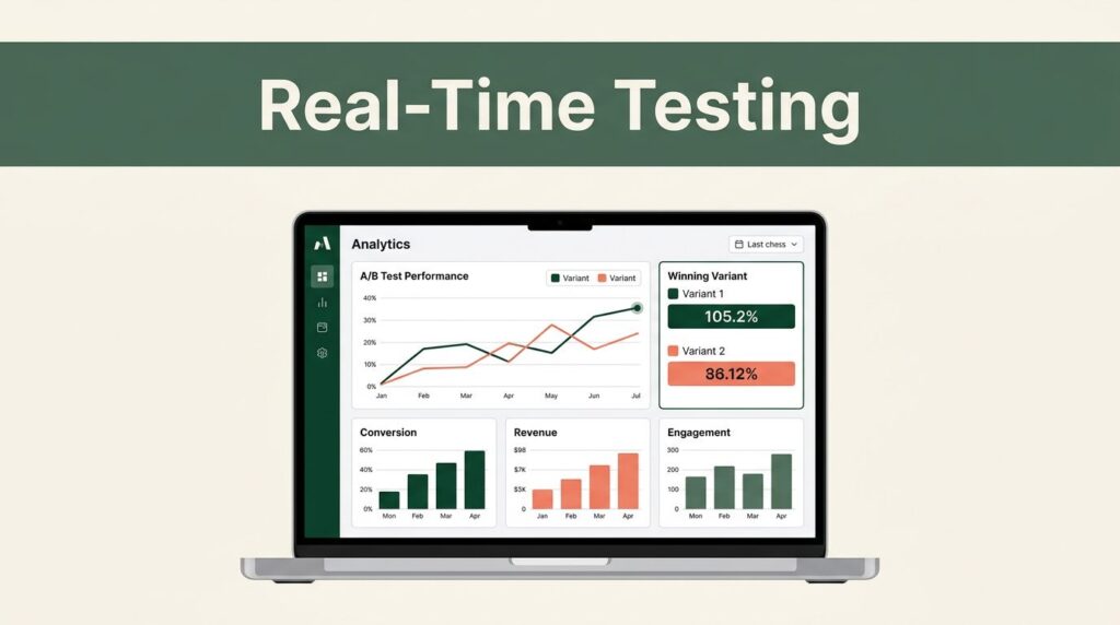
Baremetrics helps me see those refunds beside the rest of the revenue picture, so I can tell what is noise and what needs attention.
Why refund data changes the story behind revenue
A refund is more than a reversed charge. It changes the revenue story for the month, and sometimes for the quarter.
If I only scan gross sales, I miss the money that left. If I only count churn, I miss customers who left money on the table without fully canceling.
That matters for SaaS founders, finance leaders, and rev ops teams because refunds can point to product fit, pricing, support, or payment friction. When I keep them visible in Baremetrics, I get a clearer read on MRR, ARR, customer count, and retention.
I also use that view when I talk about GRR and NRR. Those metrics can look fine on paper while refunds quietly trim revenue underneath. The caution around retention metrics and SaaS churn pitfalls is useful here, because refunds are easy to undercount if they live in a spreadsheet instead of the revenue system.
How I read refunds inside Baremetrics
I start by connecting the billing source and checking that refund entries flow through the dashboard with the rest of the subscription data. Baremetrics connects with Stripe, so I don’t have to stitch together separate exports just to see the full picture.
From there, I look at refunds next to upgrades, downgrades, cancellations, and failed payments. That mix tells me whether I have a one-off issue or a broader trend.
I also build my dashboard with context in mind. I want segments by plan, signup month, region, or acquisition source when I need them. That’s why I keep setting up a smarter Baremetrics dashboard close at hand. A refund on an enterprise plan does not mean the same thing as a refund on a low-cost trial conversion, and I want the chart to show that difference.
When I change pricing or launch a feature, I add annotations. Later, if refunds spike, I can line the chart up with the event and ask a simple question: did I create confusion, or did I fix a product gap?

The refund numbers I watch first
I don’t start with the raw count alone. A refund total by itself can mislead me, because one enterprise refund and ten tiny trial refunds are not the same story.
Instead, I look at refund rate, refund dollars, refund timing, and the plan or segment behind the refund. I also watch whether refunds line up with failed charges or downgrades, because that tells me whether the issue lives in billing or in product fit.
When I build the view, I keep the metrics simple:
- Refund rate by plan shows where the business model is under pressure.
- Refund dollars by cohort shows whether a recent group of customers is struggling.
- Time to refund shows how fast buyers change their mind.
- Refunds after pricing changes shows whether the market accepted the new offer.
- Refunds after support contact shows whether service quality needs work.
I also pair that view with tracking key SaaS metrics to prevent churn, because refunds rarely appear alone. They often sit right next to the first signs of retention trouble.
Refund patterns I watch closely
Some refund patterns are loud, and some are faint. I look for both.
A spike after signup often points to a promise mismatch or onboarding friction. A cluster after a pricing change usually points to surprise, not anger. Refunds from one segment can reveal a channel problem, a weak audience fit, or a plan that attracts the wrong buyers.
A refund spike is often a product or expectation problem wearing a billing mask.
I also compare refund timing. If most refunds happen in the first week, I look at activation. If they show up after a support exchange, I look at service quality. If they appear after a failed payment, I look at retry logic and dunning.
This simple table helps me sort the signals faster:
| Refund pattern | What it usually means | What I do next |
|---|---|---|
| Refunds spike after signup | The offer or onboarding set the wrong expectation | Review the signup flow, trial handoff, and first-use emails |
| Refunds rise after a price update | Pricing shock or unclear plan value | Check messaging, grandfathering, and billing notices |
| Refunds cluster in one segment | Segment mismatch or weak channel quality | Break the data by plan, source, region, or cohort |
| Refunds pair with failed charges | Payment friction and weak recovery | Tighten retries, card prompts, and dunning timing |
Once I sort the pattern, the next step gets easier. I know whether I need a product fix, a billing fix, or a customer communication fix.
Turning refund data into action
Refund data matters most when it changes behavior. I do not want a prettier chart that ends with the same questions.
Instead, I turn the numbers into a short weekly routine. First, I review new refunds with finance and customer-facing teams. Then I tag the reason in a way that matches the business, not just the processor. Next, I compare the refund list with recent releases, campaigns, and pricing edits. Finally, I assign one owner to each repeated cause.
That habit keeps the work from drifting. Finance can keep the books clean, support can see which complaints repeat, and product can spot where users feel misled or stuck. For the accounting side, I also keep SaaS bookkeeping best practices in view, because refund tracking gets messy fast when revenue, taxes, and deferred income sit in different places.
When I need a broader context, I treat Baremetrics as part of a larger stack, not the whole answer. I say the same thing in my Baremetrics analytics platform review, because refund data is strongest when it sits beside the rest of the subscription story.
Common reporting mistakes I avoid
The biggest mistake is treating refunds as a side note. When they sit outside the dashboard, I spend more time reconciling numbers than improving the business.
I also avoid mixing counts with impact. Ten small refunds and one large refund do not carry the same weight. Another trap is ignoring timing. A refund on day two means something different from a refund after six months of use.
Finally, I don’t read refund data without context. A refund during a support outage, a billing migration, or a major pricing test tells a different story than a random one-off.
Baremetrics helps me keep that context visible, so I can ask better questions before month-end closes. If the data points to a pattern, I can correct the process instead of arguing about the spreadsheet.
Conclusion
Refunds are easy to shrug off when they look small. Yet they can reveal product gaps, pricing friction, and weak onboarding long before those issues show up in a board deck.
When I keep refund data visible in Baremetrics, I get a cleaner read on revenue and a faster path to action. That clarity matters more than any single refund total.
If I can see why money went back out, I can make better calls on what to fix next.