Agency revenue rarely breaks in one loud moment. It leaks.
A client downgrades. A renewal slips. A few card failures sit unpaid. By the time I notice the pattern in a spreadsheet, the month already feels thinner than it should.
I use Baremetrics subscription metrics to catch those leaks early. For agencies that run on retainers, memberships, or recurring support, the numbers tell a better story when I read them together, not one at a time. The trick is knowing which metrics matter, how to read the trend, and what decision each one should trigger.
Start with clean billing data and one view everyone trusts
My first move is to connect the billing source and confirm that the plan data is clean. If the sync is messy, every chart gets shaky. That is why I start with the Stripe integration setup guide, because the revenue view only helps when the billing feed is reliable.
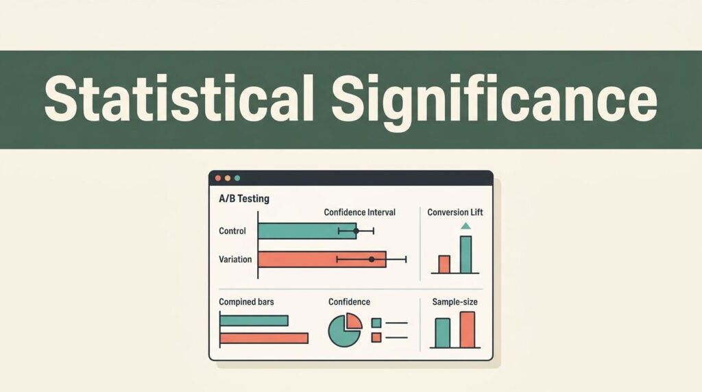
Once the data is in place, I build a dashboard that matches how my agency actually works. Leadership needs a fast read on recurring revenue, churn, and retention. Finance needs failed payments, contraction, and expansion. Client leads need a smaller view that shows where accounts are growing or slipping.
If I have enough history, I also use Forecast+ to sketch the next few months without living in a spreadsheet. Benchmarks help when I want a little context around a rough month. A bad week feels different when I know whether it is normal noise or a real drop.


A dashboard like this works best when I keep it simple. Too many tiles turn a clear view into wall art.
The Baremetrics subscription metrics I watch first
Baremetrics tracks a broad set of subscription numbers, but I do not need all of them every day. Its own 28 subscription metrics cover more ground than most agency teams will use at once, so I focus on the ones that answer business questions fast.
Here is the core set I keep on screen.
| Metric | What it tells me | Healthy trend | Warning sign |
|---|---|---|---|
| MRR | Monthly recurring revenue | Steady climb from new work and expansion | Growth hides churn or one big account |
| ARR | Yearly recurring revenue | Clean annual view for planning | Looks fine while monthly churn rises |
| Churn rate | Share of clients who leave | Low and stable | Jumps after onboarding, pricing, or service changes |
| Net Revenue Retention | Revenue kept from current clients | Above 100% in many subscription models | Below 100%, the base shrinks |
| ARPU | Average revenue per client | Moves up with better packaging | Drops because discounts pile up |
| New MRR | Revenue from new clients | Consistent adds from target accounts | Growth depends on a few one-off wins |
| Expansion MRR | Revenue from upgrades and add-ons | Existing clients buy more over time | Existing accounts never expand |
| Contraction MRR | Revenue lost from downgrades | Rare and tied to clear business changes | Frequent downgrades after onboarding |
| Failed payments | Billing friction | Low failure rate, quick recovery | Cards fail often and revenue stays lost |
| Recovery rate | How much failed revenue I recover | Strong dunning and fast collection | Lost payments sit for weeks |
I do not trust a rising MRR line by itself. I trust the mix of MRR, churn, expansion, and failed payments beside it.
ARR matters when I plan hiring or yearly budgets. ARPU matters when I want to know if packaging is working. New MRR and expansion MRR show where growth comes from, and contraction MRR shows where it leaks out. That mix keeps me honest.
How I read the trend lines without fooling myself
Healthy data has rhythm. MRR rises, churn stays flat, and existing accounts expand often enough to offset small losses. In many recurring businesses, a Net Revenue Retention rate above 100% is a strong sign, because the current client base is growing even before I add new logos.
Concerning data looks busy but weak. New MRR climbs while contraction and churn climb too. That means I am filling a bucket with holes. The top line can still move up for a while, but the base is not stable.

I also watch the shape of change, not just the final number. If ARPU rises and churn stays steady, pricing or packaging may be working. If ARPU rises and churn rises with it, I may be asking too much of the wrong segment.
When a metric moves, I connect it to a decision:
- If MRR grows but NRR slips, I review downgrades before I celebrate new sales.
- If churn rises after onboarding, I fix the first 30 days of the client experience.
- If failed payments spike, I tighten dunning emails and card-update prompts.
- If CAC climbs faster than LTV, I slow paid spend and sharpen targeting.
- If expansion MRR is flat, I train account teams to look for add-on needs earlier.
That is where the numbers become useful. They stop being a report and start acting like a short checklist for the week.
The weekly review I run with my team
I keep the review simple because reports that need a speech usually fail. My team opens the same dashboard every week and answers the same questions.
First, I check the headline view. MRR, churn, and NRR tell me if the base is healthy. Then I look at the details. Expansion, contraction, failed payments, and reactivation tell me where the change came from.
I built my layout using creating effective subscription metrics views, then trimmed it until each tile answered a real question. One view serves leadership. Another serves ops. A third helps finance spot billing trouble before it turns into cash pressure.
I also annotate anything that could explain a shift. A price change, a new service package, a major client loss, or a billing issue should live in the chart notes. Without that context, the chart becomes a guessing game.
When I want a weekly rhythm that sticks, I follow this order:
- Check the headline numbers first.
- Compare this week with the prior month and the same period last year.
- Read the movement by segment, such as plan, channel, or client type.
- Add notes for launches, pricing changes, or service problems.
- Pick one action for the next week.
That process keeps the dashboard tied to action. Otherwise, it becomes a pretty screen that nobody changes behavior from.
Where Baremetrics fits, and where I pair it with something else
Baremetrics is strong when I need subscription finance clarity. It is weaker when I need feature usage, funnel drop-off, or support history. That is why I treat it as the center of my subscription reporting, not the whole stack.
I explain that tradeoff more in my subscription analytics platform overview. The short version is simple. Baremetrics gives me the revenue truth. Other tools help me explain why that truth changed.
I also keep a few caveats in mind. If my agency mixes retainers with one-off projects, I separate those streams before I judge MRR. If a billing flow includes custom invoices, manual offsets, or delayed collection, I make sure those numbers are mapped cleanly. Clean inputs matter more than fancy charts.
Baremetrics makes the same point in its subscription analytics for startups article, the job is not to admire the dashboard. The job is to act while the month is still open.
Conclusion
The first warning sign is usually small. A downgrade here, a failed payment there, and the month starts to lean the wrong way.
When I track agency subscription metrics in Baremetrics, I get a clear read on MRR, churn, NRR, ARPU, and payment health. That gives me a better answer to a simple question, is the agency base getting stronger or more fragile?
A good dashboard does not make the decision for me. It keeps the story honest long before the month closes.