I treat a Baremetrics dashboard like a cockpit, not wall art. When revenue shifts, I don’t want a pretty chart alone. I want a fast read on growth, retention, and risk.
Baremetrics now lets me pair live metrics with tools like Segmentation, Annotations, Benchmarks, and Forecast+. So, instead of chasing numbers across tabs, I can read the business in one place. In this guide, I’ll show how I build that view, why each metric earns its spot, and how I shape separate layouts for leaders, finance, and growth. If I want fresh layout ideas before I start, I usually skim Baremetrics dashboard examples and templates.
Start with decisions, not charts
I never begin by dragging widgets onto a blank canvas. First, I write down the calls I need to make each week. Most SaaS teams come back to three: are we growing, are we keeping customers, and are we turning demand into clean revenue?
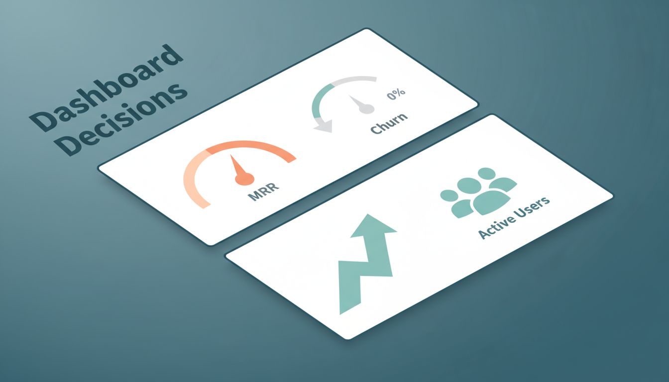
So, my top row stays tight. I lead with MRR, net new MRR, churn, and active customers. MRR shows pace. Net new MRR shows whether new sales beat downgrades and churn. Churn tells me if the bucket has a crack. Active customers adds scale, because revenue can rise while the customer base gets thin.
Next, I add ARPU, LTV, and trial conversion. ARPU helps me judge pricing and plan mix. LTV is useful as a directional signal, not a promise, because it comes from past behavior. Trial conversion tells me whether onboarding works. If failed payments matter, I also watch delinquent revenue, because avoidable churn is the easiest churn to cut.
A dashboard should settle arguments, not start them.
Context turns numbers into decisions. I use Segmentation to break metrics by plan, region, signup month, or lead source. If I sync CRM traits, I can go deeper. I also add Annotations whenever I change price, launch a feature, or run a campaign. Then, when a line bends, I can see the weather that hit it.

Build the dashboard in Baremetrics in five passes
Baremetrics works best when I build in layers. I don’t try to make the perfect view on day one. I make a useful one, then I sharpen it.
- Connect the data source. I start with Stripe, Chargebee, Shopify, or the API. Then I clean plan names and billing quirks, because messy inputs create fake stories.
- Pick one default time frame. I usually compare this month, last month, and the trailing 12 months. Short windows create noise.
- Place the health metrics first. The first screen should answer, in seconds, whether the business is healthier than last week.
- Add diagnostic widgets next. This is where I use Segmentation, churn views, failed charge trends, and Cancellation Insights to explain movement.
- Share the right view. I send role-based email reports or Slack updates so people see the same truth without digging.
I also think hard about screen order. Summary tiles sit on top, because leaders scan before they study. Trend charts live in the middle. Root-cause views sit lower, ready for the moment a headline number looks off. That simple order keeps the dashboard calm.
Right now, Baremetrics gives me custom dashboards with live updates, Benchmarks for peer context, and Forecast+ for planning. If I have enough history, Forecast+ helps me model the next few months without living in a spreadsheet. People Insights is where I go when I want money data next to logins, product use, or support signals.
If your team still builds reports by hand, compare that workflow with this SaaS financial dashboard guide. Manual reporting feels familiar, but it ages fast. A live dashboard gives me a better weekly rhythm.
Create role-based Baremetrics dashboard views, then read them with care
One dashboard for everyone sounds tidy. In practice, it creates fog. I build one core view, then I shape lighter versions for each team.

Here’s the layout pattern I keep coming back to:
| View | Top row | Second row | Main decisions |
|---|---|---|---|
| Executive | MRR, net new MRR, churn | Benchmarks, Forecast+, annotations | hiring pace, targets, pricing |
| Finance | MRR, ARPU, failed charges | upgrades, downgrades, cancellations | collections, budget, risk |
| Growth | trial conversion, new customers, expansion MRR | segments by channel or plan, cohort trends | spend, onboarding, packaging |
The takeaway is simple, each team needs the same source of truth, but not the same screen. For executives, I want a windshield. For finance, I want the engine bay. For growth, I want the funnel and its leaks.
I also watch for bad reads. Churn without segmentation can fool me, because one weak plan can poison the average. MRR growth can look great while discounts drag quality down. LTV can tempt a team into bold spending, even though it’s still a forecast. So I never read one metric alone. I pair churn with Cancellation Insights, pair acquisition with trial conversion, and pair revenue with customer mix.
Pretty charts can hide ugly math.
When I keep that habit, the Baremetrics dashboard becomes more than a report. It becomes a calm voice in a noisy room.
A blank dashboard is quiet, but a good one speaks. I build mine around decisions, then I add context until the numbers tell a clean story. Start small, give each team its own view, and keep testing your assumptions. When the next dip hits, your Baremetrics dashboard should tell you where to look first.