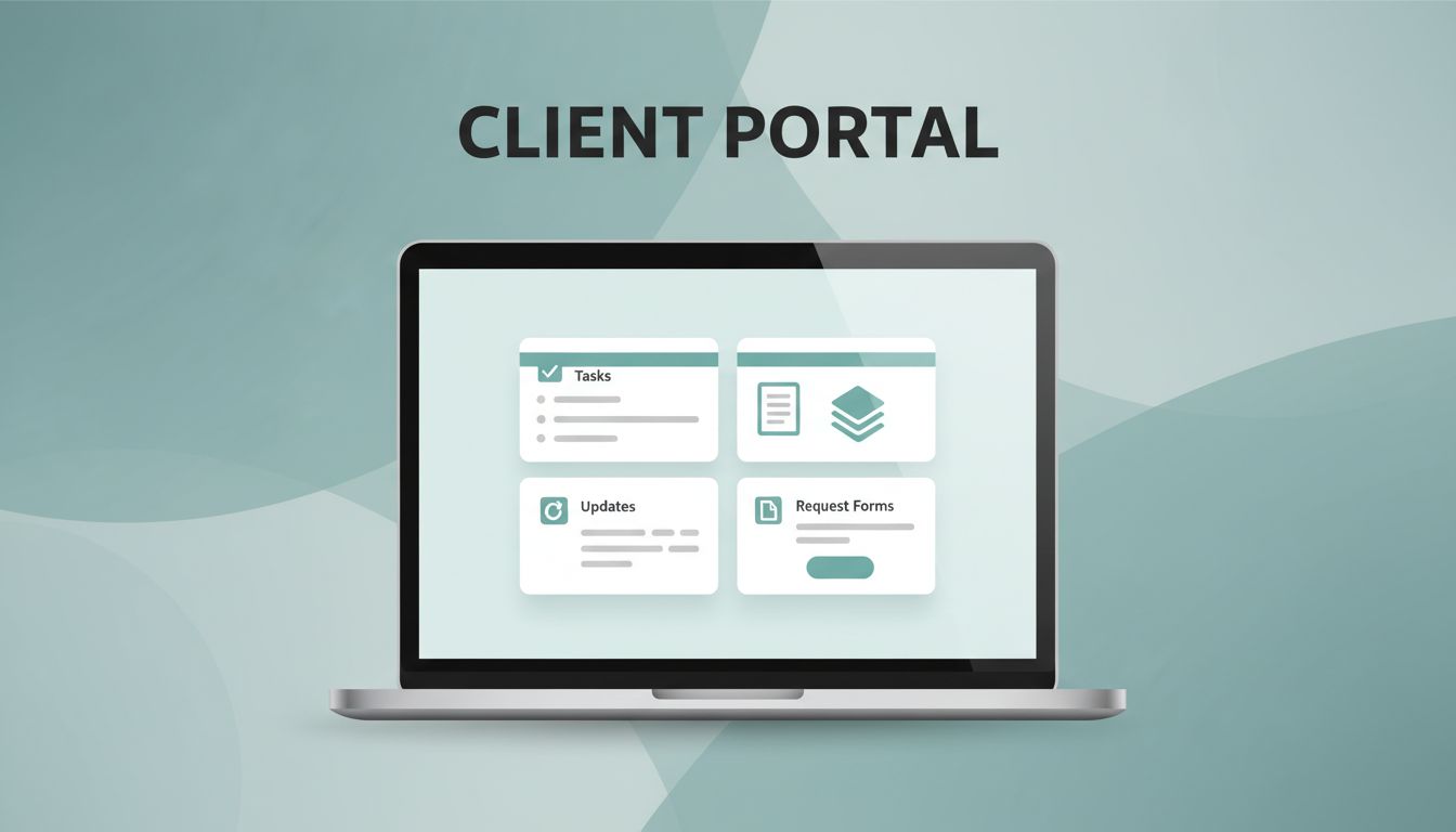
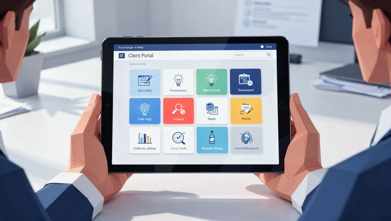
A messy client portal gets ignored fast. I build mine in Notion because it lets me keep projects, files, updates, and requests in one place without extra software clutter.
The trick is simple, but easy to miss. I don’t start by adding pages. I start by deciding what a client actually needs to see, what should stay private, and how much friction I can remove. In April 2026, Notion is stronger in dashboards and AI help, but permissions still need attention. Here’s how I set up a client portal Notion workspace that feels polished and stays manageable.
I start with the client’s daily jobs, not my internal process
Before I build anything, I write down the client’s top tasks. Most portals need the same core pieces, but the order matters. A client wants a place to check progress, find files, send requests, and see what needs approval.
I keep the scope small on purpose. If I add too much, the portal starts to feel like a storage closet. If I add too little, clients keep emailing me for basics. So I aim for one front door and a few clear rooms behind it.
My usual starting point includes these questions:
- What do they need every week?
- What do they need only when a project changes?
- What should they never see?
- What can live in one shared database, and what needs a separate page?
That first pass saves me hours later. It also keeps the portal focused on client work, not my internal habits.
I build the main dashboard first

I treat the dashboard like the lobby of an office. It should answer the first three questions right away: where am I, what do I do next, and where do I find things?
I usually build the home page with a short welcome note, a few linked sections, and a clear update area. Then I add linked database views for projects, tasks, or files. That way, I can show the right records without rebuilding the same content in five places.
I also keep the page short. Too many blocks make people scroll before they find anything useful. In Notion, clean layout beats heavy decoration every time. I might use a cover image and an icon, but I keep the rest practical.
Notion’s newer dashboard tools help here, and I still use AI for quick summaries or draft updates. I just review everything before clients see it. A portal should feel calm, not crowded.
I use a simple portal structure I can copy for every client
A good template keeps setup fast. I duplicate the same structure for each client, then swap in their projects, files, and brand details. That saves me from rebuilding the wheel every time.
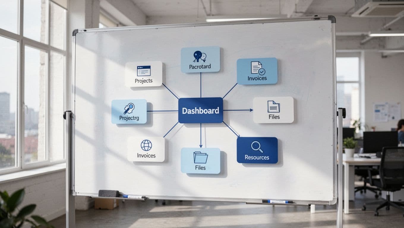
| Section | What I put there | Why it matters |
|---|---|---|
| Home | Welcome note, quick links, current status | Gives clients an immediate starting point |
| Projects | Active work, milestones, deadlines | Keeps the main work visible |
| Files | Shared assets, drafts, approvals | Stops file hunting in email threads |
| Requests | A place for new asks and feedback | Reduces random messages |
| Invoices | Payment links, status, due dates | Keeps money details easy to find |
| Resources | Guides, FAQs, SOPs | Answers repeat questions fast |
I keep this structure tight. If a page does not help the client move forward, I leave it out. That is how I keep the portal easy to use.
I handle sharing and permissions with care
This is where most Notion portals get messy. I check Notion’s sharing and permissions guide before I share anything, because access rules change the whole experience. In 2026, Notion’s latest improvements help with dashboards and AI, but client portals still need a cautious setup.
I never give a client more access than they need. If they only need one portal page, I share one portal page. If they need to comment on work, I allow that on the smallest possible scope. The goal is to protect the rest of my workspace.
If a client can see more than they need, the portal stops feeling private.
Notion still has limits here. Fine page-level control is better than it used to be, but it still isn’t perfect for every setup. For a useful breakdown of the current limits, I keep this client portal security guide handy when I test access.
If I need stricter separation, I duplicate the portal for each client and use filters tied to that client only. For intake, I route requests through a form or a separate request page. And if I need a more locked-down system with stronger client-facing controls, I compare it with Recruit CRM client portals for agencies.
I brand it lightly, then keep the layout easy to scan
A portal feels better when it looks like it belongs to the client. I add their colors, their logo, and a simple cover image. I do not overdecorate it. Clients want clarity first, style second.
Then I clean up the language. I rename pages in plain English, use short labels, and avoid internal jargon. I also pin the most-used pages near the top, because clients should not hunt for basics.
A few small habits make a big difference:
- I keep page names short and obvious.
- I use one style for status tags across every project.
- I archive old files instead of letting them pile up.
- I write one short welcome note that explains where things live.
Those details make the portal feel intentional. They also cut down on back-and-forth messages.
A good Notion portal feels quiet in the right way
When I build a client portal in Notion, I want it to feel like a tidy desk, not a crowded warehouse. The best version is simple, private, and easy to read in under a minute.
Notion works well when I keep the structure tight and the permissions narrow. If I need stronger access control, I use a workaround or move the client into a tool built for that job. Either way, the portal should make the client feel informed the moment they open it.