Revenue can rise while the product quietly loses pull. I pay attention to that gap because it tells me whether customers are buying once or building a habit.
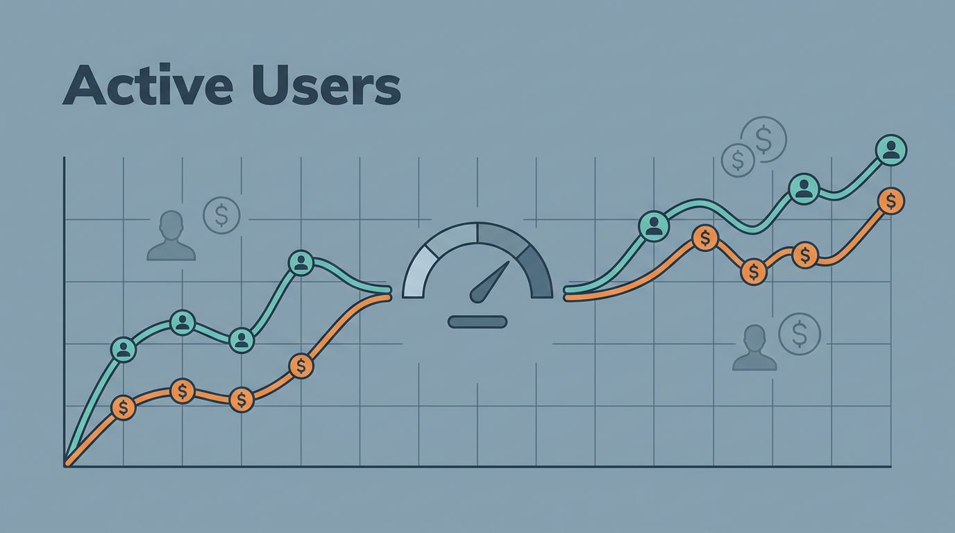
When I track Baremetrics active users beside MRR, I get a cleaner read on retention, expansion, and product adoption. A chart that mixes both signals feels less like decoration and more like a control panel.
I use that view when I need to spot weak onboarding, oversized pricing jumps, or a feature that never earned repeat use. The numbers usually reveal the story faster than meetings do. Then I can look at the business with sharper eyes.
What active users mean in a SaaS business
I define active users by a real product action, not a page view. In one app, that might be sending a message. In another, it might be creating a report, approving an invoice, or finishing a workflow.
The key is consistency. If I change the definition every month, the metric turns fuzzy. I also choose the time window that matches how customers use the product. A weekly tool needs weekly activity. A finance tool may make more sense on a monthly cycle.
I care about usage at both the user level and the account level. One loyal power user can hide a weak rollout inside a large account, and a wide login count can hide shallow use. A 20-seat account with two active seats tells me something very different from a 5-seat account with all five people inside the product.
A metric should answer the same question every week, so I avoid mixing logins, feature clicks, and account health into one fuzzy number.
That is why I treat Baremetrics active users as a business signal, not a vanity count. I want it to tell me whether the product is becoming part of the customer’s routine. That lines up with the way I think about tracking MRR and churn metrics, because usage only matters when it changes revenue behavior.
Why I want revenue and usage in the same frame
Revenue tells me what customers paid for. Active users tell me what they kept using. When I put them side by side, I can tell the difference between paid enthusiasm and lasting adoption.
Paddle’s overview of the most important SaaS metrics by stage is a useful reminder that no single number can explain a subscription business. I need the revenue line, but I also need the habit line. Together, they show whether growth is healthy or built on a thin layer of account activity.
Revenue tells me what buyers paid for. Active users tell me whether the product earned its place in their week.
If MRR climbs and active users stay flat, I start looking at pricing changes, annual prepay, or seat expansion inside a few accounts. That can be a good sign, but it can also mean the product is spreading slowly. If active users climb and revenue stays flat, I usually have a packaging gap. People are finding value, yet the plan they are on does not capture that value.


When I see that split inside a dashboard, I stop asking whether growth is up or down. I ask where the gap started. That question usually leads me to onboarding, pricing, or expansion.
How I set up Baremetrics for both signals
Baremetrics gives me clean subscription finance data, but I don’t treat it as a full product analytics suite. I pair it with my usage layer, because Baremetrics is strongest when I need revenue clarity and segmentation, not raw event analysis. That is also how I think about building a robust SaaS analytics stack.
My setup is simple.
- I define one active-user event and keep it stable.
- I match the time window to the product, usually weekly or monthly.
- I split the data by plan, account size, and acquisition source.
- I keep revenue and usage on the same weekly review.
If the product is self-serve, I watch trial-to-paid conversion. If it is sales-led, I watch seat adoption after close. In both cases, the active-user line tells me whether the first purchase is turning into real use.
I also compare new accounts, mature accounts, and large expansions without changing the frame. That helps me see whether usage is broad or concentrated.
When I want a cleaner executive view, I use building a smarter SaaS metrics view to keep MRR, churn, and usage signals in one place. That makes it easier to see whether the line is bending for a good reason or a bad one.
Baremetrics’ custom dashboards and People Insights are useful here because they put money signals next to account context. Once I can see both, I spend less time arguing over which chart is right and more time asking what changed.
Patterns that change my next move
The patterns matter more than the raw level. A dashboard can look healthy and still hide weak adoption.
Here are the four patterns I read first.
| Pattern | What I read | My next move |
|---|---|---|
| Revenue up, active users flat | Expansion or pricing is carrying growth | Check plan mix, seat growth, and which accounts drive MRR |
| Active users up, revenue flat | Adoption is growing faster than monetization | Review packaging, upgrade paths, and trial-to-paid conversion |
| Both up, but revenue lags usage | Value is spreading before pricing catches up | Look at feature gates, add-on offers, and account segmentation |
| Revenue down, active users steady | Retention may hold, but pricing or collections may be leaking | Review downgrades, failed payments, and discount use |
I do not read the first row as an automatic win. It may mean a few accounts are expanding while the broader base stays quiet. The second row is more encouraging, because it tells me the product has pull. Still, I need to ask where the money is waiting to catch up.
If the user side is hard to define, I keep The Complete Guide to SaaS Product Analytics close by. The term sounds simple, yet the exact event choice changes the story I read.
What I change when the signals disagree
When the numbers split, I use them to pick the next fix. That keeps me from guessing.
If usage is flat and revenue is strong, I look at retention first. A few high-value accounts can mask weak breadth across the base. I check cohort retention, support volume, downgrade reasons, and which features never get touched. If the product is sticky only for a small slice, expansion can stall fast.
If usage is rising and revenue lags, I look at pricing and activation. I want to know where the user found value, when they hit the first clear win, and whether that moment sits behind the right plan. Sometimes a packaging change does more than another feature release. A feature release can lift usage fast, but it may not move MRR until pricing and onboarding catch up.
If both numbers rise, I still read the shape. Broad growth across many accounts feels different from a spike inside a handful of large customers. One looks like adoption. The other looks like concentration risk.
This is where I treat Baremetrics as part of building a robust SaaS analytics stack, not the whole story. I want revenue, but I also want proof that customers keep coming back. That is the line I trust when I decide whether to fix onboarding, adjust pricing, or expand an account motion.
Conclusion
When I put revenue next to active users, the dashboard stops feeling like a scoreboard. It becomes a map of how customers behave after the sale.
That is the real value of tracking Baremetrics active users alongside MRR. Revenue tells me what landed in the bank. Active use tells me whether the product has earned a regular place in the customer’s workflow. When those lines drift apart, I know where to look, and I can act before the gap gets wider.