CSS Editor A/B Testing in Mida.so
A small CSS change can affect conversions, but only if you test it against a stable control. Mida.so lets marketing and product teams run these visual experiments without waiting for a full engineering release. You can test CTA styling, spa...

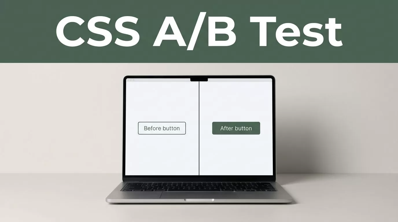
A small CSS change can affect conversions, but only if you test it against a stable control. Mida.so lets marketing and product teams run these visual experiments without waiting for a full engineering release.
You can test CTA styling, spacing, typography, visibility, and layout changes through a CSS editor. The work still needs discipline. Write one hypothesis, target the right element, check the page on every important device, and preserve the original version.
Key Takeaways
- Use CSS editor A/B testing for visual changes that don’t require new content or application logic.
- Test one clear hypothesis at a time against an unchanged control.
- Scope selectors carefully so the variation affects only the intended page and component.
- QA the variation on desktop, mobile, logged-in states, and important browsers.
- Keep the control version available so you can stop a weak or broken test quickly.
WHAT CSS EDITOR A/B TESTING DOES IN MIDA.SO
CSS controls presentation. It changes how an existing page looks without rewriting the page structure. That makes it useful for conversion experiments where the question is visual.
You can use a CSS variation to test:
- A stronger CTA color or border treatment
- Larger or smaller button text
- More space around a form
- Different heading sizes or line heights
- A shorter card layout
- A hidden secondary element
- A different position for trust information
- A wider content column
- A mobile-specific spacing adjustment
The test compares the original page, called the control, with a variation that contains your CSS rules. Visitors are assigned to the available versions through the Mida experiment. You then compare the conversion goal attached to the test.
The important limit is simple. CSS can’t create a new checkout step, change server-side pricing, or replace a product function. It can change visibility and layout, but it shouldn’t carry business logic. Use CSS when the page already contains the element you want to test.
Mida.so provides the testing environment and the page editor. Your CSS still needs valid selectors and sensible rules. The Mida.so platform is useful for this type of work because the test can sit outside your normal deployment cycle. Your developer doesn’t need to merge a separate stylesheet for every small visual experiment.
CSS editor A/B testing also reduces the risk of changing the live experience for every visitor. You can expose the variation to the experiment audience while the control remains available for comparison.
A CSS test answers a narrow question: does this presentation change improve the selected outcome?
That question keeps the experiment useful. A collection of unrelated styling changes doesn’t tell you what caused the result.
PLAN THE TEST BEFORE OPENING THE EDITOR
Start with the page and the conversion event. Don’t begin by changing a button because it looks old. Begin with an observation that points to a problem.
For example, you might see many product-page visitors but a low click rate on the primary CTA. Your hypothesis could be:
Increasing the CTA’s visual contrast will increase clicks to the signup page without reducing completed signups.
That statement gives you a control, a change, and a measurable outcome. It also prevents scope from growing during implementation.
Choose one variable
Keep the first test narrow. Don’t change the CTA color, copy, size, position, and surrounding layout in one variation. A result may show that the variation won, but you won’t know which change caused it.
A better sequence is:
- Test the CTA color while keeping size and position unchanged.
- Test button spacing in a separate experiment.
- Test typography only after the earlier result is understood.
This process takes longer than a single redesign. It gives you cleaner evidence.
Confirm the control
Record the current page before editing. Save a screenshot of the desktop and mobile states. Note the existing CTA text, destination, position, and surrounding elements.
The control should stay unchanged during the test. Don’t update the site’s global CSS halfway through the experiment. If the control changes, the comparison no longer measures one stable baseline.
Check that the target URL is correct. If the page has several URL variations, decide which ones belong in the test. A product page and a checkout page usually need separate experiments because visitor intent and conversion behavior are different.
Match the goal to the change
A CTA styling test should first measure the CTA action. A form-spacing test should measure form starts and completed submissions. A layout test may need a downstream conversion goal because more clicks don’t always produce more customers.
Keep secondary metrics available when Mida provides them, but name one primary decision metric before launch. This stops teams from selecting whichever number looks best after the test ends.
BUILD THE CSS VARIATION IN MIDA.SO
Open the experiment workflow in Mida.so and select the page or URL where the change should run. Use the available page editor to create the variation, then add the CSS rule for the target element.
The exact editor layout may change as Mida updates its product. The implementation principle stays the same: select the correct page, add a controlled style change, preview it, and attach the experiment to the right goal.
Start with a selector that identifies the component rather than a broad HTML element. A rule such as button { ... } can affect every button on the page. A class or component selector is safer, such as .pricing-page .primary-cta.
The MDN CSS selector reference is useful when you need to confirm how a selector targets an element.
Test CTA styling
A CTA variation should change one visual property when possible. For example, you might alter the background color while retaining the existing dimensions:
.pricing-page .primary-cta { background-color: #146c5a; }
You can also test a stronger border, a different text color, or a modest change in border radius. Avoid changing five properties in the same rule unless the hypothesis is about the complete button treatment.
Check hover and focus states too. A button that looks fine in its default state can become unreadable when a visitor moves a cursor over it or reaches it with a keyboard.
Test spacing and layout
Spacing changes are easy to implement and easy to overdo. A little extra space around a form can improve scanability. Too much space can push the CTA below the fold.
Use a scoped rule such as .signup-form { margin-top: 24px; } only when that selector identifies the intended form on the test page. Prefer a small, pre-defined adjustment over a full layout rewrite.
For a layout test, change one relationship. You could increase the width of the main content column, reduce the gap between a benefit list and its CTA, or move a trust element closer to the form. Watch for text wrapping and changes in page height.
Test typography
Typography affects hierarchy and readability. You can test a heading’s size, weight, line height, or maximum width.
For example, .product-hero h1 { line-height: 1.1; } changes the spacing between heading lines without changing the wording. Test readable values. A large heading that wraps into four lines may reduce the visibility of the CTA below it.
Use the site’s existing font stack where possible. Loading a new font through a CSS test can create layout shifts and may introduce a separate performance problem.
Test visibility with care
You can hide a secondary element with display: none, but treat this as a real content change. Removing delivery information, pricing context, testimonials, or support details can change visitor confidence.
Don’t hide an element simply because it makes the page look cleaner. State the reason in the hypothesis and check the effect on downstream conversions. Also confirm that the hidden element isn’t needed for accessibility or keyboard navigation.
QA THE VARIATION BEFORE YOU RUN IT
A CSS editor makes deployment faster. It doesn’t remove the need for testing. Preview the variation at the target URL and inspect the page at the widths your visitors use.
Check the following before launch:
- The variation appears only on the intended page.
- The control still looks unchanged.
- The CTA remains readable in default, hover, and focus states.
- Text doesn’t overlap or wrap into an unusable layout.
- The form and buttons remain clickable.
- Hidden elements don’t remove required information.
- Mobile spacing works without horizontal scrolling.
- The page works for logged-out and logged-in visitors when both states matter.
- The primary conversion action still reaches the correct destination.
CSS conflicts are a common failure point. A site stylesheet may use a more specific selector than your test rule. The result is a variation that appears in the editor but not on the live page. Use browser inspection to compare the competing rules. The MDN guide to CSS specificity explains why one declaration overrides another.
Don’t solve every conflict with !important. It can force the variation to display, but it also makes later debugging harder. First improve the selector and confirm that the rule is scoped correctly.
Accessibility needs a separate check. Confirm color contrast, visible focus, text resizing, and keyboard access. The WCAG 2.2 requirements provide the baseline for these checks.
Run a tracking check before sending traffic. Complete the test action yourself and confirm that the conversion is recorded. If the event doesn’t fire, the experiment result won’t answer the business question.
LAUNCH, MONITOR, AND READ THE RESULT
Set the experiment audience and traffic allocation in Mida according to the risk of the change. A small CTA color test usually carries less operational risk than hiding a pricing explanation or changing a checkout layout.
Keep a launch record. Write down the page, hypothesis, selector, CSS rules, primary goal, start date, and control screenshot. Store the original CSS separately. This gives your team a clean rollback path.
After launch, monitor the first visits for broken layouts and unexpected page behavior. Early numbers can move sharply when the sample is small. Don’t stop a test because of one strong day or one weak hour.
Read the primary goal first. Then review supporting metrics such as CTA clicks, form starts, completed submissions, revenue, or cancellation behavior when those metrics are available. A variation that produces more clicks but fewer completed signups isn’t a successful CTA test.
Segment results only when the segment was planned or has enough traffic to support a useful comparison. Mobile visitors, new visitors, and returning customers may behave differently, but slicing every result creates noise.
When the test has a clear result, document the decision. Keep the variation only if it improves the primary goal without creating a serious guardrail problem. If it loses, return to the control and record what the test taught you. If the result is unclear, don’t force a winner. Refine the hypothesis and run a cleaner test.
COMMON CSS TESTING ERRORS TO AVOID
The most common error is testing a redesign instead of a hypothesis. A variation with new colors, new spacing, new copy, and a new layout may look better, but the result won’t identify the cause.
Broad selectors create another problem. A rule that affects every .button, heading, or form can change unrelated sections. Scope CSS to a page wrapper and the exact component.
Don’t edit production styles while the Mida test is running. Keep the control stable. Don’t remove the original CSS until the result is recorded and the winning version has been moved into the normal deployment process.
Finally, don’t treat the CSS editor as a substitute for QA. A page can pass a desktop preview and fail on a narrow screen. Check the complete user path before trusting the data.
Conclusion
CSS editor A/B testing in Mida.so works best for focused visual experiments. Use it to test one change, one hypothesis, and one primary conversion goal against an unchanged control.
Scope every selector. Check the page across devices. Verify tracking before launch. When the result is clear, move the winning change into your normal codebase and keep the control record for future tests. A small CSS adjustment is useful when the test behind it is precise.

