Desktop Vs Mobile Testing Strategy
You cannot treat desktop and mobile traffic as the same user segment. Many teams make the mistake of pooling all visitors into a single experiment, which dilutes data and obscures the unique friction points that kill conversion rates on sma...
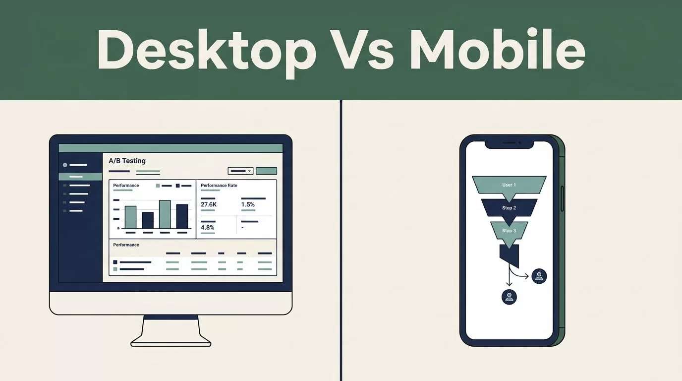
You cannot treat desktop and mobile traffic as the same user segment. Many teams make the mistake of pooling all visitors into a single experiment, which dilutes data and obscures the unique friction points that kill conversion rates on smaller screens. When you separate these streams, you gain a clear view of how specific layouts perform for the devices your users actually hold.
Key Takeaways
- Desktop and mobile users possess different interaction patterns, intent levels, and context, making unified A/B testing data unreliable.
- Mobile-specific conversion rate optimization requires identifying unique friction points, such as tap targets, form length, and navigation complexity.
- Relying on desktop performance trends to predict mobile outcomes often leads to false negatives or missed opportunities for revenue growth.
- Using Mida.so to segment traffic allows you to run independent experiments that address the device-specific needs of your audience.
- You should prioritize mobile testing for high-traffic pages where the delta between desktop and mobile conversion is most significant.
Understanding Device Differences in User Behavior
Desktop environments offer precision and screen real estate. Users have mice, keyboards, and a stable connection. Mobile environments are chaotic. Users move, use one thumb, and frequently deal with network instability. When you test a new call-to-action button, a desktop user might click it in seconds. A mobile user might struggle to scroll past a sticky header just to reach that same button.

If you ignore these variables, you assume your interface is universal. Data shows that mobile visitors convert at a lower rate than desktop users, often due to poor mobile-specific design. You need to identify where that drop-off happens. If your desktop conversion rate is healthy but your mobile rate is stagnant, your testing program is missing the mark. You must isolate your variables to understand if a failure is design-related or device-limited.
Why Pooled Data Masking Hurts Conversion
Many analysts group device traffic to reach statistical significance faster. This practice is a major operational risk. You might see a winning variation that works well on desktop, but if the mobile traffic is large enough, the aggregate data might suggest the test failed or produced mixed results.
Running tests without segmenting by device forces you to make average decisions for two very different groups. As highlighted in professional conversion rate optimization best practices, grouping traffic hides the reality of your user experience. If a desktop test succeeds, you only know it works for desktop. If you apply that same logic to mobile without testing it, you gamble with your revenue. You need Mida.so to enforce strict segmentation, ensuring that your mobile tests are evaluated against mobile traffic and desktop tests against desktop.
Testing Navigation and CTAs by Device
Navigation structures that function on a desktop monitor rarely translate well to a smartphone screen. A mega-menu works when you have a cursor. On a phone, that menu often becomes a nested list that buries the content your user actually wants. When you test navigation updates, keep the device in mind. Test a simplified hamburger menu against a persistent bottom navigation bar on mobile, while keeping your desktop header testing separate.
Call-to-action buttons face similar issues. A large, bold CTA above the fold on desktop might take up the entire screen on a mobile device, forcing the user to scroll unnecessarily. Use Mida.so to experiment with placement variations. Test a sticky button at the bottom of the screen on mobile against a standard inline button. Your metrics should focus on the percentage of users who successfully initiate the action, not just the clicks on the page.
Optimizing Form Flows and Checkout
Forms are the most common conversion killers on mobile. Every field you require on a desktop form is a barrier you put in front of a mobile user. When you evaluate mobile forms, look for field validation errors. If a user has to tap back and forth to fix a zip code error, they will leave.
| Element | Desktop Strategy | Mobile Strategy |
|---|---|---|
| Navigation | Show all primary links | Collapse into simple menu |
| CTA Placement | Mid-page with space | Sticky bottom bar |
| Form Input | Tab-through fields | Single-column, auto-fill |
| Checkout | Multi-step progress bar | One-page tap-to-pay |
You should test these flows independently. A one-page checkout might work perfectly on desktop, but it could fail on mobile if the layout breaks or if the keyboard covers the “Submit” button. Effective optimization programs focus on these technical constraints. With Mida.so, you can monitor the completion rate for each form step specifically for your mobile cohort, allowing you to refine the inputs until you remove every unnecessary bit of friction.
Implementing Device-Level Analysis in Mida.so
When you launch an experiment in Mida.so, start by setting your audience rules. Define your segments clearly: Desktop (Screen width > 1024px) and Mobile (Screen width < 768px). Do not allow crossover. Once you isolate these segments, you can begin your test cycles.
Start your testing by identifying the biggest revenue gap. If your mobile checkout page has a conversion rate 30% lower than desktop, that is your testing priority. Run an A/B test on the mobile checkout flow alone. Keep the desktop flow as your control until you find a winning mobile variation. By focusing your testing resources on the device that underperforms, you maximize the impact of your conversion rate optimization effort.
Ensure that you track device-specific events. Do not rely solely on macro-conversions like “Purchase.” Track micro-conversions like “Added to cart” or “Form started.” This data will tell you where the mobile journey breaks down, even if the user does not complete the purchase.
Establishing a Testing Cadence
You do not need to test every page on every device simultaneously. Prioritize your high-traffic pages and your highest-impact user flows. Start with the cart, the checkout, and the primary lead-generation forms. Once you have a steady cadence for these core areas, expand to product pages and landing pages.
Avoid the temptation to guess what will work. Instead, document your hypotheses for each device. If you believe a change will improve mobile conversion, state why. Is it because of reduced scrolling? Is it because of better button contrast? If the test fails, you know exactly what to discard. If it wins, you have proof that the change solved a specific mobile friction point.
Consistency is the goal. By running dedicated mobile tests, you slowly build a library of what works for your mobile users. Over time, these insights accumulate into a mobile-first strategy that increases your overall conversion rate rather than just padding your desktop numbers.
Conclusion
The divide between desktop and mobile user behavior is a permanent feature of web commerce. Treating them as a single audience unit is an operational failure that leaves revenue on the table. You must segment your traffic, isolate your testing variables, and focus on the distinct friction points that exist on smaller screens.
Use Mida.so to maintain strict separation between your device-specific experiments. This allows you to gather clean, actionable data that avoids the interference of desktop-biased results. When you commit to a device-first mindset, you stop making assumptions and start building interfaces that work for the specific conditions your users face every day. Focus your resources on the weakest links in your mobile journey, test decisively, and optimize for the device in the user’s hand.
