How to Test Customer Review Placements on Mida.so for Better Conversions
Most ecommerce sites leak potential buyers before they ever reach the checkout screen. Visitors arrive from paid social ads, organic search, and email campaigns, scan your product pages, and leave without buying. Bumping up those conversion...

Most ecommerce sites leak potential buyers before they ever reach the checkout screen. Visitors arrive from paid social ads, organic search, and email campaigns, scan your product pages, and leave without buying. Bumping up those conversion numbers doesn’t require guessing what color button works today. It requires a disciplined, structured approach to user behavior and rapid experimentation.
Mida.so provides the testing infrastructure you need, but tools only work when you pair them with an operational testing process. Social proof is your strongest lever for reducing shopper hesitation, yet many stores bury their feedback at the bottom of the page. Finding the optimal spot requires testing different layouts rather than relying on design intuition.
Here are the key takeaways from this guide:
- Establish baseline conversion rates and traffic stability before launching any new experiment on your store pages.
- Formulate clear hypotheses based on user friction points rather than random design tweaks.
- Test one meaningful customer review placement variable at a time instead of launching messy multi-element redesigns.
- Monitor segment performance across mobile devices and traffic sources instead of relying solely on aggregate totals.
- Connect your experimentation platform data to your CRM and billing systems to protect down-funnel lead quality and revenue.
Building a Clear Placement Testing Hypothesis
A useful hypothesis connects an observed problem to a measurable outcome. Avoid statements like, “Moving reviews higher will improve trust.” That claim is too broad to test effectively. Use a structure that names the audience, change, mechanism, and expected result.
If mobile visitors scroll past the fold without seeing social proof, then completed checkouts will increase because they won’t need to hunt for product ratings. You can explore Mida.so features to see how lightweight scripts handle these visual modifications.
Random design changes waste valuable traffic. Every test needs a direct connection between an observed user problem and a measurable change. If mobile users abandon your product page before scrolling down to customer testimonials, your test should focus on moving a trust snippet closer to the top of the viewport.
Mapping Out Concrete Test Ideas for Your Store
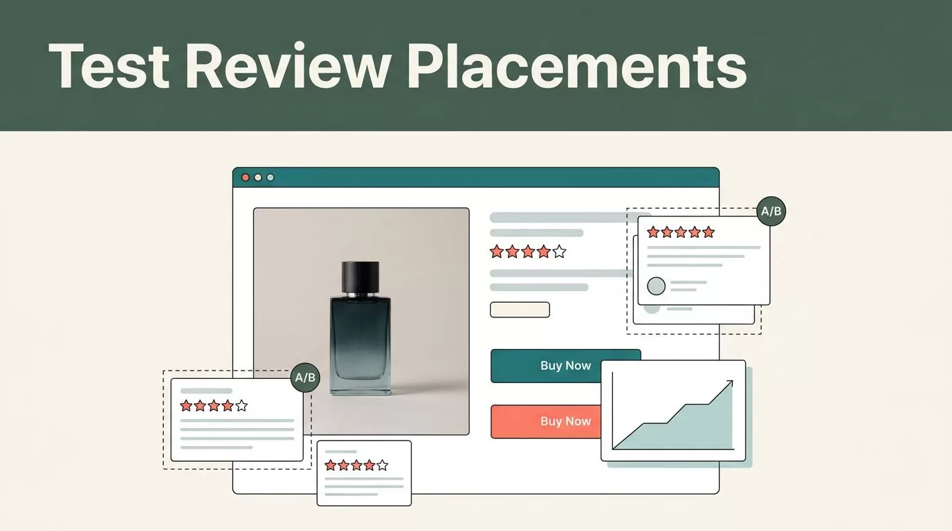
You need to test specific zones on your product template rather than guessing where feedback belongs. Each location targets a different type of buyer friction.
- Near product titles: Place a star rating and review count directly beneath the main headline to capture attention before the shopper reads product descriptions.
- Add-to-cart proximity: Position a quote or badge right beside the primary purchase button to reassure hesitant buyers at the exact moment of commitment.
- Pricing and tier sections: Put customer quotes near your pricing matrix to justify the cost and reduce hesitation on premium plans.
- Trust and guarantee zones: Group reviews alongside your shipping, return, and warranty guarantees to build a comprehensive security block.
- Checkout-adjacent areas: Add micro-testimonials near form fields or payment inputs to reduce last-second cart abandonment.
- Below-the-fold product details: Test an expanded feedback tab or masonry review grid for shoppers who want deep research before buying.
Don’t combine all six ideas in one variant. If your conversion rate changes, you won’t know which decision caused it. Test one placement at a time against your control version.
Setting Up Your First Customer Review Placement Test


Before you create your variant in the visual editor, document your current page performance. Record your baseline conversion rate, bounce rate, traffic volume, and the split between mobile and desktop visitors. Include your main traffic sources, such as paid search, organic search, and email referrals.
A noisy baseline weakens your test validity. If traffic changes sharply due to a holiday sale or an unannounced ad campaign pause, your experiment analysis will yield unreliable conclusions. Traffic allocation controls how visitors enter your test. A standard setup uses a fifty-fifty split, giving both experiences equal exposure.
Keep your targeting rules precise. If your review placement update specifically targets mobile visitors or paid search traffic, configure those audience parameters before launching. Keep your traffic distribution steady and avoid changing audience rules while the test is active. Altering targeting parameters mid-stream creates a new test condition, corrupting your sample purity and forcing you to restart your measurement period.
Reading Test Results With Practical Business Context
A winning percentage on a dashboard doesn’t guarantee a profitable campaign rollout. You must evaluate raw conversion counts alongside percentage lifts to understand the real financial impact.
Calculate your conversion rate accurately by dividing total conversions by total exposures, then multiplying by one hundred. Treat early results as directional indicators rather than absolute proof. Let your experiment run through a full business cycle to account for weekend dips and weekday spikes.
Look beyond top-level aggregate numbers. Segment your performance data by device type and traffic channel. A variation that wins overall among organic visitors might fail completely for paid traffic arriving from mobile ad placements. For teams exploring broader options, reviewing Mida.so capabilities highlights how visual testing tools handle these exact reporting parameters.
Check whether your results remain consistent across important audience segments. You should also review absolute numbers alongside rates. A small percentage difference based on a handful of conversions should never drive a site-wide redesign.
Preventing Common Experimentation Mistakes
The most expensive experimentation mistakes usually happen before you launch your campaigns. Running several overlapping experiments on the same page can contaminate your results.
If one test changes your headline and another changes your review placement, you may not know which experience each visitor received. Schedule related tests one after another or use a planned multivariate design when your traffic volume supports it.
Protect your Core Web Vitals by auditing every script you inject for an experiment. Mida.so is engineered for performance, but your implementation strategy still matters. Keep your tracking scope limited to the specific pages and audiences that require testing. Treat Largest Contentful Paint and Cumulative Layout Shift as hard test guardrails. If a high-converting variant introduces an annoying layout shift or delays your main hero image, reject the update. A modest conversion gain is never worth a slower mobile experience that frustrates your best prospects.
Conclusion
Testing customer review placements gives your ecommerce team a systematic way to improve store revenue without guessing what shoppers want. Start with a clean baseline and one narrow hypothesis focused on a specific visitor friction point. Keep your traffic allocation stable, inspect raw counts, review device and channel segments, and protect your page rendering speed. The winning review placement is the one that improves your primary business metric without creating a worse experience for the visitors who matter most.

