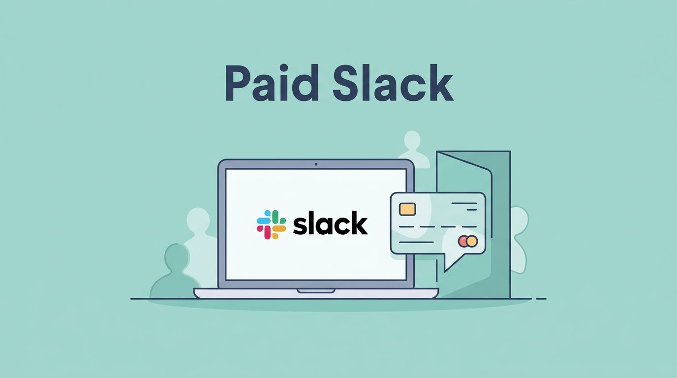
Launching a paid Slack group gets messy when the membership page and the workspace are built as separate projects. I want a cleaner path than that. When I build a MemberSpace Slack group, I keep the route short, pay, confirm, join, and start talking.
I also keep the setup boring on purpose. Boring means fewer lost members, fewer support emails, and fewer broken links. I start with the offer, then I set up the gate, then I make Slack match the promise.
Start with the offer, not the workspace
I decide what members are buying before I pick a price. For creators, coaches, consultants, and community builders, that usually means one clear outcome, like weekly office hours, private feedback, peer support, or a shared resource room. I write that promise in plain language before I touch the tech.
I also choose a rhythm. A paid Slack group feels alive when members know when to show up. A weekly call, a Friday feedback thread, or a monthly review session gives the room shape. Without that cadence, Slack turns into a quiet hallway.
If I want one recurring price, I use my monthly subscription setup. If I need a starter level and a premium room, I map tiered membership levels before I build anything. I keep the ladder simple because people buy clarity, not option fatigue.
I do not start with Slack features. I start with the result the member wants. That could be better feedback, sharper decisions, or a place to ask questions without noise. When the promise is sharp, pricing gets easier and the sales page writes itself.
Build the MemberSpace product that holds the door
I create one MemberSpace product for the Slack community. As of June 2026, I still prefer a simple path, Stripe handles payment, MemberSpace protects access, and Slack handles the conversation. I also keep MemberSpace’s paid Slack community guide open when I want to compare my setup against the official flow.
Inside the product, I set the destination as an external link and point it at the Slack join path I want members to use. I turn on the Member Menu too, because I want members to have a clear place to return after signup. If my site runs on Squarespace, I pair this with my Squarespace paywall setup so the site and the membership gate speak the same language.
I also keep the product name specific. “Community Access” is fine, but “Friday Studio Room” tells members what they bought. Clear names matter later when I build emails, coupons, or a second tier. The product should feel like one clean door, not a maze of labels.
I do not post the Slack invite link in public. I do not bury the join step three clicks deep either. The best setup feels almost plain. The member pays, gets the right next step, and knows where to click without thinking.


Set up Slack so members land in the right room
Slack is where the promise becomes real, so I set it up before I invite the first member. I create the workspace, then I make the core channels private. General chat, office hours, event recaps, and resource drops all belong behind the door.
I keep channel names short and plain. Members should know what each room does without a tour. A public teaser channel can exist, but I keep it thin and use it only to point people toward the paid space. The paid work stays private.
I also pin the welcome note, the rules, and the first action step. That first message should tell people where to post, how to get help, and what to expect in the first week. If I want members to reply from different time zones, I add a co-host or moderator before launch. Otherwise, the room can feel cold after the first day.
I do not rely on a public invite link. I want the invite to match the buyer’s email and the plan they chose. That keeps the room closed to people who never paid and saves me from cleanup later.
If the group will be active at launch, I add a short moderation plan. I decide who approves posts, who handles support, and how fast I answer in the first week. Slack feels alive when the host shows up.
Prepare the pages and assets before launch
I keep the launch moving when I prepare a small stack of assets ahead of time. A few pages do most of the work.
| Asset | What I use it for | My rule |
|---|---|---|
| Sales page | Explains the promise, price, and rules | Keep it plain |
| Protected join page | Shows the Slack step only after payment | Hide it behind MemberSpace |
| Welcome email | Points members to the first action | Send it right away |
| Community rules page | Sets behavior and support boundaries | Write it in simple language |
| FAQ or help page | Handles repeat questions | Keep it short |
That set covers most launches. I do not need a giant member portal. I need one clear sales page, one clear gate, and one clear next step. I also build a tiny onboarding checklist. It lists the first post to read, the best channel for intros, and the one place to ask for help. A simple contact form or support email helps too, because some members will always skip Slack and email me first.
When I use Squarespace, I keep the site structure tight so I can point people from the public page to the member-only step without confusion. That matters more than fancy design. The pages should read like a straight hallway, not a shopping mall.
Connect payment, email, and Slack invites
I connect the payment and invite flow after the pages exist. The path is simple.
- A buyer chooses a plan and pays through MemberSpace.
- MemberSpace shows the protected next step and sends the welcome email.
- My automation sends the Slack invite or routes the member to the right private channel flow.
- I check that the member lands in the correct room and sees the pinned welcome note.
I test that path with my own purchase before I open the doors. I also test cancellation and a failed renewal. If access ends in MemberSpace, Slack should not keep acting like the person still pays. That mismatch causes confusion fast.
I keep one more rule in place. The first-week message must tell members where the value lives. If the real value sits in office hours, I say that. If it sits in weekly feedback, I say that. A paid Slack group gets stronger when the first week feels useful, not noisy.
If I run annual plans or multiple tiers, I test each one separately. A basic member should not see a premium channel, and a premium member should not land in the wrong welcome note. That mismatch is small on paper and annoying in real life.
Common mistakes that break a paid Slack group
Most launch problems come from a few avoidable habits. The first is using a public Slack link anywhere on the sales page or in a welcome email. The second is creating too many channels before the group has a real rhythm. The third is charging for the room but never saying what happens after someone joins.
If I have to email a member the Slack link by hand, my process is still leaking.
I also watch for weak cancellation language. Members should know what happens when a payment fails, when they cancel, and when access ends. That calm, plain language saves me from support loops later. If I can explain the path in one breath, I am close to ready.
I test on mobile too, because many buyers open the welcome email on a phone. If the join path is clumsy on a small screen, the member feels that friction before they even say hello. A clean desktop flow with a broken phone flow still feels broken.
Conclusion
A paid Slack group works when the path is short and the rules are clear. I use MemberSpace to control access, Slack to host the conversation, and a few simple pages to keep the member journey clean.
Once those pieces match, I can focus on the part that matters most, showing up with a room worth paying for. The first buyer should never have to guess where to click or what happens next.