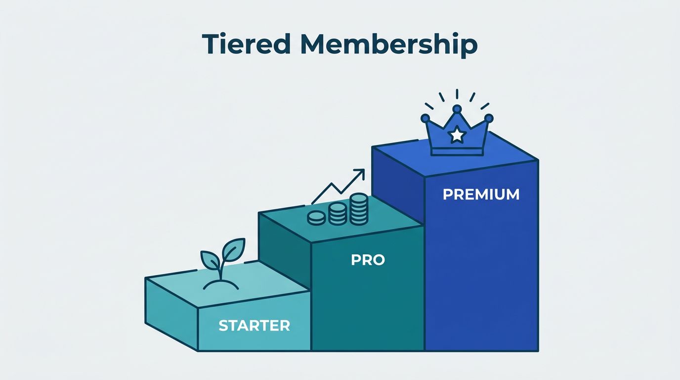
A one-price membership is easy to launch, but it often leaves money and clarity on the table. I prefer tiered membership levels because they let me match the offer to the buyer instead of forcing everyone into the same box.
When I structure tiers well, the lower plan feels easy to join, the middle plan feels like the smart choice, and the higher plan feels worth the jump. MemberSpace works well for that setup, as long as I map the tiers before I open the dashboard.
Start with the role each tier has to play
I treat each tier as a promise. It tells a member what kind of access, support, or outcome they get.
I use tiers when my audience has clear differences in need. A beginner wants a simple start. An active user wants more content. A serious buyer may want direct help, live calls, or premium resources. In those cases, one flat plan feels too blunt.
I also use tiers when I want a natural upgrade path. A good offer gives people a first step and a next step. That path matters more than packing every feature into one plan.
I avoid tiers when the differences are weak. If the lower and higher levels feel almost identical, members get stuck comparing prices instead of value. That usually creates hesitation, support questions, and cancellations.
The same rule I use when I shape a Skool membership site applies here, each level needs a clear reason to exist.
Plan the ladder before I open MemberSpace
Before I touch the settings, I sketch the offer on paper. That keeps me from building a messy stack of perks.
I write down three things for each level, who it is for, what it unlocks, and why someone would move up later. Then I keep the differences clean. Access, support, and speed are easy to understand. Random bonus items are not.
Here’s a simple structure I might use.
| Tier | Best for | What I include | Price logic |
|---|---|---|---|
| Starter | New members | Core library, one monthly update, basic community access | Low-friction entry |
| Growth | Most members | Starter plus workshops, templates, and live Q&A | Main plan |
| Premium | Members who want help | Everything above, plus priority feedback or private sessions | Highest value tier |
I keep the middle tier as the default choice. That is usually where most members belong. The starter tier lowers the barrier to entry, and the premium tier gives ambitious members a clear next step.
I also keep the names plain. The best tier names make sense at a glance. I like the naming advice in MemberPress’s guide to membership level names, because it pushes me toward names that sound clear instead of clever.
Build the levels in MemberSpace
Once I know the structure, I build one plan per tier in MemberSpace. I keep the setup simple so the member journey stays easy to follow.


- I create the first plan with the name, price, and billing cadence I want.
- I duplicate that plan for the next tier, then change only the benefits and the price.
- I connect the right protected pages, posts, files, or sections to each plan.
- I check that the member can find the next step after signup.
- I test the flow with a real account before I publish anything.
I try to keep each plan tied to a single clear promise. If a page belongs to every member, I leave it in the lower tier. If a bonus resource or private area is meant to reward the upgrade, I keep it higher up.
I also check the member experience on mobile. A tier can look perfect in the admin panel and still feel confusing on a phone. That is why I open the member view, click through the pages, and confirm that the locked content, unlocked content, and upgrade prompts all make sense.
If I want a second look at upgrade behavior, membership tier strategies that encourage member upgrades gives a useful framework. I use that same logic when I decide what belongs in the next plan.
Write pricing and upgrade paths that feel obvious
Pricing works best when it matches the value gap between tiers. I do not want a tiny jump between plans if the benefits are very different. I also do not want a huge price gap if the upgrade only adds a small bonus.
I try to keep one clear reason for each tier. The starter plan is for access. The middle plan is for momentum. The premium plan is for help, speed, or direct attention. When I keep those roles separate, pricing gets easier to explain.
I also make the upgrade path easy to see. Members should not have to hunt for it. If they outgrow the lower tier, the next step should be one click away inside the member area or the account flow.
A good plan name helps here too. If the name says what the member gets, the pricing makes more sense. “Starter,” “Pro,” and “Elite” are plain, but they work because they create a ladder. A long branded name often slows people down.
If I cannot explain the difference between two tiers in one breath, I change the offer.
That rule saves me from overbuilding. It also keeps the upgrade path honest. A member should move up because the value is real, not because I buried the good stuff behind a vague label.
Avoid the mistakes that make tiers hard to buy
Most tier problems come from clutter. Too many levels, too many promises, or too many names can turn a good offer into a puzzle.
- I avoid more than three tiers unless I have a very clear reason.
- I remove overlap fast when two tiers look too similar.
- I keep one benefit type per tier, instead of mixing everything together.
- I test every permission before launch so locked content stays locked.
- I make sure the upgrade path is visible, not hidden in a support email.
I have seen offers fail because the premium tier felt like a junk drawer. It had extra files, random calls, and a few scattered bonuses, but no clear purpose. Members did not see the point, so they stayed put.
I have also seen the opposite problem. A tier had a sharp name, but no real difference in access. That creates friction fast. People compare plans, then choose the cheapest one because the better option does not feel better.
If the structure feels confusing to me, I simplify it before launch. That keeps the sales page cleaner and the support inbox calmer.
Keep members moving after signup
The first week matters. I want new members to know three things right away, where to start, what they get, and what comes next.
I send a welcome message that repeats the tier promise in plain language. Then I point members to the first quick win. That first win could be a starter lesson, a template, a live call, or a short path through the library. The point is to create momentum.
I also give each tier a reason to return. A weekly drop, a monthly workshop, or a new bonus resource keeps the offer alive. Members stay when the membership feels active, not static.
The same habit-building rhythm I use in building a profitable Skool membership site works here too. A member is more likely to keep paying when the plan has a steady pulse.
I review confusion points once a month. If people keep asking the same question, I change the copy, the labels, or the member flow. I do not treat that as a member problem. I treat it as a design problem.
Conclusion
Tiered memberships work when each level has a job. One tier brings people in. Another keeps them engaged. A higher one gives the extra support that makes the upgrade feel fair.
In MemberSpace, I get the best results when I map the tiers first, then build the plans, access rules, and upgrade paths around that structure. That keeps the offer easy to explain and easier to buy.
If I can explain the whole membership in a minute, I know I am close. Three clear levels, one obvious next step, and a clean member path are enough to make the structure work.