Revenue Churn vs Customer Churn in Baremetrics: What I Watch First
A quiet churn report can hide a loud revenue problem. I don’t treat revenue churn vs customer churn as the same signal, because they answer different questions. In Baremetrics, one metric tells me how many accounts left. The other tel...

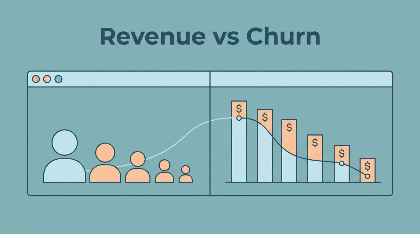
A quiet churn report can hide a loud revenue problem. I don’t treat revenue churn vs customer churn as the same signal, because they answer different questions.
In Baremetrics, one metric tells me how many accounts left. The other tells me how much recurring money walked out with them.
When I compare both, I can see whether the issue is broad retention, pricing mix, or a few large accounts slipping away.
What each churn metric tells me
Customer churn is the share of customers I lost during a period. Revenue churn is the share of recurring revenue I lost during that same period. In SaaS, those numbers can point in different directions, because one customer can be worth ten times another.
I keep the math simple.
| Metric | Formula | What it tells me |
|---|---|---|
| Customer churn | Customers lost / customers at start of period x 100 | How fast accounts leave |
| Revenue churn | Lost MRR / starting MRR x 100 | How much recurring revenue disappears |
| Gross revenue churn | (Cancelled MRR + downgraded MRR) / starting MRR x 100 | The raw revenue leak before growth offsets it |
| Net revenue churn | (Cancelled MRR + downgraded MRR – expansion MRR) / starting MRR x 100 | Whether expansion revenue makes up for the loss |
If I start the month with $50,000 in MRR and lose $5,000, revenue churn is 10%. If expansion revenue brings back $2,000, net revenue churn falls to 6%.
That gap is why I keep both views open. Baremetrics has a clear comparison of customer churn vs revenue churn, and I also keep calculating SaaS churn rate handy when I need to sanity-check the math.
Why the metrics split apart
When the numbers diverge, I stop reading churn as one problem. I want to know whether the leak sits in many small accounts or a few large ones.


For example, if I start with 100 customers and $20,000 in MRR, losing four customers worth $4,150 total gives me 4% customer churn and 20.75% revenue churn. The customer count looks manageable. The revenue hit doesn’t.
The reverse happens too. If 15 low-priced accounts leave out of 150, customer churn is 10%. Yet if those accounts only made up $300 of $18,000 in MRR, revenue churn is 1.7%.
That split often comes from plan mix, discounts, or usage-based tiers. It also shows up when downgrades pile up. The customer stays, but the spend drops.
The revenue churn and logo churn relationship is useful context here, because account size changes the meaning of every lost customer.
When customer churn stays low but revenue churn spikes, I usually look at big accounts, heavy discounts, or downgrades first.
A quiet customer churn number can still hide a loud revenue problem. Revenue churn tells me where the money is leaking.
How I read both in Baremetrics
My first stop is the Baremetrics dashboard, where I want churn next to MRR, expansion revenue, and retention. That keeps the story in one place instead of spread across tabs. I start with tracking churn and retention in Baremetrics because it shows how churn moves beside the rest of the subscription data.
Then I check the time range. A rough week can look serious in a seven-day view, so I compare the last 30 days with the prior month. A three-month trend matters more than a single noisy dip.
After that, I scan MRR movement, cancellations, downgrades, failed payments, and reactivations. Those details tell me whether churn came from hard exits or softer revenue pressure.
I don’t stop at the headline metric. I compare churn with key SaaS revenue metrics such as ARPU and NRR, because churn means less when expansion revenue is strong. If revenue churn falls while customer churn stays flat, I usually look for price increases, add-ons, or annual prepay. If customer churn rises while revenue churn stays tame, I look at low-cost plans and onboarding.
I also segment by plan and account size. A single enterprise exit and a dozen starter-plan exits never tell the same story. That is why Baremetrics feels useful to me in practice, not just in reports.
What I do when the pattern changes
The pattern tells me where to spend time next. It also keeps the team from arguing about the wrong metric.
| Pattern in Baremetrics | What it usually means | My next check |
|---|---|---|
| Low customer churn, high revenue churn | A few large accounts left or downgraded | Enterprise plans, discounting, usage drops |
| High customer churn, low revenue churn | Small plans are churning | Onboarding, entry-tier value, trial-to-paid conversion |
| Both are high | Retention is weak across the base | Cohorts, cancellation reasons, failed payments |
That table keeps me from chasing the wrong problem. If the revenue line is hurting, I look for concentration risk and pricing mix. If the customer line is hurting, I focus on product fit and early-life retention.
I also use the table as a quick handoff note for finance and product. Finance wants to know whether revenue is at risk. Product wants to know whether the issue sits in onboarding, pricing, or ongoing value. Both questions matter, but they need different answers.
When Baremetrics shows a split between the two churn rates, I treat it like a smoke alarm with two tones. One tone points to volume. The other points to value.
How I explain the difference to my team
I keep the explanation simple. Customer churn tells me how many accounts left. Revenue churn tells me how much money left with them.
That matters because a team can celebrate a clean-looking logo churn rate and still miss a real problem. One large account can do more damage than a row of small ones. On the other side, a noisy stream of tiny cancellations can make the customer count look worse than the cash flow really is.
So when I review Baremetrics with leadership, I frame churn in three layers. First, I check how many customers left. Next, I check how much MRR disappeared. Then I ask whether expansion revenue softened the hit or whether downgrades made it worse.
That sequence gives the room a clear answer. It turns a vague churn complaint into a focused decision about retention, pricing, or customer mix.
Conclusion
Revenue churn and customer churn only look interchangeable at a glance. Once I put them side by side in Baremetrics, the difference tells me whether I’m losing accounts, dollars, or both.
That matters because the fix changes with the signal. One metric points me toward retention volume. The other points me toward financial exposure.
If I want one habit to keep, it’s this: I read the count and the cash together every month. That is the cleanest way to keep the churn story honest.

