The fastest membership sites do not start with fancy tech. They start with one clear promise and a simple way to pay for it.
That matters when I’m building for creators, coaches, educators, or a small business that needs revenue soon. A MemberSpace membership site works best when I keep the offer focused, the access rules simple, and the first month easy to deliver.
I start with the offer, then I build the site around it.
Start with one clear promise
Before I touch the settings, I write down exactly what members are buying. I want one outcome, one audience, and one reason to come back.
If I want a community-heavy model, I compare it with Skool vs Kajabi for recurring revenue models. If I want to protect content on my own site and keep my brand front and center, MemberSpace fits better.
The current version of MemberSpace is built for that kind of setup. It lets me gate pages, sell subscriptions or one-time access, drip content, manage members, and plug into tools I already use. The official MemberSpace site makes that core promise clear, turn part of my existing site into a paid area without rebuilding everything from scratch.
If the offer needs a long explanation, the offer is not ready yet.
I keep the first version narrow. That usually means one course, one template library, one coaching vault, or one member newsletter with a few protected bonuses. The site grows later. The first launch just needs a reason to join this month instead of “someday.”
Set up MemberSpace on the site you already own
MemberSpace works best when I treat it like an access layer, not a new website. I keep my current site, then I protect the parts that should be private.
I usually connect it to WordPress, Squarespace, or Webflow first, since those are common starting points for small teams and solo creators. If I’m on Squarespace, I follow MemberSpace’s Squarespace membership guide so I can map the setup to my actual pages.


I start by choosing the pages I want to protect. That might be a course library, a resource vault, a private blog, or a downloads page. Then I connect signup and login so members can enter without friction. I like that MemberSpace supports Google sign-up and login, and some setups also support faster checkout options like Apple Pay and Google Pay.
Next, I test the member path myself. I click through as if I were a first-time visitor. If the payment flow feels slow, I fix that before launch. If the login page feels awkward on mobile, I fix that too. A membership site falls apart fast when the first screen feels clumsy.
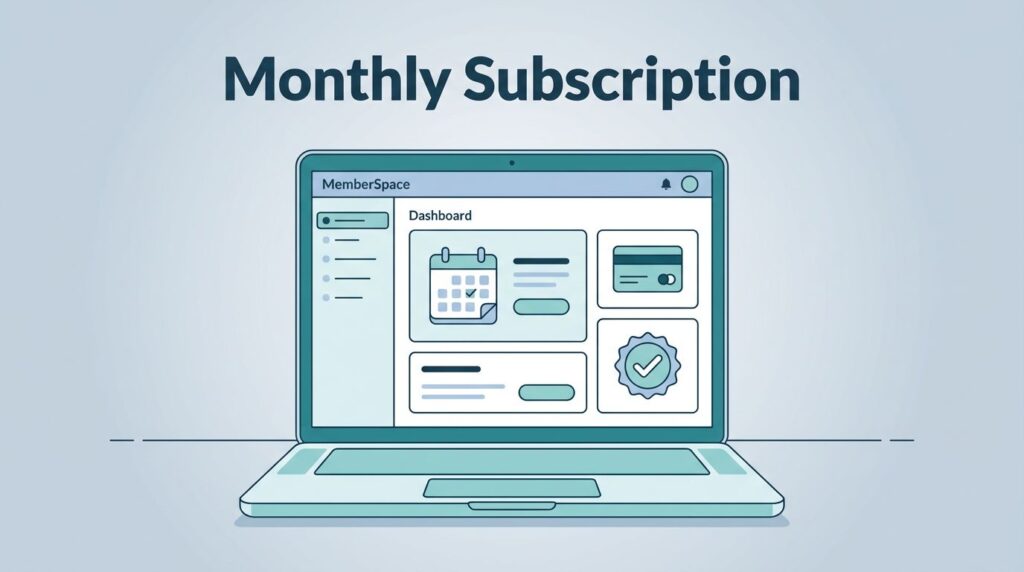
I also check the member dashboard. People should be able to see billing details, account info, and their access without emailing me for every small thing. That saves time for both sides.
Build membership tiers that match real buyer behavior
I do not start with five plans. I start with the fewest tiers that make sense. Clear pricing helps people say yes.
Here is the structure I use most often:
| Tier | What I sell | Best use case |
|---|---|---|
| Free preview | A sample lesson, a lead magnet, or a starter resource | When I want easy signups |
| Core membership | The main library, new posts, or monthly content | When I want recurring revenue |
| Premium tier | Live calls, feedback, or private reviews | When members want access to me |
| One-time pass | A workshop replay or a short challenge | When the content has a clear end date |
That mix covers most launches. I can add more later, but I avoid clutter on day one.

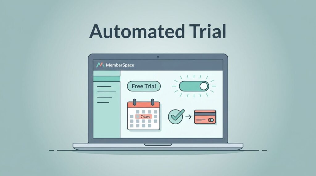
MemberSpace also gives me room to use flexible pricing. I can sell subscriptions, one-time access, free trials, and, when needed, discounts or coupons. I look at the plan details carefully, because transaction fees can vary by setup.
For launches with a long runway, I like a low-friction entry point first. A free preview or a short trial can warm people up. Then I offer the paid tier once they understand the value. For time-sensitive offers, a one-time pass works better. It feels clean, and it gives me a natural deadline.
If I need to recover missed payments or reduce cancellations, I set that up early too. Failed charge recovery matters more than most people expect. So do cancellation offers and renewal reminders. Those small fixes protect revenue without forcing me to chase every member by hand.
Prepare the member experience before launch
A membership site is not only a checkout page. It is a rhythm. People join, look around, and decide whether they belong.
I prepare the first week before I open the doors. That means a welcome email, a short “start here” page, and at least one immediate win. If I sell a course, the first lesson should be ready. If I sell templates, the first pack should be useful right away. If I sell coaching, the first call date should already be on the calendar.
I also set the tone for support. Members need to know where to ask questions, where to find billing info, and what happens if their card fails. MemberSpace helps here because the dashboard keeps account details in one place. That cuts down on confusion.
When the plan includes comments or member interaction, I use that feature early. I do not wait for a huge crowd. Even a small welcome thread can make the space feel alive.
I also watch the analytics-style data inside the platform. I want to know which pages get visited, which offers convert, and where people drop off. That feedback helps me adjust the next launch week without guessing.
Launch with a small audience and simple promotion
I do not try to launch to everyone at once. I start with a small audience that already trusts me.
My favorite launch path is a short list of people who already know my work, plus a few fresh visitors from one channel. That can be email, LinkedIn, YouTube, a webinar, or a live workshop. I want one message, one offer, and one link.
The first launch week is about proof, not scale. I invite a founding group, give them a clean price, and ask them to join while the offer is still being refined. That early feedback is gold. It tells me what confused people, what made them buy, and what they expected next.
I also keep the pitch simple. I explain the result, show the inside of the membership, and point to the first win. I do not bury the offer under a long list of features. People buy clarity.
If I want more community energy later, I build that into the cadence. If I want a content-first setup, I keep the focus on the library and the outcomes. For creator-led businesses, that balance matters more than fancy design.
Common mistakes I avoid with a membership site
I see the same mistakes over and over, and I try not to repeat them.
- I avoid too many tiers. Three or four choices are easier to understand than seven.
- I avoid launching without a first win. Members need something useful on day one.
- I avoid hiding the billing terms. People should know exactly what they are paying for.
- I avoid skipping mobile tests. A rough phone experience hurts signups fast.
- I avoid ignoring failed payments. Revenue leaks when card retries never get set up.
- I avoid mixing community and content without a plan. One clear model works better than a muddled one.
If I want a more community-led setup, I study how I build a Skool community and compare that rhythm with what I’m trying to sell. That keeps me honest about the type of membership I am really building.
The biggest mistake is launching before the offer feels real. A membership site should feel like a room with a clear reason to return. If it feels like a folder full of random files, people will leave after the first visit.
Conclusion
A strong membership launch does not need a huge stack of tools. It needs a clear promise, a simple price, and a member experience that feels useful right away.
When I build with MemberSpace, I focus on access, payments, and retention first. Then I add polish. That order saves time and keeps the offer easy to understand.
If I were starting today, I would protect one section of my site, launch one tier, and invite a small founding group before I tried to scale anything. That is usually enough to turn an idea into a working MemberSpace membership site.