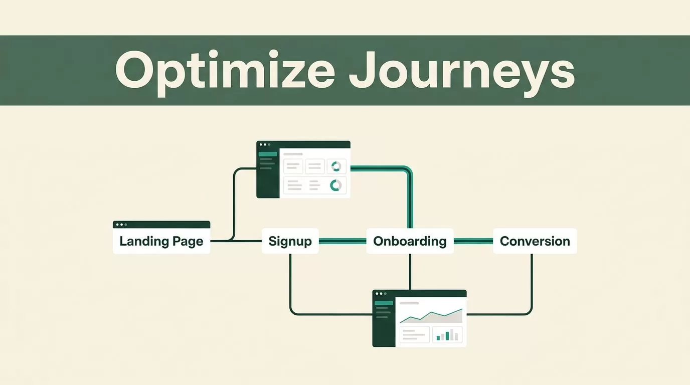
A visitor rarely leaves because of one bad page. They leave after several small problems stack up, such as unclear messaging, a slow form, weak onboarding, or a missing next step.
User journey optimization gives you a way to find those problems in sequence. Mida.so helps you connect behavior data with the actual paths people take across landing pages, signup flows, onboarding screens, and conversion points.
The work starts with a clear journey map and ends with focused tests. Start by identifying where users lose momentum.
Key Takeaways
- Map the journey around user intent, not only page views.
- Track events that show progress toward activation or revenue.
- Use Mida.so behavior data to find friction behind conversion losses.
- Segment findings by device, traffic source, plan, and user type.
- Test one meaningful change at a time and measure the full path.
Start With the Journey You Need to Improve
User journeys are rarely linear. A prospect may visit a pricing page, return through a paid ad, read a case study, and sign up several days later.
Your analysis should account for that behavior. A page-level conversion rate can show that a problem exists, but it won’t always show where the problem starts.
Begin with one business outcome. Choose a result such as:
- A completed demo request
- A qualified account creation
- A completed onboarding milestone
- An upgrade to a paid plan
- An activated product user
Then work backward. Which actions usually happen before that result? Which page, event, or message moves the user forward?
Mida.so is useful when you review these actions together instead of treating every page as an isolated asset. Depending on your configuration and plan, you may use event tracking, funnels, heatmaps, session recordings, or form behavior data. Review the current Mida.so platform to confirm the features available to your team.
Set a clear boundary for the first analysis. A B2B SaaS team may focus on the path from a paid landing page to an activated trial account. A product-led company may focus on the path from signup to the first completed workflow.
Don’t start with every user and every page. A narrow journey gives you cleaner evidence and a faster route to an actionable change.
Map Each Stage With Measurable Signals
A journey map should show user intent, the action you expect, and the signal that confirms progress. Avoid labels such as “awareness” unless you connect them to measurable behavior.
Use a small event vocabulary. Names such as pricing_viewed, signup_started, workspace_created, and report_exported are easier to analyze than vague labels such as button_clicked.
The following structure works for most SaaS journeys:
| Journey stage | User intent | Useful signals | Common friction |
|---|---|---|---|
| Landing page | Understand the offer | Scroll depth, CTA click, return visit | Weak message match |
| Signup flow | Create an account | Form start, field error, completion | Too many fields |
| Onboarding | Reach first value | Setup step, invite sent, key action | Unclear next step |
| Conversion point | Buy or request contact | Pricing interaction, checkout start, form submit | Unresolved objections |
Use the table as a starting point, not a complete measurement plan. Your product’s activation event must reflect real value. For a project management tool, that may be creating and assigning a task. For a reporting platform, it may be connecting a data source and publishing the first report.
Create the tracking plan before you change the interface. Define the event name, trigger, page, user property, and destination for each important action. Record the plan in a shared document so marketing, product, and analytics teams use the same definitions.
Keep events tied to decisions. If nobody will act on a metric, don’t add it to the first version of the plan. Too many events create noise and make basic questions harder to answer.
Mida.so can sit alongside tools such as Google Analytics. For teams using GA4, Google’s funnel exploration documentation provides useful guidance on analyzing sequential steps. The same discipline applies in Mida.so: define the stages first, then inspect the evidence behind each result.
Use Mida.so to Find Friction, Not Just Drop-Off
A funnel tells you where users stop. Behavior data helps you understand what happened before they stopped.
Set a baseline before making changes. Record the current completion rate, time between stages, device split, traffic source, and user segment. A baseline prevents teams from judging a test by one encouraging session or one unusual day.
Next, segment the journey. At minimum, compare:
- Mobile and desktop visitors
- Paid, organic, referral, and direct traffic
- New and returning users
- Self-serve and sales-assisted accounts
- Free, trial, and paid customers
A single average can hide a serious problem. Desktop users may complete signup while mobile users encounter an error. Organic visitors may understand the product while paid visitors arrive with a different expectation.
Review sessions or interaction reports after you find a weak step. Look for repeated behaviors. Users may click a non-interactive heading, revisit the pricing section, open an FAQ, or pause after an error message. These actions show where the interface fails to answer the user’s next question.
For a signup investigation, follow this order:
- Find the step with the largest completion loss.
- Compare completion by device and acquisition source.
- Review sessions that reached the step but didn’t finish.
- Check form errors, unclear fields, and unexpected redirects.
- Write one hypothesis based on repeated evidence.
A strong hypothesis is narrow. “The signup flow is bad” isn’t testable. “Mobile visitors abandon after the company-size field because the input is difficult to use” gives the team a clear investigation and a defined change.
Use heatmaps to understand attention and clicks. Use recordings to inspect sequence and hesitation. Use funnels to measure scale. Each view answers a different question.
A recording can show what one person did. A funnel shows whether the same issue affects enough users to matter.
Protect user data during this process. Mask sensitive form fields, limit access to recordings, and follow your consent requirements. Don’t collect personal information that your team doesn’t need for the analysis.
Apply Findings Across the Main Conversion Stages
User journey optimization becomes useful when it changes real pages and flows. Review each stage with a different question.
Landing pages
The landing page must answer three questions quickly:
- What does the product do?
- Who is it for?
- What should the visitor do next?
Use Mida.so to compare CTA clicks, scroll behavior, and sessions by traffic source. If paid visitors leave before reaching the proof section, the page may not match the ad promise. If visitors scroll to pricing but don’t start signup, the page may leave cost, limits, or implementation questions unanswered.
Test one major change at a time. You might change the headline to match the highest-intent search term, move proof closer to the CTA, or add a product screenshot beside the first action. Keep the target event the same so the result remains easy to read.
Page speed also affects the first step. Check loading performance with Google’s Core Web Vitals guidance, then compare behavior across device types. A page that works on a fast office connection may create friction on a mobile network.
Signup flows
Signup forms should request information that supports the next step. Remove fields that sales, onboarding, or compliance teams don’t use. Keep fields that qualify accounts or prevent wasted setup.
Track signup_started, each meaningful validation error, and signup_completed. A high start rate with a low completion rate points to the form itself. A low start rate points earlier in the journey, often to message, offer, or CTA clarity.
Review error copy and field behavior. Users need to know what went wrong and how to fix it. Don’t make them search the page for the problem.
Onboarding
Onboarding should move users toward a defined activation event. It shouldn’t ask users to complete every available setup task before they can see value.
Track the first meaningful action, not only account creation. A trial user who creates a workspace but never imports data hasn’t reached activation.
Use Mida.so to review the path between setup steps. If users stop after workspace creation, inspect the next screen. The prompt may be unclear, the required integration may be difficult, or the product may ask for information before demonstrating value.
Reduce optional decisions early. Give users one recommended next action, then provide secondary choices after they make progress.
Pricing, demo, and upgrade points
Conversion points carry more uncertainty than ordinary page views. Users may need answers about security, integrations, contract terms, support, or implementation effort.
Review interactions around pricing cards, comparison tables, FAQs, demo forms, and checkout fields. Repeated returns to a specific section can show an unresolved concern. A form with high starts and low submissions needs field-level analysis.
Don’t treat every hesitation as a copy problem. Some users need a product comparison. Others need proof that the tool fits their stack. Match the response to the observed behavior.
Turn Insights Into a Repeatable Test Cycle
Mida.so should support a repeatable operating process, not a one-time report.
Start each cycle with one journey problem. Write the current baseline and the expected behavior. Then define the change, the primary metric, and the guardrail metric.
For example, you might change the first onboarding screen to show one recommended setup action. The primary metric could be completion of that action. A guardrail could be support requests or early account abandonment. This prevents a local improvement from creating a new problem later.
Rank potential tests by impact, confidence, and effort. High-impact issues with strong behavior evidence should move ahead of cosmetic changes. A clearer field label may be useful, but it shouldn’t outrank a broken mobile interaction.
Run the test long enough to capture normal traffic patterns. Check results by segment, not only by total users. A change can improve desktop signup while reducing mobile completion.
Keep a decision log. Store the hypothesis, audience, date, result, and next action. Over time, this gives your team a record of what worked, what failed, and which user groups need separate treatment.
Use established usability principles during review. Nielsen Norman Group’s guide to common usability heuristics is a useful reference for checking feedback, error recovery, consistency, and user control.
Conclusion
A strong user journey doesn’t happen because one page looks better. It happens when every step gives users a clear reason and usable path to continue.
Use Mida.so to connect journey stages with behavior evidence. Map the events, segment the data, inspect the friction, and test one focused change at a time.
The goal is not to remove every pause. The goal is to remove the pauses that prevent the right users from reaching value. That is the practical work of user journey optimization.


