When I want to know whether new customers are sticking, I don’t start with a trend line. I open Baremetrics signup cohorts and look at the month they joined. That view tells me which signups behave well, which ones fade fast, and where revenue starts to bend.
This matters because monthly averages can hide a lot. A strong launch month can mask weak retention later, while a bad acquisition month can distort the whole quarter. I use the cohort view to see the product the way customers experience it, one signup month at a time.
Open the cohort view and choose the right churn lens
I start in Baremetrics and head to the Cohorts area in the dashboard. If the interface has shifted since the last time I used it, I look for the closest cohort or segmentation option. Baremetrics changes labels from time to time, but the core path stays familiar.
From there, I pick the lens that matches the question I’m asking:
- User Churn when I want to track how many customers stay active.
- Revenue Churn when I care about the dollars tied to each signup month.
- Signup date or signup month as the cohort basis.
- A time range that gives me enough history to spot a pattern.
If I’m only checking retention, I usually begin with User Churn. If I’m reviewing pricing or expansion, Revenue Churn gives me better context. Stripe’s guide to SaaS cohort analysis uses the same idea, group people by start date, then watch what happens over time.
I treat each signup month like a class of customers that shared the same starting line.
The view is simple, but that’s the point. I’m not looking for decoration. I’m looking for behavior.
Read the chart row by row, not as one big blur


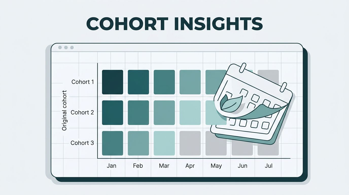
I slow down and read the cohort table one row at a time. Each row is one signup month. Each column shows what happened after that month, usually in months since signup.
Here’s the part I pay attention to first. Baremetrics lets me switch between Relative (%) and Absolute ($) views, and that choice changes the story.
| View type | What I look for | What it tells me |
|---|---|---|
| Relative (%) | How many customers stayed | Retention quality |
| Absolute ($) | How much revenue remained | Revenue durability |
In relative view, I can spot a cohort that keeps more users alive after month 3 or month 6. In absolute view, I can see whether a cohort keeps more money, even if the user count drops. That distinction matters, especially if higher-tier plans bring in fewer but better customers. Maxio’s explainer on MRR cohorts covers that same logic from the revenue side.
I also compare the current cohort against earlier months. If February signups hold better than January signups, I ask what changed. Was it onboarding, pricing, sales qualification, or a product fix? If the newer line falls faster, I know something in the funnel slipped.
What I learn from retention, expansion, and churn
Retention shows product fit
Retention is the clearest signal in the chart. If a signup month keeps a steady shape over time, I know the product met a real need. If the line drops like a stone in the first two months, I start asking hard questions about onboarding, activation, or acquisition quality.
I also use retention by signup month to compare campaigns. A paid channel might bring in more signups, but if that cohort churns early, the volume is misleading. The month of signup becomes a filter that strips away noise.
Expansion shows where value grows
Expansion is easier to miss, but it matters just as much. In revenue cohorts, I watch for months where later columns stop shrinking or even rise. That usually means upgrades, add-ons, or seat growth.
When I see that shape, I ask what the cohort learned after signup. Did they reach an aha moment? Did the team expand the account? Did annual billing smooth out the cash flow? I cross-check those patterns with revenue cohort breakdowns when I want a tighter read on retention leaks and upsell behavior.
Churn shows where the cracks open
Churn shows up fast in signup-month cohorts. A weak month may fall early and never recover. That tells me the problem is not seasonal noise. It’s a real gap in the customer journey.
I use that signal to separate product issues from acquisition issues. If every month drops at the same point, the product or onboarding is the likely cause. If one month performs badly and the others hold up, I look at the traffic source or sales motion behind that cohort.
Turn cohort data into decisions I can defend
Baremetrics signup cohorts become useful when I pair them with action. I often keep the cohort view near my main dashboard, so I’m not bouncing between screens. I use my Baremetrics dashboard layout when I want MRR, churn, and cohort trends in one place.
Then I make one decision at a time.
- If the newest signup month retains worse than the previous month, I review onboarding and activation.
- If revenue cohorts expand after month 2, I study the behaviors that came before the upsell.
- If one acquisition source keeps producing weak cohorts, I cut spend or fix the messaging.
That process keeps me honest. A cohort chart doesn’t hand me a diagnosis. It points to the row that deserves attention. After that, I check the funnel, the plan mix, and the support history before I change anything.
Conclusion
When I view cohorts by signup month in Baremetrics, I get a cleaner picture than any single MRR chart can give me. I can see retention, expansion, and churn in the same frame, which makes the differences between signup months hard to ignore.
The real value is not the chart itself. It’s the decision it helps me make next. If one cohort holds, I learn what worked. If another drops fast, I know where to look first.