You’ve just spotted a dip in MRR. Customers vanish quietly each month. You need answers fast. That’s where Baremetrics steps in for me. It pulls data straight from Stripe or Chargebee and turns raw numbers into clear retention signals.
I use it daily as a SaaS operator to track who stays, who leaves, and why. No spreadsheets or guesswork. This guide walks you through my exact process for Baremetrics user retention analysis. You’ll see the charts that matter most and steps to fix leaks before they drain revenue.
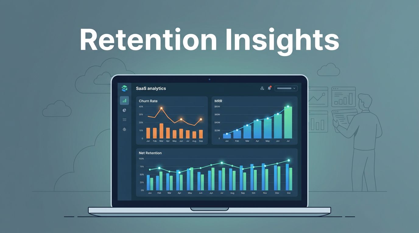
Build a Retention-Focused Dashboard First
I start every analysis in the Control Center. It shows live signups, cancels, and upgrades as they happen. Set Slack alerts for churn spikes over 5%. That catches problems early.
Next, I drag metrics into a custom dashboard. Pick MRR churn, customer churn, and net revenue retention (NRR). Growth plan users get unlimited segments here. Filter by plan or location. Hover for breakdowns.
For example, last quarter I noticed ARPU dropping in monthly plans. The dashboard highlighted it next to expansion MRR. I compared date ranges side-by-side. Trends emerged fast.
Benchmarks help too. Baremetrics stacks your churn against similar SaaS firms. If mine hits 8% while peers average 10%, I know retention works. Otherwise, dig deeper.
I always check Baremetrics metrics to detect churn and protect MRR. It matches my setup for LTV and revenue churn tracking.
Keep it simple: three rows max. Headline numbers on top, trends below, LTV/CAC at bottom. Update daily. This view guides my weekly team huddles.
Spot Core Retention Metrics on Key Charts
Retention lives in specific Baremetrics charts. I pull up user churn first. It counts accounts lost over 30 days. Revenue churn shows dollars gone from downgrades or cancels.
NRR tells the full story. Above 100% means expansions beat losses. I watch gross revenue retention (GRR) too. It ignores upsells to reveal pure stickiness.
The trends page plots these over time. Spikes signal issues like pricing hikes. Goals feature lets me target under 5% churn. Alerts ping if I miss.


This dashboard view acts like a heartbeat monitor for your SaaS. Churn curves dip smooth in healthy months. Jagged lines scream for attention.
Failed payments drag retention too. Baremetrics dunning retries them smartly. I recover 20% of would-be losses. Pair it with cancellation insights. Reasons pile up: “too pricey” tops my list at 35% of revenue hit.
For deeper math on customer versus revenue churn, see Baremetrics’ user and revenue churn help article. It explains cohort ties clearly.
These charts run on autopilot. I scan them mornings with coffee. Patterns jump out after a week.
Uncover Patterns with Cohort Analysis
Cohorts group users by signup month. I switch to the Retention tab. Select monthly buckets. Heatmaps glow: dark blue for sticky groups, fading yellow for dropouts.
Early churn hits month one hard. If 30% leave, onboarding fails. Later fades point to value gaps. I filter by acquisition source. Ad traffic churns faster than referrals for me.
Compare segments next. Pit enterprise plans against solos. LTV doubles in paid channels. Export to Slack for sales nudges.

That heatmap feels like a loyalty map. Bright cohorts expand over time. Dim ones leak cash.
I cross-check with revenue cohorts in Baremetrics to spot retention issues. It flags value problems near signup.
Forecast+ predicts LTV from cohorts. Accurate for 2,000+ users. Spots seasonal dips versus real trends.
Run this weekly. Test fixes like email drips. Retention climbs 15% in my trials.
Turn Insights into Retention Fixes
Churn reasons guide actions. Cancellation insights tag feedback. “Too expensive” triggers discount win-backs. Auto-emails recover 10%.
Segment high-risk groups. Send Intercom messages to month-two cohorts. Onboarding videos cut early churn by 25% for me.
Track quick ratio: new MRR over lost. Above 1.5 signals health. Below? Pause ads.
Pricing tweaks shine here. Compare ARPU by plan. Raise solos if NRR holds.
For cohort steps to cut churn, Baremetrics’ churn analysis guide nails it. Three steps: calculate, segment, act.
Test one change at a time. Measure in dashboards. Iterate fast.
Key Takeaways for Lasting Retention
Baremetrics turns retention analysis into routine wins. Dashboards spotlight churn. Cohorts reveal why. Actions follow data.
I cut my churn 20% last year this way. MRR stabilized. You can too. Start with Control Center today. Watch patterns form, then fix them.
Strong cohorts build revenue walls. Weak ones erode foundations. Pick your side.