A membership site can grow fast, then turn clumsy even faster. Pages get buried, checkout gets confusing, and members start emailing basic questions you thought the site already answered.
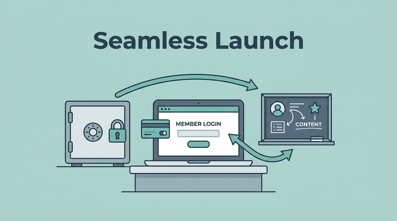
When I build a MemberSpace membership site, I treat it like a front desk, a vault, and a classroom at the same time. The software matters, but the flow matters more. If the first paid step feels awkward, people notice right away.
I start with the offer, the access rules, and the member path. Then I shape the software around those choices instead of the other way around.
Start with the offer before I touch settings
Before I open MemberSpace, I write down what a member is actually buying. That might be weekly lessons, a private archive, a template library, or access to a coaching group. The software can handle all of those, but the offer has to stay simple enough to explain in one sentence.
If my business is more community-led than content-led, I compare that with my Skool vs Kajabi comparison before I commit. That keeps me from forcing the wrong tool into the wrong model.
For a broad planning pass, I also sanity-check my structure against Wix’s membership site checklist. It keeps me honest about the basics, like audience fit, site structure, and member flow.
I ask myself a few plain questions:
- What do members get on day one?
- What content stays public as a teaser?
- Which pages, files, or videos should stay locked?
- Do I want one plan, a few tiers, or a free trial?
That first pass saves me from building a maze. A coaching business, for example, might only need one paid plan with a private lesson hub and a resource vault. A publisher might need a free archive, then a paid layer for premium posts. A creator may want a short trial, then a recurring plan.
I keep the answer small when I can. The more tangled the offer, the harder the launch gets.
Map access, billing, and the member journey
MemberSpace gives me the pieces I need for gated content, membership plans, payments, drip content, and a member portal. I use those pieces in a very specific order. First, I define what gets locked. Next, I decide how people pay. Then I map what they see after signup.
I usually work through the setup like this:
- I connect MemberSpace to the site I already use.
- I choose the pages, posts, videos, or files that need protection.
- I set up one or more plans, depending on what the offer needs.
- I test payment paths, including one-time payments, subscriptions, and trials.
- I open the member portal and check what a user sees after login.
- I review the welcome email and recovery emails before launch.
That sequence keeps the build clean. It also helps me catch the awkward parts early, like a plan name that sounds fine in my head but reads badly on the checkout page.
If I need a second structure check, I use WildApricot’s membership site guide. It helps me spot gaps in the offer before I get lost in settings.
I also pay attention to drip content. If I dump everything at once, members binge and disappear. If I release content in a steady rhythm, I give them a reason to return. That works well for courses, paid newsletters, and coaching programs with weekly lessons.
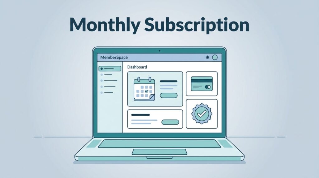
The member portal matters more than people expect. I want it to answer the easy questions fast: what did I buy, where do I go, and how do I update billing? When those answers are obvious, support requests drop.
Protect content without making the site hard to use

I never lock everything. I protect the content that carries the promise, then I leave enough public material for people to understand the value.
I protect the lesson, the archive, or the file, not the entire business.
That rule keeps the site usable. It also gives search visitors something to read before they decide to join. A public preview page, a sample lesson, or a short excerpt works well. A blank wall does not.
For security, I test access on a logged-out browser, a phone, and a second email address. I want to know exactly what a non-member can see. I also check that the locked content opens only after payment or approved access. If I see a stray page, a public file name, or a broken redirect, I fix it before launch.
I use MemberSpace’s plan-based access to keep tiers clear. That helps when I sell different levels to different buyers. A business audience may need a premium archive, while a coach’s members may need access to calls and worksheets. In both cases, the path should feel direct.
I also keep an eye on automation. Welcome emails, reminders, and failed-payment recovery emails can save a lot of manual work. If a card fails, the system should give the member a clean way back in. That matters because a billing issue should not feel like a dead end.
Good protection also means good restraint. I don’t hide every sentence behind a gate. I hide what needs to be paid for and keep the rest clear.
Pick the right pricing model for the first launch
MemberSpace supports subscriptions, one-time payments, and free trials, so I start with the business model, not the feature list. The wrong pricing structure can slow a launch more than a missing page ever will.
Here is the simple way I think about it:
| Pricing model | Best use case | Watch-out |
|---|---|---|
| Monthly subscription | Ongoing content, coaching, or community access | Churn can rise if the value feels thin |
| Annual subscription | Publishers or educators with steady content calendars | Members need a clear reason to commit early |
| One-time payment | Template libraries, evergreen vaults, or lifetime access offers | I need a firm content scope |
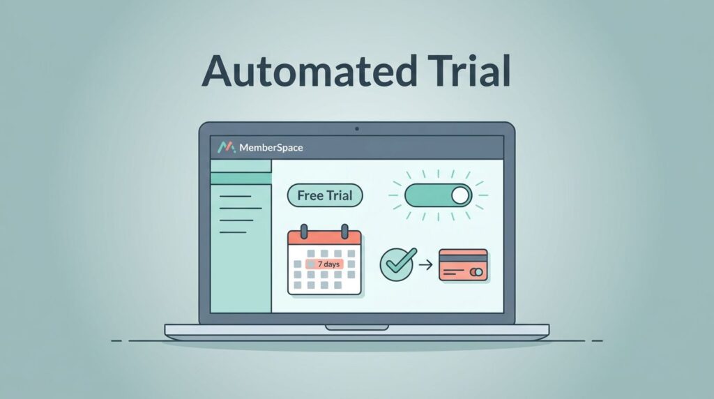
| Free trial | Offers that need a quick taste before purchase | The trial has to show value fast |
I try not to launch with too many tiers. One strong plan is easier to explain than three weak ones. Two tiers can work when the differences are obvious, like self-serve access on one level and live support on another.
I also think hard about pricing language. If I call something “premium” but the page feels thin, people notice. If I call a plan “pro” and it only unlocks three posts, the mismatch hurts trust. Clear naming always wins.
A simple price model also makes refunds and support easier to manage. When members understand what they bought, fewer disputes show up later.
Launch, then watch the weak spots
The first week after launch tells me more than a month of planning. I watch for three things first: checkout drop-off, access problems, and support tickets that repeat the same question.
I also look at the message flow. If people buy but never open the welcome email, the subject line or timing needs work. If they open the email but still can’t find the portal, the navigation needs a cleaner path. If they reach the content but don’t return, the drip schedule may be too loose.
My post-launch checklist stays short:
- I test the signup flow on mobile.
- I confirm that the first paid page opens without friction.
- I check that members can find billing details in the portal.
- I review any failed-payment recovery messages.
- I scan for confusing labels, broken links, or pages that look too hidden.
I keep notes on every small issue. A lot of membership problems start as tiny frictions. One awkward button label can turn into ten support emails. One unclear tier name can slow conversions for weeks.
After that, I adjust in small steps. I may change the headline on the sales page, shorten the checkout copy, or move the welcome module higher in the member area. I don’t remake the whole site every time. I fix the part that hurts.
Conclusion
A good launch starts before the software does. I decide what members are buying, how they pay, and what they see first. Then I let MemberSpace handle the gates, the plans, and the billing flow.
When I keep the offer simple and the member path clear, the site feels easier to trust. That matters more than packing in extra features.
The best sign is simple. If a new member can join, find the content, and know what happens next without asking for help, the deployment is working.