When I want to sell online courses without building custom software, I turn my existing website into a functional online course platform. MemberSpace lets me lock lesson pages, collect payments, and keep the entire student experience in one place.
That matters because a course launch can get messy fast. A clear page structure, a simple pricing model, and a clean login flow help me move forward before the project turns into a long tech job.
I also like keeping my options open. If I later need a more complex setup, I can compare my current tools with a traditional learning management system to see if a lighter approach still fits. This flexibility is also ideal for those managing corporate training who need a lean, effective way to distribute content without the bloat of dedicated enterprise software.
Key Takeaways
- Leverage Existing Websites: Use tools like MemberSpace to gate content on your current site, allowing you to maintain full control over your branding and design without needing a complex learning management system.
- Prioritize Simplicity: Keep the course scope narrow and the student path clear; a well-defined, easy-to-follow structure helps students finish the material and improves your conversion rates.
- Flexible Pricing Models: Match your revenue strategy to your content delivery, whether it is a one-time purchase for self-paced learning or a recurring subscription for ongoing support.
- Test Before You Launch: Perform thorough technical checks, including test purchases and mobile compatibility, to ensure a seamless experience for your first wave of members.
Start with a course people can finish
The first thing I do is shrink the offer. I write one promise, one clear result, and one path to get there. A course that tries to teach everything at once usually feels foggy, and because it is much easier to sell online courses when your value proposition is clear, I keep my scope tight.
I like to build around a simple shape, such as a welcome page, three to five lessons, and one bonus resource page. Using a course builder approach within MemberSpace allows me to maintain ownership of my community and branding, which provides far more control than relying on a generic online learning marketplace. This structure gives me enough to launch without getting stuck polishing details for weeks. If I think I may need to add quizzes and assessments, certificates, or a larger content library later, I compare that plan with my Skool vs Teachable comparison for course creators before I build too far.
I also keep the student path short. A new member should land on a start-here page, see the first lesson, and know what to do next. If they need a map to find the map, the course is already too complicated.
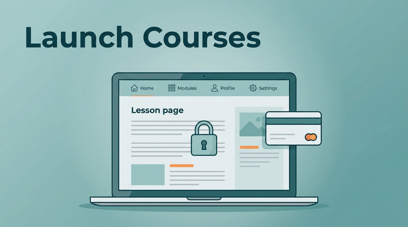
Put MemberSpace on the site you already own
I use MemberSpace as the ideal online course platform to gate content on my existing website. My public pages remain accessible to everyone, but my lessons, digital products, and member-only resources stay protected behind specific access rules. This approach gives me a functional course site without the need to rebuild my brand, migrate my custom domain, or alter my carefully crafted site design.

I keep the MemberSpace online course guide open while I build, and I cross-check the Squarespace course builder guide when I want another pass on the page flow. Those references help me move faster when I am setting up a simple site, especially if I already have a home page, sales page, and lesson pages in place.
The setup process is straightforward when I stay organized. I publish the public-facing landing pages first, then create a private area for the lessons. During the technical configuration, I connect the payment gateway and define the membership rules so only the right people can access the content. I like that split because it keeps the checkout process open for everyone while the course material stays secure behind the paywall.
I also test the basics before I announce that the course is live. I click through the signup path, check the welcome email, log in as a new member, and open the lesson pages on a mobile device. Small bugs feel harmless during the setup phase, but they feel much worse after the first sale.
Price the course in a way that matches the content
Pricing works best when it matches how I teach. Unlike restrictive all-in-one platforms that force you into their specific ecosystem, using MemberSpace allows me to keep my own site architecture and choose a pricing structure that fits my brand. If the course is finished and self-paced, a one-time price feels clean. If I plan to add new lessons, office hours, or fresh content each month, recurring pricing for a membership site makes more sense. For larger offers, I may split access into tiers or add coaching packages to provide extra value.
Here is the way I think about it:
| Pricing model | Best fit | How I use it | Watch out for |
|---|---|---|---|
| One-time payment | Evergreen course | I sell full access to a finished program | The content needs to feel complete on day one |
| Recurring membership | Ongoing lessons or support | I add new material over time | I need a strong reason for members to stay |
| Tiered access | Course plus extras | I separate core content from premium help | Too many tiers can confuse buyers |
| Cohort-style launch | Live or timed programs | I open access for a set window | I have to manage dates and communication well |
I usually start with one clear offer, then add a higher tier only if demand shows up. A small launch is easier to explain, easier to support, and easier to fix if the pricing needs a tweak. When setting these prices, keep in mind that some third party payment gateways may charge transaction fees, so account for those costs to ensure your margins stay healthy.
I keep the landing pages public and the lessons private. That one rule makes the offer easier to understand.
I also think about refunds before I launch. A simple pricing page, a clear billing policy, and a short FAQ can prevent a lot of support emails. If I am selling a subscription, I want people to know when they will be billed and what happens if they cancel. If I am selling lifetime access, I want that to be obvious too.
Shape the student experience before launch
The student experience starts before the first lesson opens. I want the login email, the welcome page, and the lesson names to feel calm and easy to follow. If a new member hesitates on lesson one, I know the structure needs work. A simplified layout is the best way to boost student engagement from the very first day.
I write my course curriculum in plain language, using clear labels like “Start Here,” “Module 1,” and “Your First Win” instead of clever names that sound cute but hide the point. I also keep my intro pages short. A long welcome page feels like homework, and nobody pays to do homework before they reach the actual course.
A few small choices make a big difference:
- I keep the first lesson visible as soon as the member logs in.
- I use one simple welcome email that explains where to start, or I use drip content to release modules gradually so students do not feel overwhelmed.
- I ensure my site provides a smooth mobile app experience, as many students will access their lessons on the go.
- I add a dedicated channel for customer support so questions do not pile up in silence.
I also like to separate the learning path from the bonus material. Core lessons should feel like the main road, while templates, downloads, and certificates of completion can sit to the side. That keeps the course focused and helps students feel progress faster.
If I offer group coaching or office hours, I place those dates where members can see them without digging. A course should feel like a guided path, not a hidden folder tree.
My launch checklist for the first week
I treat launch week like a short checklist, not a grand event. A clean first week gives me better feedback and fewer surprises.
- I publish the sales page and the first lesson path.
- I run a test purchase to verify the signup flow and ensure my sales funnels are working correctly.
- I log in as a member and confirm that the right pages are locked.
- I test all quizzes and assessments to ensure they trigger the correct results.
- I verify that certificates of completion are generated properly once all modules are finished.
- I open the course on desktop and mobile to catch layout issues.
- I connect my email marketing tools and send the welcome email to confirm the link lands in the right place.
- I invite a small group first, utilizing student tracking to monitor where they click and where they stop.
That last step matters more than people think. The first members show me where the instructions are weak, where the page order feels awkward, and where the offer needs a better explanation. I would rather learn that from five people than from fifty. I also use this time to verify that my quizzes and assessments are providing clear value to the user.
I also review the support inbox during launch week. If I see the same question twice, I add the answer to the course page or FAQ. That saves time and makes the next student experience smoother.
For some creators, the best move is to launch a simple course and improve it after the first sales. For others, the right move is to wait until every page looks perfect. I almost always pick the first option. It gives me real feedback sooner, and real feedback beats guesses.
Frequently Asked Questions
Can I use MemberSpace with any website builder?
Yes, MemberSpace integrates with most major platforms like Squarespace, Webflow, and WordPress. It functions by adding a simple code snippet to your site, allowing you to turn any existing page into a protected member-only area.
Should I choose a one-time payment or a subscription model?
A one-time payment works best for evergreen, static content that the student can complete at their own pace. If you plan to provide ongoing updates, live office hours, or fresh monthly content, a subscription model is generally more sustainable and valuable for your students.
How do I ensure my students don’t get overwhelmed?
Keep your curriculum focused by using clear, simple labels and limiting the amount of extra material provided. By separating core lessons from optional bonuses and using a drip-content approach, you help students stay on the path without feeling bogged down by too much information.
Conclusion
When I launch an online course platform with MemberSpace, I keep the system simple on purpose. Rather than getting bogged down by a bloated learning management system or an all-in-one platform that restricts my design, I use my existing website, lock the right pages, and choose a pricing model that fits the course itself.
This approach helps me move fast without losing control of the student experience. It also provides plenty of room to grow, as I can start with one offer and expand into tiers, incorporate an affiliate program to boost sales, or even scale up to handle corporate training and live webinars as my brand evolves.
The cleanest launch is usually the one that gets out of the way and lets the lessons do the work.