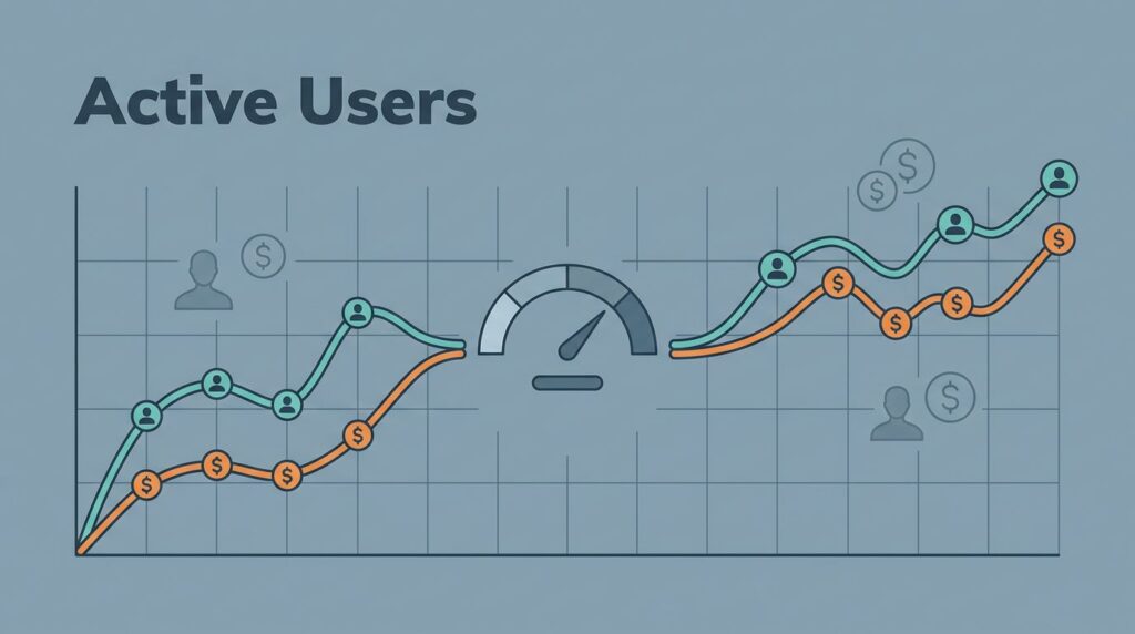
Some SaaS dashboards look healthy until I line them up against similar companies. Then the picture changes fast. What looked like steady growth can turn out to be slow, expensive growth, or a pricing model that leaves money on the table.
The hard part is not collecting numbers. The hard part is picking the right peers, reading the spread correctly, and turning the result into a decision on pricing, retention, acquisition spend, or forecast range. I use SaaS growth benchmarking in Baremetrics to do exactly that.
Here’s how I set it up, and what I do with the results.
Why comparable peers matter more than broad averages
Baremetrics says its benchmarks draw from anonymized data across 800+ small and medium subscription companies, and I keep that in mind every time I open the report. Breadth helps, but similarity matters more. A self-serve SMB tool should not compare itself with an enterprise sales motion just because both sell software.
I sort peers by business model, stage, pricing, and customer profile. A company with a low-price annual plan and high-volume signups lives in a different world from a high-ARPU product with long sales cycles. I want my benchmark group to feel like a close street, not a different city.
I usually check four filters first:
- Self-serve or sales-led.
- Early stage or established.
- Low ARPU or high ARPU.
- SMB, mid-market, or enterprise customers.
Baremetrics explains the setup in How to benchmark your SaaS metrics against 800+ companies, and that’s a good starting point. I still narrow the peer group again inside my own model, because a benchmark is useful only when the peer set is close enough to matter.
A benchmark is useful only when the peer set is close enough to matter.


Setting up Baremetrics so the comparison is clean
I start with building a Baremetrics dashboard, because the benchmark is only as good as the data feeding it. If subscriptions, refunds, trials, and failed charges are mixed badly, the report will look precise and still miss the point.
My setup usually follows a simple order. First, I confirm that the billing source is synced and current. Next, I separate monthly, annual, and usage-based plans so I don’t blend different buying habits. Then I choose one time window, usually the trailing 90 days or the last full quarter. After that, I tag segments by plan, acquisition source, or customer type when the data supports it.
I keep the core metric set tight. MRR, churn, revenue churn, active customers, quick ratio, failed charges, and ARPU give me enough signal without drowning me in charts. If I need a reminder of where Baremetrics is strong and where I should keep another tool in the stack, I revisit my Baremetrics analytics platform review.
Clean setup matters because one mixed segment can blur the whole picture. If annual customers stay strong while monthly customers churn, I want to see that split. If one country or one plan carries the business, I want that visible before I compare myself with anyone else.
Reading quartiles without fooling myself
Baremetrics’ benchmarks feature gives me lower, median, and upper quartiles. That spread matters more than a single average line, because averages can hide a weak middle. I’m not trying to win a scoreboard. I’m trying to understand where my company sits in the pack.
Here’s the way I read the main signals:
| Signal | What it usually means | What I do next |
|---|---|---|
| Churn above the median | Retention is weak for this peer set | Re-check onboarding, fit, and support flow |
| MRR growth near the lower quartile | Growth is slow compared with similar companies | Inspect channel mix and upgrade path |
| ARPU below peers | Pricing or packaging may be too soft | Test annual plans or higher tiers |
| Failed charges high | Revenue is leaking after the sale | Tighten retries and payment reminders |
I pair that view with key SaaS metrics for retention analysis when I want to trace churn, revenue churn, and failed charges back to one segment.
The quick ratio also matters. If it stays weak while new bookings look fine, I know the top line is hiding churn or discounting. A one-metric gap can hide a very different customer mix.
I do not act on a single gap when the customer mix is different.
Sample bias is the other trap. A thin cohort, a recent pricing change, or a tiny segment can make a normal move look extreme. When that happens, I treat the benchmark as a clue, not a verdict.
Turning benchmark findings into pricing, retention, and forecast calls
Once I know where I stand, I decide whether the problem is price, retention, acquisition, or forecast math. The benchmark itself does not fix anything. It gives me a cleaner place to start.


Pricing changes when ARPU trails peers
If ARPU sits below similar companies and churn is stable, I test packaging before I cut costs. I look at annual prepay, tier separation, seat minimums, and usage limits. A small price change can tell me whether I underpriced the value or built the wrong mix.
I do not raise prices just because a benchmark says I am low. I raise them when the customer fit and support load say there is room. That keeps me from fixing one metric by breaking another.
Retention work when churn crosses the line
If churn or revenue churn lands above the peer band, I slow down and inspect the path from signup to first value. I check onboarding drop-off, plan mismatch, support friction, and payment failures. Those are the places where revenue leaks first.
This is where key SaaS metrics for retention analysis helps me keep the fix tied to the right failure point. A churn problem can hide in the product, the bill, or the customer promise. The chart only shows the leak. The team still has to find the pipe.
Acquisition efficiency when growth looks expensive
Fast growth can still be weak growth. If MRR rises but quick ratio stays soft, I look at channel mix, CAC payback, and conversion quality. Paid traffic can fill the top of the funnel while revenue slips out the side.
In that case, I do not just buy more traffic. I tighten targeting or shift budget toward channels that bring better-fit accounts. Benchmarks help here because they show whether my growth rate is strong enough to justify the spend, or just loud enough to hide it.
Revenue forecasts that respect the benchmark range
I use benchmarks as guardrails for my forecast, not a magic number. If my growth sits below the median peer range, I keep my next-quarter plan conservative. If retention and quick ratio sit above it, I give the forecast more room, but I still keep a downside case.
That makes planning less dramatic and more honest. I stop arguing over one heroic forecast and start planning around a range I can defend.
Conclusion
When I run SaaS growth benchmarking well, Baremetrics stops being a dashboard and becomes a decision aid. The numbers tell me whether I have a pricing issue, a retention issue, or just the wrong peer group.
The biggest mistake I can make is reading a clean chart with the wrong context. Once I compare like with like, the benchmark becomes a sharper input for pricing, churn work, acquisition spend, and forecasting.
A good benchmark does not flatter the business. It tells the truth early.