Stripe keeps the money moving, but it can still leave me staring at a pile of numbers. Baremetrics turns that pile into a view I can use for revenue, churn, and customer health.
When billing data is messy, every forecast gets shaky. A spike in refunds can look like growth for a day, then turn into a problem by Friday.
I use Stripe billing analytics in Baremetrics when I need finance, RevOps, and leadership looking at the same story. The first step is always the source data.
Start with clean Stripe data
I begin by checking whether the Stripe account is live, current, and tied to the right business unit. If I have multiple entities, custom invoices, or unusual billing logic, I map that first. Otherwise, the cleanest chart can still point me in the wrong direction.
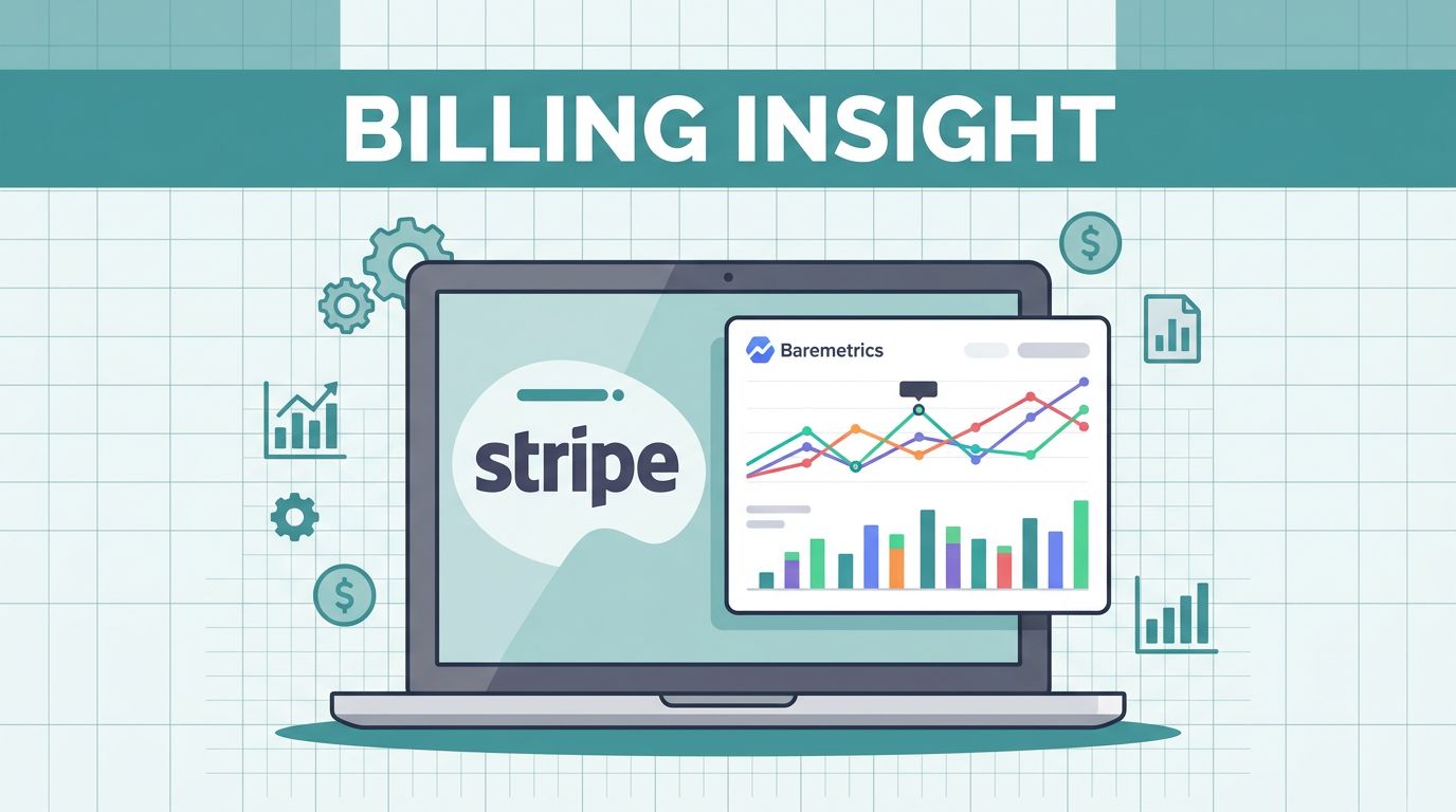
For a quick sense of the product focus, I keep Baremetrics’s Stripe analytics page open while I map the fields. Baremetrics pulls customer, subscription, transaction, and billing history data from Stripe, so I can verify changes against real invoices.
I also follow my own integrating Stripe and Baremetrics notes when I bring in a new account. That keeps me from mixing test mode with live data or reading tax and discount changes as revenue growth.
When revenue looks off, I compare gross charges, refunds, discounts, and tax treatment. Small differences there can make a big chart look like a cliff.

That is the screen I want before I trust the numbers.
Build a dashboard that answers the real questions
I do not want a dashboard that shows everything at once. I want one that answers the next decision.
My first pass is simple. I keep the top view focused on MRR, ARR, churn, total customers, and failed payments. Then I put refunds and billing history a click away, so I can go from headline to cause without hunting through tabs.
I usually build the layout in three layers:
- Top row: MRR, ARR, churn, and total customers
- Middle row: failed payments, refunds, and recent billing changes
- Drill-down: customer billing history for account-level checks
I trust a dashboard more when it answers one finance question at a glance.
That structure keeps me from treating every metric as equal. If MRR moves, I want to know whether the change came from new subscriptions, downgrades, cancellations, or payment failures. Baremetrics is useful because it gives me those pieces in the same place.
When I want a fuller take on fit and trade-offs, I use my Baremetrics analytics platform review. That helps me separate the parts I need from the parts I can leave on the shelf.

Read the metrics in the right order
I never start with ARR alone. It looks clean, but it hides too much.
First, I check whether MRR moved for a good reason. Then I look at churn, failed payments, and refunds. After that, I compare LTV with customer counts and plan mix. That order helps me see whether growth is broad or fragile.
A single headline number can fool me if I let it. A healthy MRR chart with rising failed payments usually means I have a collections or retention issue underneath the surface. A flat churn line with falling LTV can point to lower-value plans, weak expansion, or a rougher customer mix.
When a number looks strange, I go back to the billing history for the account. That often tells me more than the chart does. I can see whether a customer upgraded, paused, hit a failed card, or canceled after a pricing change.
When I need a broader view of how the platform fits into my stack, I also use Baremetrics Stripe analytics in context. That helps me keep the tool in the right lane, which is subscription billing clarity, not a full warehouse or product analytics setup.
Review billing health on a fixed cadence
I set a cadence so the data does not turn into a daily distraction. A rhythm keeps me calm, but it also keeps me honest.
Here is the schedule I use most often:
| Cadence | What I review | Why it matters |
|---|---|---|
| Daily | failed payments, refunds, cancellations, sharp MRR swings | I catch leaks before they spread |
| Weekly | new subscriptions, upgrades, downgrades, churn, customer count | I see whether growth is stable |
| Monthly | ARR, LTV, long-term churn, billing history changes | I use it for planning and close work |
That rhythm stops me from overreacting to one-day noise. It also helps me spot patterns that hide inside a bigger trend line. A drop in failed payments over a week matters more than a noisy hour.
I also keep one rule in place, I never compare periods unless the billing rules are the same. If pricing changed, taxes changed, or a promo ended, I note that before I judge the chart. That habit saves me from chasing false alarms.
Use billing analytics to protect retention and forecast revenue
Retention work gets easier when I can see where billing friction starts. If failed payments rise, I do not treat it as a billing-only issue. I treat it as a customer risk signal.
Baremetrics gives me enough detail to tie a revenue dip back to a reason. If a set of accounts starts failing cards, I look at the payment flow and account history. If downgrades cluster after a pricing change, I revisit packaging before I blame acquisition. If churn climbs in a narrow plan band, I ask whether that tier still fits the customer promise.
That same view helps me forecast with more confidence. I care less about a perfect model and more about a model that reacts to real billing behavior. If MRR falls because a few accounts cancel, I want that to show up fast. If LTV improves because customers stay longer, I want that reflected in the next planning cycle.
When finance needs cleaner timing, I pair analytics with simplifying SaaS revenue recognition. That keeps billing data and close logic pointed in the same direction.

The point is not to predict the future with perfect math. The point is to narrow the gap between what I expect and what the billing data says.
Common mistakes that muddy the picture
I see the same mistakes again and again, and they all make Stripe billing analysis harder than it needs to be.
- Mixing test and live data: This is the fastest way to ruin trust in the dashboard.
- Ignoring refunds and discounts: Gross revenue can look fine while net revenue tells a different story.
- Reading MRR without customer history: A clean chart hides the real reason behind the change.
- Comparing periods with different billing rules: Pricing shifts, tax changes, and billing updates can distort the story.
The fix is plain. I verify the source, keep each chart tied to one question, and re-check the numbers when billing logic changes. That approach is slower than guessing, but it saves far more time later.
Conclusion
Baremetrics helps me turn Stripe from a payment log into a working revenue view. I get the most value when I keep the data clean, keep the dashboard narrow, and review it on a schedule.
That combination makes MRR, churn, LTV, and failed payments easier to read. It also gives me a clearer path from a billing change to a retention move or a forecast update.
When I can explain why revenue moved, the next decision gets easier. That is the real value of Stripe billing analytics.