An alumni association website works best when it feels useful the second someone lands on it. If the page only posts old event photos and a broken contact form, people leave fast.
I like MemberSpace because it lets me turn an existing site into a real membership hub without rebuilding everything from scratch. If my school already uses Squarespace, I start with how to set up MemberSpace on Squarespace and keep the rest of the build focused on content, access, and member value.
Why MemberSpace fits alumni groups
For alumni teams, the biggest advantage is control. MemberSpace works with WordPress, Squarespace, Wix, Webflow, and custom HTML, so I can keep the brand, layout, and domain the school already owns. That matters because alumni often trust a site that looks like the institution they know.
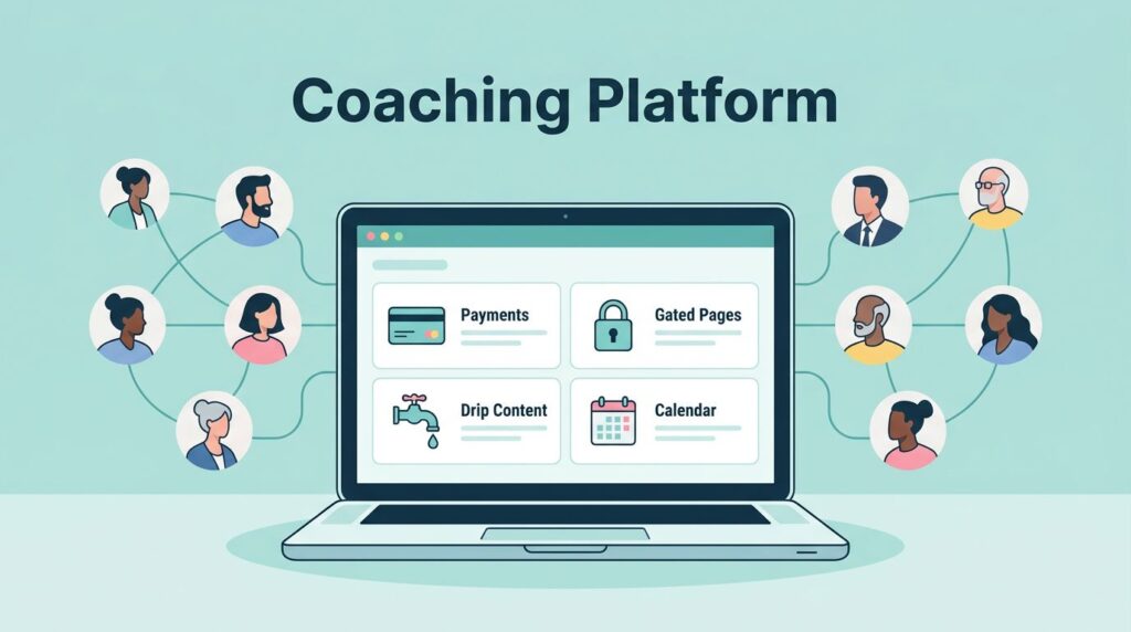
MemberSpace also fits the way alumni organizations actually operate. I can lock pages, videos, files, and posts behind different access rules, then set up free and paid tiers for students, recent graduates, long-time members, or donor circles. The platform also supports Stripe and PayPal, which makes payment handling much easier to manage.
The public MemberSpace alumni management software guide lines up with the same approach I use, set up the website first, then add membership functions around it. That keeps the site from feeling like a separate portal bolted onto the side of the university.
If the site looks good but the benefits are hidden, members won’t stick around long.
Map the website before you open the dashboard
I always sketch the site structure before I lock anything. Alumni sites get messy when the homepage tries to do every job at once. I want the path to be obvious, because people should know where to click within seconds.
Here’s the page structure I use most often:
| Page | What I put there | Why it matters |
|---|---|---|
| Home | Short overview, key benefits, featured events, join button | Gives visitors a fast first impression |
| Join / Membership | Tier options, pricing, sign-up form | Turns interest into membership |
| Events | Reunion dates, webinars, registration links | Drives attendance and participation |
| Directory | Searchable member profiles or class-year groups | Helps alumni reconnect |
| Resources | Career tools, downloads, alumni perks, recordings | Gives members a reason to return |
| Donate | Annual fund, reunion gifts, scholarships | Supports fundraising |
I keep the navigation short and plain. Alumni do not need clever menu names. They need to find things like “Join,” “Events,” and “Directory” without hunting around.

That same planning step helps me decide what stays public and what gets member-only access. If a visitor can see the value before signing up, the site feels open instead of gated.
Set membership tiers that feel fair and easy to explain
A good alumni association website needs pricing that makes sense on the first read. I keep the tiers simple and tied to real value, not abstract labels.
I usually build something like this:
- Student or recent graduate tier: low-cost or free access, plus newsletters, career resources, and event notices.
- Annual alumni tier: a modest yearly fee, with directory access, private content, and member pricing for events.
- Young alumni tier: a lower-priced annual plan for the first few years after graduation, often with career networking perks.
- Supporter or lifetime tier: a one-time payment for people who want long-term access and extra recognition.
When I want a cleaner structure, I use creating tiered membership levels in MemberSpace as my blueprint. It helps me match benefits to price instead of guessing.
I also budget for the platform itself. MemberSpace’s general plan includes a 5% transaction fee, so I factor that into the membership math before I publish pricing. If I’m collecting payments, I connect setting up Stripe payments in MemberSpace early, because the checkout flow needs to work before launch day.
Manual approval helps too. For some schools, I want to confirm graduation year or alumni status before I activate access. That extra step is worth it when the directory or private resources contain sensitive information.
Build the member experience around repeat visits
People join for access, but they return for rhythm. I want the alumni association website to feel alive after the first signup.
That starts with the member menu. I keep it obvious and short, so members can jump to the directory, event calendar, downloads, and profile settings without guessing. I also use welcome emails with a friendly first step, like “Complete your profile” or “Register for the next virtual meetup.”

MemberSpace’s Member Messages feature is useful here. I can send newsletters, renewal reminders, and announcements from the dashboard, then check open rates to see what people read. If a subject line falls flat, I change it. If an event reminder gets traction, I reuse the same tone next time.
I also like drip content for alumni communities. For example, I might release one career guide at signup, then send a mentorship worksheet a week later, then unlock a networking directory after that. It keeps the site from feeling empty after the first login.
Add the pages that drive money and participation
A strong alumni site does more than collect dues. It gives members a reason to act.
The pages that usually move the needle are the ones tied to real life. Event registration brings people back for reunions, panels, and regional meetups. A donation page supports class gifts, scholarships, chapter funds, and emergency aid. Private content gives members something they cannot get from a public social feed.
I like to think in terms of practical resources:
- an alumni directory with class year, city, and industry filters
- job boards or career articles
- mentorship signups
- recorded panels and lectures
- reunion planning documents
- member-only discounts or partner perks
- newsletter archives for people who missed an update
If I need more ideas for retention and alumni engagement, I compare my approach with Raklet’s alumni management strategy guide. That kind of reference helps me spot gaps, especially around networking, events, and long-term engagement.
For events, I keep the registration page simple. I list the date, location, price, and what is included. If a seat limit exists, I show it clearly. If tickets have different tiers for alumni, guests, or donors, I make that obvious too. Alumni usually register faster when the page reads like a clean invitation instead of a sales form.
Launch, test, and improve without guessing
I never publish an alumni association website without a test run. Small errors can break trust fast, especially when payment, login, or private content is involved.
My launch checklist usually looks like this:
- I connect the site to MemberSpace and confirm the code is loaded on every key page.
- I connect payment processing and test a real checkout flow with Stripe.
- I protect the right pages, then verify that free visitors and paid members see different content.
- I send a test welcome email and a test renewal or reminder email.
- I log in as a member, browse the directory, open a resource, and register for an event.
I also watch for friction in the signup flow. If a form asks for too much too soon, I cut it down. If people stall before payment, I add a clearer explanation of what they get. MemberSpace’s abandoned signup reminders and cancellation alternatives are useful here, because they help me recover people who hesitate at the last step.
After launch, I review the site monthly. I check which pages get visits, which emails get opens, and which membership tier gets the most signups. That tells me where alumni see value and where I need to tighten the offer.
Conclusion
A good alumni association website does a few things well, and it does them without confusion. It helps people join, find each other, show up to events, read private updates, and support the school in a way that feels easy.
MemberSpace gives me a practical way to build that structure on top of an existing site. Once the pages, tiers, and member journey are clear, the website starts working like a real alumni home base instead of a static brochure.
If I had to start today, I’d build one clear membership tier, one strong resource library, and one event page first. The rest gets easier after that.