
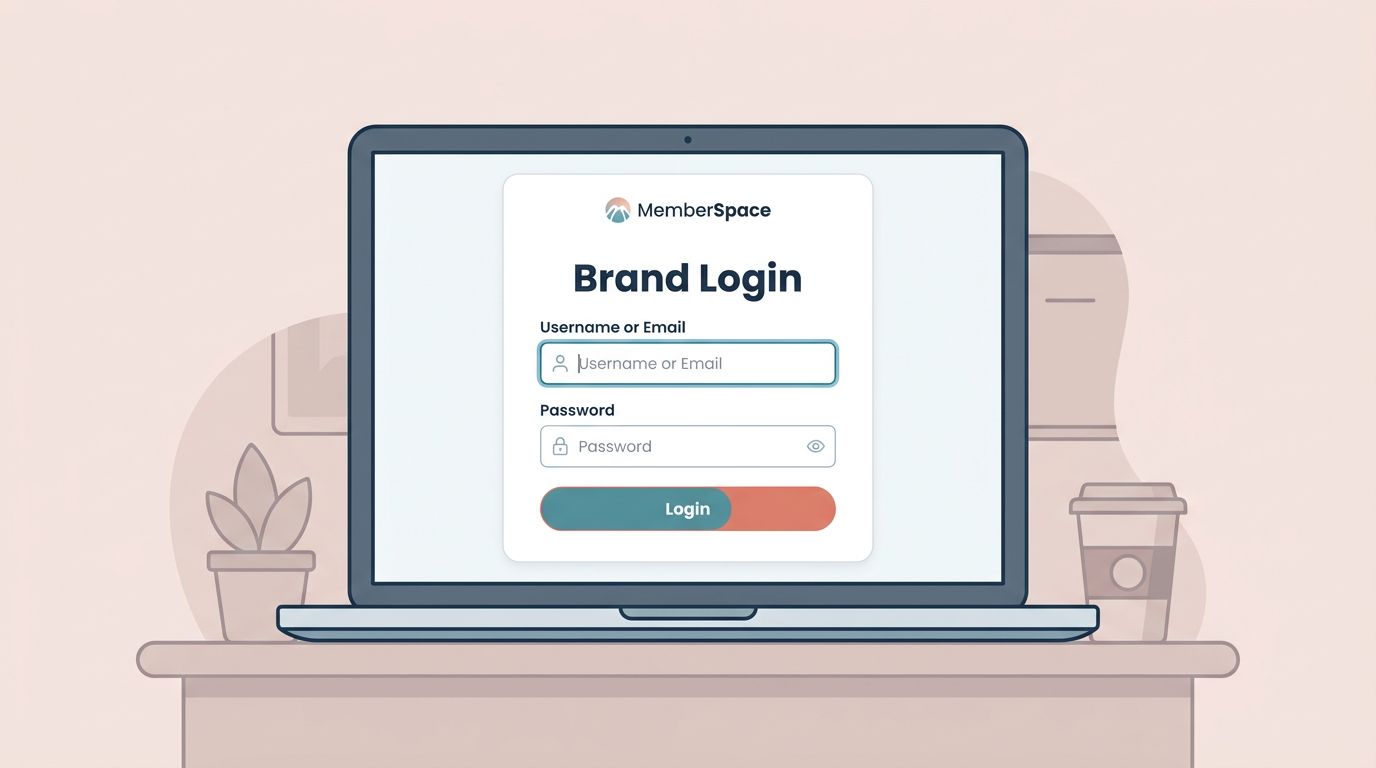
The first login screen tells people whether my membership site feels polished or patched together. If the colors drift, the form looks off, or the buttons feel generic, trust drops fast.
When I handle MemberSpace login styling, I start with the same brand rules I use everywhere else. That keeps the member path consistent from signup to sign-in.
From there, I make a few CSS changes, test them on mobile, and check the form with fresh eyes.
I start with brand rules, not random tweaks
Before I touch CSS, I write down the parts of my brand that matter most on a login page. I want the page to feel like the rest of the site, not like a borrowed panel dropped on top.
I usually decide on the logo size, the main text color, the button color, the border radius, and the spacing around the form. If those pieces stay steady, the page feels familiar in a few seconds.
I also make sure the member flow is already settled. That is why I keep my MemberSpace monthly subscription setup open when I plan the login screen, because a styled form still needs to fit the real access path.
| Brand piece | What I match | Why I care |
|---|---|---|
| Logo | Size and placement | It tells people they are in the right place |
| Buttons | Main brand color | It makes the action obvious |
| Form fields | Border, radius, padding | It keeps the layout clean and easy to scan |
| Text | Font family and weight | It keeps the page from feeling mixed up |
| Errors | Color and spacing | It helps problems stand out without drama |
When I make those choices first, I avoid the trap of styling one field at a time. The login page feels like one room, not five different corners.
The CSS changes that make the page feel native
MemberSpace gives me a place to add custom CSS, and I keep MemberSpace Help Docs open while I work. I do that because class names, layout hooks, and update paths can change, and I want to check the source instead of guessing.


I usually change four things first. The container gets a width that matches my site content. The input boxes get more breathing room. The button gets the same visual weight as the rest of my calls to action. The error text gets enough contrast to stay readable.
A login form should feel like a front door, not a shipping label.
I keep the edits simple at the start:
- The wrapper gets a max width so the form does not sprawl.
- The fields get padding so text is easier to tap and read.
- The button gets stronger contrast and a clear hover state.
- The labels stay visible, because hidden labels cause confusion later.
- The error message stays plain and direct, because users need the fix fast.
I also use browser dev tools to inspect the page before I paste anything into the stylesheet. That lets me see which element holds the form, which class belongs to the button, and which rules are already in place.
If my site sits inside Squarespace or another builder, I sometimes compare notes with a MemberSpace customization discussion on Squarespace. It helps when I want to understand how the surrounding template affects the login area.
My responsive checklist for phones and tablets
The login page can look perfect on a laptop and still fail on a phone. That happens when the fields sit too close together or the button feels too narrow to tap.
I check the mobile view early. A narrow screen forces me to see the form the way many members will see it. That usually exposes the rough edges fast.
I keep this checklist close:
- I make the main container fit small screens without side scrolling.
- I let buttons stretch wide enough for easy taps.
- I increase spacing between fields so thumbs do not hit the wrong box.
- I keep the text large enough to read without pinching or zooming.
- I test the form at both 375 pixels and tablet width before I call it done.
When I work on the visual side, I also think about the bigger member journey. If MemberSpace connects to payments, I want the login screen to match the rest of the path, so I keep my Stripe and MemberSpace integration guide nearby while I test the flow.
That matters because the login page is not a poster. It is a working screen. The layout needs to survive real use, shaky thumbs, and small displays.
Accessibility makes the styling hold up
Good styling does more than look neat. It helps people use the page without extra effort.
I never hide labels just because placeholders look cleaner. Placeholders disappear when someone starts typing, and then the form loses its map. I keep the labels visible so the page stays clear.
I also watch contrast closely. Light gray text on a white background may look sleek in a mockup, but it can vanish in real use. The same goes for the button text. If I have to squint, the page is already failing.
A login page can be simple and still feel intentional.
Keyboard use matters too. I tab through the form to make sure the focus state is easy to see. If I cannot tell where I am on the page, the styling is working against me.
I look at three more things every time:
- Error text should explain the problem in plain language.
- Focus rings should stay visible on inputs and buttons.
- The form should still read well if the user zooms the browser.
That last point matters more than most people think. Some members zoom because they need to. Others do it because the laptop screen is small. Either way, the design should stay intact.
How I test before I publish
I do not trust the page after one quick preview. I test it in a fresh browser session, on a real phone, and on at least one other desktop browser. That catches the small layout glitches that hide in a logged-in browser.
I also test the page as a new member would. I type the wrong password on purpose. I check the error message. I use the password reset link. Then I sign in correctly and confirm the redirect lands where I expect.
If the page includes any sign-up or support text nearby, I read that copy aloud once. Clumsy wording can make polished styling feel fake. Clean copy and clean layout should tell the same story.
I like to treat the login page as part of the site’s first impression, not a separate admin screen. When I do that, the last round of testing gets easier, because I already know what the page should feel like.
Conclusion
The strongest MemberSpace login styling comes from restraint. I match the brand first, then I shape the form so it stays clear on small screens, works with a keyboard, and holds up under real use.
When the login page looks like it belongs on the site, members feel that before they even sign in. I start with the brand rules, check the mobile view, and keep the form readable before I touch anything decorative.


