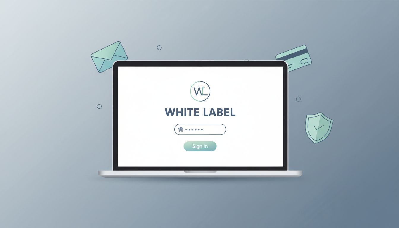
Launching a white label membership feels simple until the details pile up. One wrong login screen, one branded email, or one messy access rule can break the whole experience.
I build these memberships for founders, creators, agencies, and SaaS teams that want the site to feel like their own product, not rented software. MemberSpace gives me the structure, but I still have to shape the brand, the flow, and the launch with care.
What I white-label, and what stays inside MemberSpace
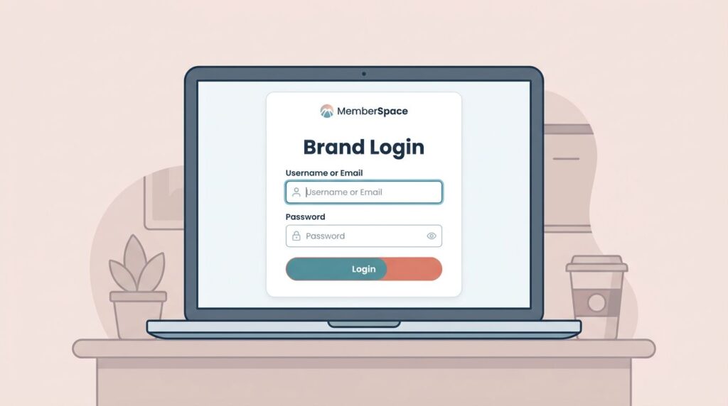
When I set up a branded membership, I pay close attention to the first five seconds. The logo, the login path, the email sender, and the payment screen all need to feel like one system.
Here’s the split I keep in mind:
| Member-facing area | Can I white-label it? | What I do |
|---|---|---|
| Signup and login | Yes | I keep members on my site and match the look and copy |
| Notification emails | Yes, with setup | I send them from my own domain when the settings allow it |
| Member pages and protected content | Yes | I hide pages, posts, files, or sections behind the plan |
| Admin dashboard | No | I still manage plans and access inside MemberSpace |
MemberSpace still runs the engine behind the scenes. I use its admin tools to manage plans, protect content, and control access. That matters, because white-labeling changes the front of the house, not the kitchen.
I keep the MemberSpace branding settings open while I build, and I check the current MemberSpace features page before I promise a client a specific setup. Some white-label options can vary by plan, so I confirm the details before I sell the result.
The setup I map before I build anything
I start with the offer, not the software. I write down who the membership is for, what problem it solves, and what the first win looks like. If the offer feels fuzzy, the membership will feel fuzzy too.
Before I touch a setting, I map three things:
- The main promise the member is buying.
- The content that should stay private.
- The path from signup to first value.
That keeps me from building a pretty shell around a weak idea. When I need a tiered offer, I use my tiered membership levels guide to keep the pricing ladder simple. I want each tier to make sense without a sales call.
I also treat launch planning like a brand launch, not a tech task. The pacing matters. The message matters. The first few touchpoints matter most. For that part, I borrow from the same mindset I’d use in a brand launch strategy, because the membership should feel clear before the first member even logs in.


How I configure plans, access, and branding in MemberSpace
Once my offer is mapped, I build the plans. I keep the structure tight so members do not get lost.
- I create one plan at a time and name it clearly. If I have multiple tiers, I build the base tier first and then expand from there. My tiered membership levels guide helps me keep the structure easy to explain.
- I connect the content the plan should unlock. That may be pages, posts, files, or specific sections. I keep the lock points close to the actual value, so the preview feels useful but incomplete.
- I set the signup and login flow so it stays on brand. If I’m building on Squarespace, I use my MemberSpace Squarespace paywall guide as a reference. That saves me from guessing where the checkout path should live.
- I check billing labels, upgrade paths, and cancel paths. If a member can’t tell what happens next, I fix the flow before I go live.
- I test the whole thing with a fresh email address. I never trust the admin view alone. The member view is the one that counts.
For email, I follow MemberSpace’s email white labeling guide, then I fine-tune the wording with notification email customization. Those two steps matter more than people expect. A login email that sounds off-brand can make the whole product feel rough.
Keeping the member experience consistent
Branding falls apart when the login page says one thing and the email says another. I keep the same voice across the site, the welcome message, billing notices, and support replies. That usually means short copy, one product name, and one obvious place to get help.

I also pay attention to what members see after they join. The dashboard, the confirmation message, and the follow-up email should feel like parts of the same room. If the design is calm but the copy is loud, the experience feels split.
I know the membership is ready when a new member can move through it without asking where they are.
That is why I keep a few rules in place. I use the same sender name every time. I keep the support reply-to address easy to spot. I avoid different terms for the same offer, because that creates doubt fast.
If the plan depends on a specific branding option, I confirm it before I build the rest of the experience around it. I’d rather change a draft than rebuild a launch.
My launch checklist before I invite anyone
I launch the same way I test any paid product: with a fresh email address and a little skepticism. I run through the path as if I had never seen the site before.

I also keep a simple website launch step-by-step checklist nearby. It helps me slow down the rollout and catch the obvious misses before members do.
My pre-launch checklist is short:
- I test one free signup and one paid signup.
- I confirm the lock and unlock rules work on every protected page.
- I check the sender name, reply-to address, and domain on every email.
- I read the public labels on mobile, because tiny copy gets messy fast.
- I review upgrade, cancel, and access-loss messages.
- I ask one teammate to join without help and note where they hesitate.
That last step catches more problems than any dashboard. If a teammate pauses, a real member probably will too.
Conclusion
A strong white label membership feels quiet in the best way. Members see one brand, one voice, and one path.
I get there by mapping the offer first, building the plan structure carefully, and testing every member-facing touchpoint before launch. MemberSpace gives me the machinery, but the experience only feels branded when I shape the details around it.
If I were starting today, I’d build one tier, protect one clear piece of content, and run one test signup before I opened the doors wider.