If revenue looks healthy on paper, churn can still be chewing through the base. When I track Baremetrics customer success metrics, I stop guessing and start seeing which customers are slipping, which plans are healthy, and where billing friction begins.
That matters because customer success is not a vague feeling. It shows up in payments, upgrades, downgrades, cancellations, and renewals.
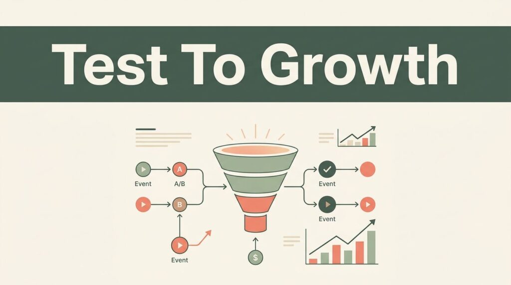
Below, I show how I read those signals in Baremetrics and turn them into action.
The metrics I watch first in Baremetrics
I keep the first pass simple. If I try to inspect everything at once, I lose the pattern. Baremetrics gives me a clean view of revenue movement, and I start with the numbers that tell me whether customers are staying, growing, or slipping away.
Baremetrics’s own customer success guide treats tracking as a lifecycle habit, which is how I use it too.
| Metric | What I watch for | Why it matters for customer success |
|---|---|---|
| Churn rate | Customers who cancel | Shows if retention is slipping |
| MRR | Monthly revenue movement | Tells me whether growth is holding up |
| ARR | Yearly revenue trend | Helps me plan beyond the current month |
| Active subscriptions | Remaining subscriptions | Shows if the base is still wide enough |
| Upgrades | Customers moving to higher plans | Signals expansion and stronger adoption |
| Downgrades | Customers moving to cheaper plans | Often points to value or fit issues |
| Failed charges | Payments that do not go through | Reveals billing friction before churn |
| LTV | Revenue earned over time | Helps me judge acquisition quality |
| User churn | Users who stop using the product | Often points to weak engagement |
This mix gives me more than a headline. Churn, failed charges, and downgrades point to different kinds of pain, so I never read them as one problem.
A churn spike can hide a billing issue. A wave of downgrades can hide weak onboarding. A healthy upgrade trend can hide a smaller active base. I want all of that on one page before I act.
I also keep those metrics in a smarter SaaS metrics dashboard so I do not have to hunt across reports.
Why MRR needs a retention lens
MRR is the headline, but it is not the whole story. Revenue can rise while active subscriptions flatten, which means growth is carrying too much weight on a few accounts. It can also rise because of upgrades while churn quietly cuts away the base.
That is why I pair MRR with ARR, active subscriptions, and churned subscriptions. I want the trend and the source, not just the total. If I need a quick refresher on the revenue side, Baremetrics’s SaaS metrics academy keeps the core terms straight.
I also look at the movement beneath the total. When MRR jumps, I ask whether upgrades drove it or whether a few large accounts masked a weaker month. When MRR dips, I check if churn, downgrades, or failed charges caused the drop.
I trust the story more when I can trace MRR back to the customer action that caused it.
That matters because customer success teams need a practical read, not a vanity chart. A flat MRR line can hide healthy retention if expansion and new sales are covering churn. It can also hide a real problem if one segment is shrinking fast.
The fix is simple. I read MRR as part of a set, then I compare it with retention behavior. That gives me a usable picture instead of a polished one.


How I turn metric swings into customer success work
Baremetrics only helps when it changes behavior. Once I see a shift, I want a clear next move. That is where the metrics become part of a working system, not just a report.
Here is how I use the data in practice.
- When failed charges rise, I check card failures, dunning timing, and whether support should reach out before a cancellation lands.
- When downgrades spike, I review onboarding gaps, product use, and plan fit. A downgrade often means value is not obvious yet.
- When churn moves in one segment, I split the data by plan or customer type. One weak segment can make the whole chart look worse than it is.
- When upgrades climb, I ask what those accounts have in common. Strong onboarding, steady use, and good fit usually show up there.
I keep a second reference open, key SaaS metrics for retention, so the team can tie each swing to a likely cause.
That workflow keeps the discussion grounded. It stops the team from blaming churn on one thing when the real issue is often split across billing, product adoption, and customer fit.
It also helps me protect the time of customer success managers. If the issue is a failed charge, I do not ask CS to rewrite onboarding. If the problem is a poor plan fit, I do not send Finance to solve it alone. The metric tells me where to start.

How I segment churn so the data can speak
If I only read total churn, I can miss the real problem. A small enterprise plan can carry a large share of revenue, while a self-serve tier can drive most of the account count. Those two views do not tell the same story.
I usually split churn by plan, customer type, and payment status. Then I compare the movement over the same date range. That is where Baremetrics helps me see whether I have a product fit issue, a billing issue, or a pricing issue.
For example, if churn is high in one low-price plan, I look at onboarding and product usage first. If failed charges cluster in the same period, I check payment recovery before I call it retention loss. If downgrades come from a segment that renews later, I pay attention to value adoption instead of rushing to discount.
That context matters even more when revenue is noisy. One large account can distort a weekly chart. One payment outage can make retention look worse than it is. Baremetrics gives me the raw trail, but I still have to read it in context.
I also like to compare churn against active subscriptions. If the account base is shrinking while MRR looks stable, I know the business may be leaning too hard on expansion. That is a fragile place to stay for long.
Building a weekly review that sticks
I use the same review rhythm every week because surprise is the enemy of retention. If I wait too long, I lose the thread between the metric change and the customer action.
On Monday, I check churn, failed charges, upgrades, and downgrades. Midweek, I compare those numbers with notes from support and success calls. At the end of the month, I look for repeating patterns by plan or customer type.
A weekly review should answer three questions, what changed, which segment moved, and who owns the follow-up. If I cannot answer those, the chart is only decorative.
I also assign one owner to each metric. Finance owns payment issues. Customer success owns churn follow-up. Revenue leadership owns the broader pattern. That split keeps everyone from waiting on everyone else.
The best part is that this rhythm makes the data useful fast. I do not need a giant report. I need a clean habit. Once the team knows what to check and when, Baremetrics becomes part of the operating rhythm instead of a tool we open only after something breaks.
What I want the dashboard to tell me
Baremetrics works best when I read revenue, churn, and payment activity together. That is how I spot the difference between healthy growth and growth that is hiding a problem.
The clearest Baremetrics customer success metrics are the ones I can act on the same week. If churn climbs, I want to know why. If failed charges rise, I want to know whether support should step in. If upgrades outpace downgrades, I want to know which accounts are finding more value.
That is the real win. I am not staring at a chart and hoping it makes sense later. I am using the numbers to keep customers longer and build a stronger base underneath the revenue line.