Paying customers can look healthy on the surface and still hide a slow leak underneath. A clean month of MRR does not tell me who is staying, who is expanding, or who is quietly slipping away.
That is why I use Baremetrics customer analytics as more than a reporting layer. I use it to read behavior, spot patterns, and make sharper decisions about retention, pricing, and customer health. The real value shows up when I stop staring at one number and start asking better questions.
Start With the questions revenue can answer
I begin with a simple rule, I never look at revenue alone. Revenue tells me what happened, but I want to know why it happened and which customers drove the change.
So I set up my view around a few questions. Which plans keep customers longest? Which segments expand after month three? Where do downgrades cluster? Which accounts are expensive to keep relative to their value?
That is also why I like to shape a SaaS metrics view before I go deep. A dashboard gives me a single place to watch churn, expansion, and plan mix without jumping between spreadsheets. When the numbers sit together, the story becomes easier to read.
Baremetrics customer analytics works best when I treat it like a map, not a scoreboard. I want to see the routes customers take after purchase. I want to see where they slow down. I want to see where they exit.
Baremetrics’ own customer success tracking guidance matches that mindset. I do not care only about who paid this month. I care about who will still pay six months from now, and who will pay more.
A flat MRR chart can hide a lot of churn if upgrades cover the losses.
That is the first lesson I keep in mind. Expansion can mask weak retention, so I need multiple views before I trust the trend.
Read retention and expansion together
When I analyze paying customers, I always pair retention metrics with expansion metrics. If I only watch churn, I miss the customers who stay but shrink. If I only watch expansion, I miss the accounts leaving through the back door.
When I want a clean view of recurring revenue, I rely on tracking MRR with Baremetrics. MRR gives me the broad shape of the business. Then I break it into the parts that matter most, like gross revenue retention, net revenue retention, churn, and expansion MRR.
This is the way I read them:
| Report | What I learn | What I do next |
|---|---|---|
| NRR | Whether existing customers are growing net of churn | I test expansion motion and pricing power |
| GRR | How much recurring revenue stays before expansion | I look for product or service friction |
| MRR Churn | How much revenue leaves each month | I inspect churn cohorts and cancellation reasons |
| Expansion MRR | How much upsell and add-on revenue I win | I study which accounts upgrade and why |
| Cohort Report | How customer groups behave over time | I compare retention by signup month, plan, or segment |
The table is simple, but the decision path is not. I use NRR to judge whether the base is healthy. I use GRR to see whether customers would stay even without upsells. Then I use expansion MRR to see if growth is coming from real product value or temporary pricing effects.
If I want to dig into long-term value, I also look at predictive analytics for SaaS lifetime value. That perspective matters because a customer who looks average in month one can become one of my best accounts by month six.


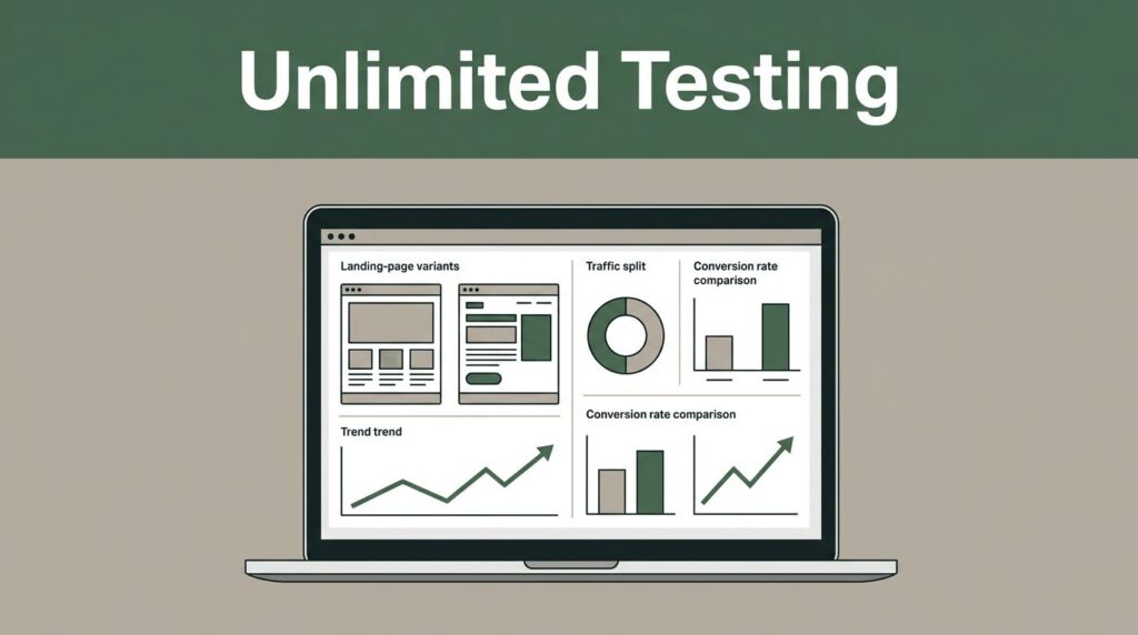
The image above is the kind of view I want before I start making claims. If the chart looks smooth but churn keeps rising, I know I need to look harder. A healthy line can still carry weak segments underneath it.
Find high-LTV segments and churn risk patterns
Once I trust the core revenue reports, I move into segments. This is where Baremetrics customer analytics gets more useful for finance and growth teams, because the same customer base can hide very different behaviors.
I look for high-LTV groups first. That might mean customers on annual plans, accounts from a certain acquisition channel, or users who cross a usage threshold early. Once I spot a strong segment, I ask what they have in common. Did they start on a higher-priced plan? Did they activate faster? Did they use support less?
That kind of pattern matters because it tells me where to spend more time. If one segment produces higher lifetime value, I can learn from it and copy the path.
I also look for churn risk patterns. For example, if smaller teams on a low-tier plan cancel after two billing cycles, I do not treat that as random noise. I treat it as a clue. Maybe onboarding is too thin. Maybe the feature gap is too wide. Maybe the price is too low for the value they need, which can still create bad-fit churn.
Baremetrics helps me compare those groups side by side, then test my own assumptions against the data. That is more useful than broad labels like “power users” or “at-risk accounts.” Those labels sound neat, but they do not help me act.
A few patterns I watch closely are:
- Plan concentration: If most churn comes from one plan, I study that plan first.
- Early-life churn: If customers leave early, I inspect onboarding and activation.
- Expansion lag: If upgrades happen late, I ask whether the product value is arriving too slowly.
- High-LTV outliers: If a small set of customers drives a lot of value, I look for repeatable traits.
I also compare these findings with pricing. A segment can look churn-prone because the plan is wrong, not because the customer is poor quality. That distinction saves me from making the wrong fix.
Turn cohorts into decisions, not just charts
Cohort analysis is where I stop guessing. I group customers by signup month, plan, or source, then watch how each group behaves over time. That gives me a cleaner read on retention than a single blended average.
The best cohort charts answer practical questions. Do newer customers stay longer than older ones? Do annual customers expand faster? Did a pricing change improve retention or hurt it? Did one acquisition channel bring in customers with stronger LTV?
I like cohorts because they keep me honest. A strong month can hide weak acquisition quality. A weak month can hide a pricing issue. Cohorts show the shape behind the snapshot.
Here is how I turn cohort results into action:
- I compare retention curves across signup months to see if product changes improved stickiness.
- I break cohorts by plan to see whether one tier creates better long-term value.
- I add acquisition source when I want to judge marketing quality, not just volume.
- I pair cohorts with churn reasons so I can separate product issues from billing issues.
- I use the results to decide whether to fix onboarding, rework pricing, or change target accounts.
If I see a cohort that keeps expanding, I study its path first. I want to know what happened before the upsell. If I see a cohort that fades early, I check the first 30 to 60 days. That window often tells me more than a quarterly report ever will.
This is also where finance and growth finally speak the same language. Finance wants durable revenue. Growth wants efficient expansion. Cohorts show whether both goals are moving together or pulling apart.
Build a workflow both finance and growth can trust
I get the best results when I treat Baremetrics as part of a weekly decision loop. First, I check MRR and churn. Next, I scan NRR, GRR, and expansion. Then I open cohort and segment views when something looks off. After that, I decide what needs attention from product, support, pricing, or sales.
That rhythm keeps analysis grounded. I do not wait for a month-end surprise. I also do not let one loud account distort the bigger picture.
For finance leaders, the value is control. I can tie revenue movement back to real customer behavior instead of broad assumptions. For growth teams, the value is focus. I can tell which customers are worth more time, which plans deserve more attention, and which segments need a better offer.
For SaaS founders, the value is clarity. I can see whether the business is growing because customers love it, or because a few upsells are covering weak retention. Those are very different stories.
What I watch next
The strongest use of Baremetrics customer analytics is not prettier reporting. It is better judgment. When I read retention, expansion, cohorts, and LTV together, I stop treating revenue as a blur and start seeing the customer behavior inside it.
That makes my next move more obvious. I know which segments deserve expansion work, which plans need attention, and which churn patterns need a fix before they spread.
The data is only useful when it helps me act. With the right Baremetrics workflow, I can do that with a lot more confidence.